The network for creativity
Join 1.25M professional creatives like you
Connect with clients, get discovered, and run your business 100% commission-free
Creatives on Contra have earned over $150M and we are just getting started
Back to feedPost

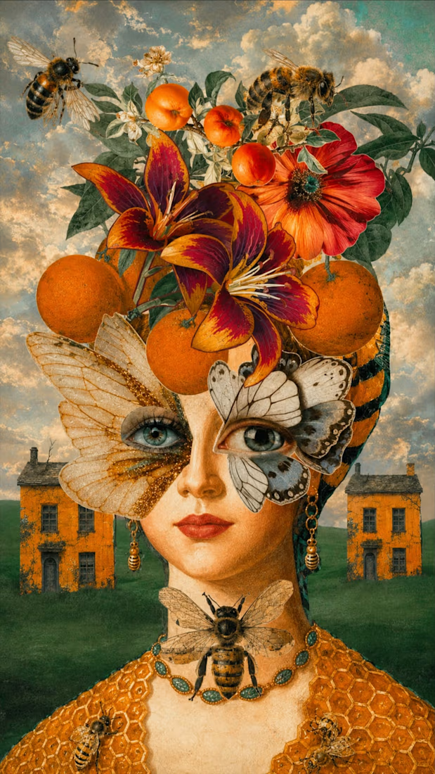
Queen of Nectar
Digital Collage
Crowned with blossoms and citrus, Queen of Nectar embodies the harmony between nature, transformation, and the sacred feminine. Her butterfly eyes perceive the world through dual lenses—clarity and mystery—while bees serve as symbols of community, devotion, and the intelligence woven throughout the natural world.
Encased in honeycomb-like armor, she wears sweetness not as fragility, but as strength. Surrounded by fertile landscapes and golden skies, the figure emerges as a guardian of abundance, intuition, and renewal, honoring the cyclical rhythms that connect growth, decay, and rebirth.
Created through an intuitive digital collage process, the work developed organically through the layering of symbolic imagery, allowing its narrative to emerge gradually through composition and atmosphere.


The network for creativity
Join 1.25M professional creatives like you
Connect with clients, get discovered, and run your business 100% commission-free
Creatives on Contra have earned over $150M and we are just getting started





Related posts

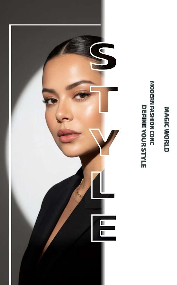
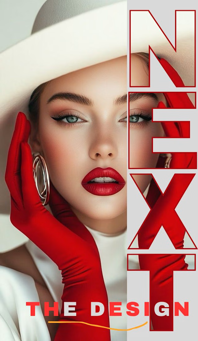
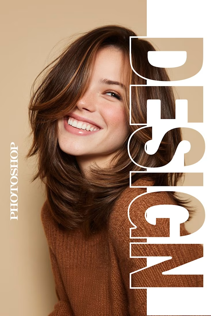
✨ Modern Fashion Poster Design - STYLE ✨
Designed a clean, high-fashion poster concept focusing on bold typography and minimalist aesthetics.
Concept: Modern Fashion | Define Your Style
Tool: Canva / Photoshop
Style: Luxury, Minimal, Editorial
Open to feedback and freelance work!
#GraphicDesign #PosterDesign #FashionDesign #Canva #ContraCommunity

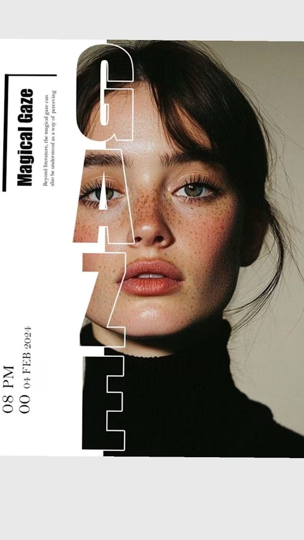

The way you let the bold type dominate the empty space really drives the luxury feel.

Hey everyone! 👋
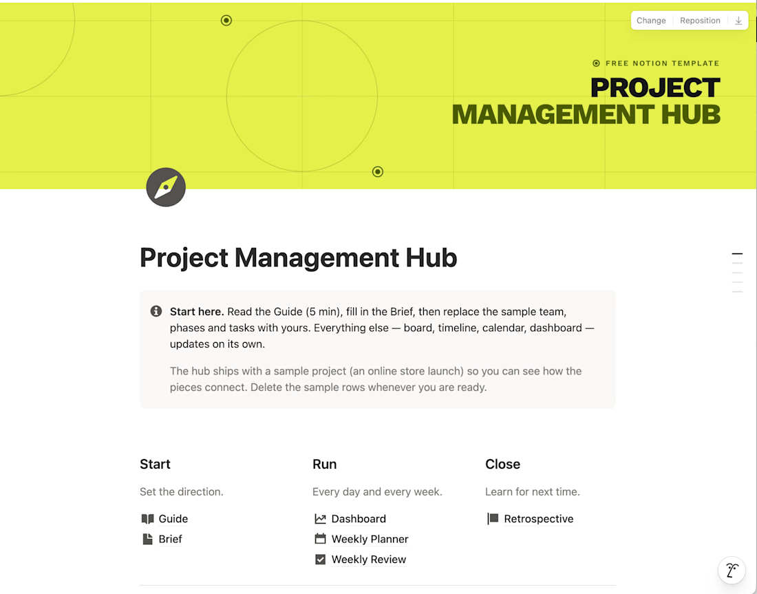
I built a Project Management Hub in Notion to run projects from brief to retrospective in one calm, minimalist workspace. It's for sale on Gumroad, but I'm sharing it for free with the Contra community.
It includes a guide, project brief, dashboard, weekly planner and review, plus 7 linked databases (tasks, phases, team, budget, risks and more). A sample project shows how everything connects.
It's for your personal use only, so please keep it within the Contra network.
Hope it helps! Let me know what you think 🙌


Love this!!

Flowlane 2.0, a launch video for a concept ops automation tool. Ops that run themselves.
The dashboard UI comes apart into layers to show each feature: live metrics, self-building reports and AI that drafts for you. It was built in Remotion and finished in After Effects.


Building the scenes in Remotion and hand-keying the light sweeps in After Effects is an interesting split. When a client asks for a late copy or colour change, which side ends up costing you more time?