The network for creativity
Join 1.25M professional creatives like you
Connect with clients, get discovered, and run your business 100% commission-free
Creatives on Contra have earned over $150M and we are just getting started
Back to feedPost
When Aervion was created, it wasn’t just about launching another airline.
It was about creating a symbol people could trust.
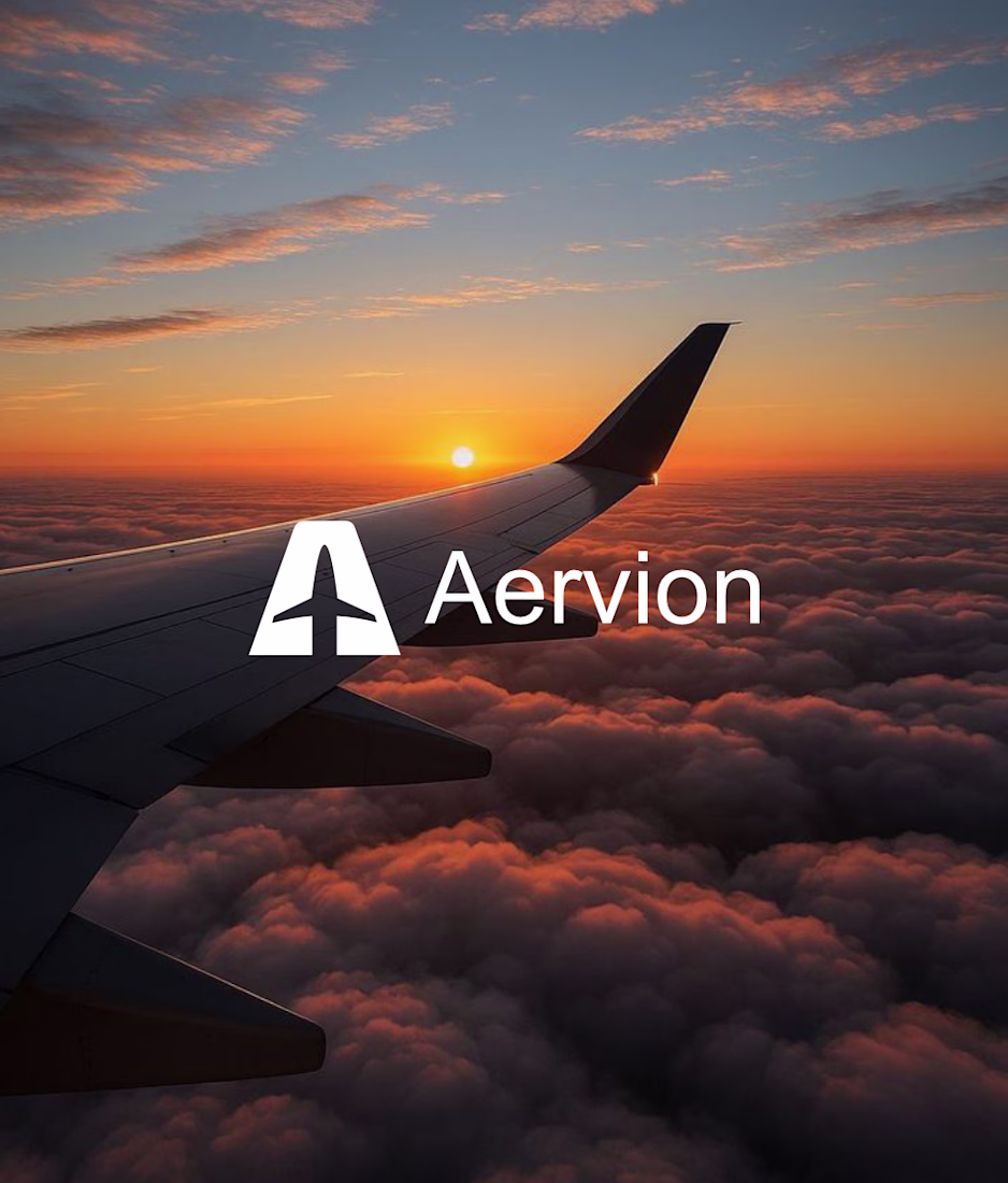
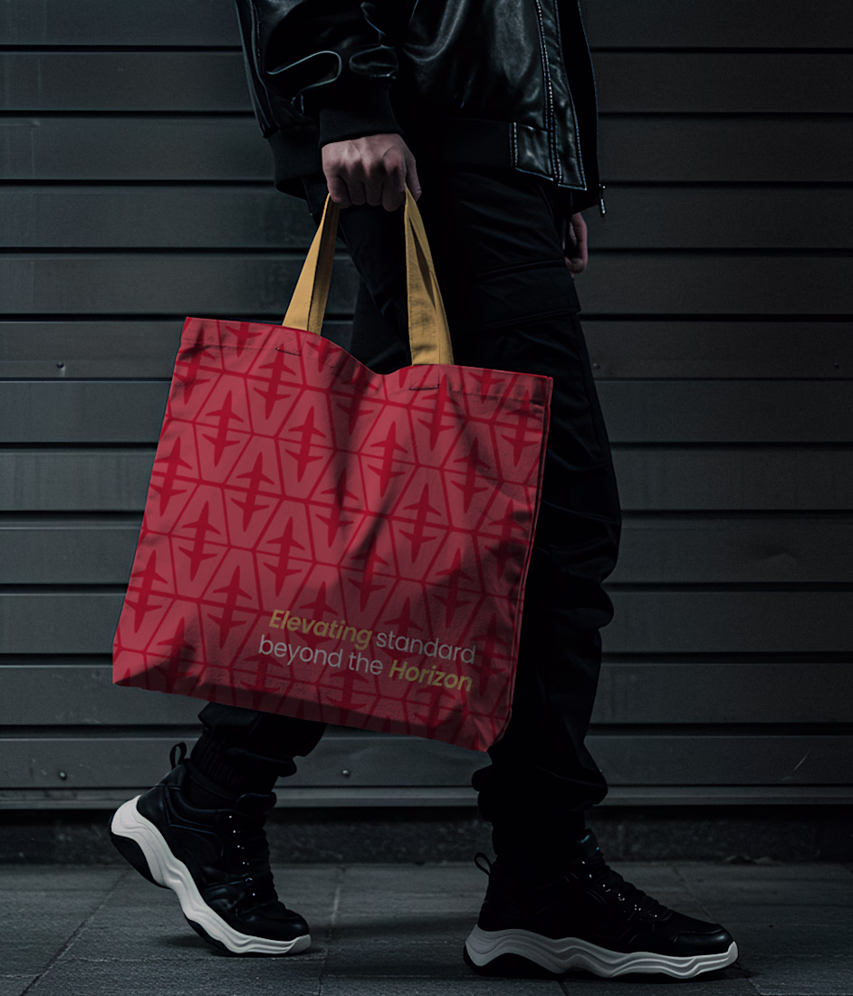
The bold red background wasn’t chosen to be loud.
It was chosen to be confident, to stand out on the runway, to be seen from a distance.
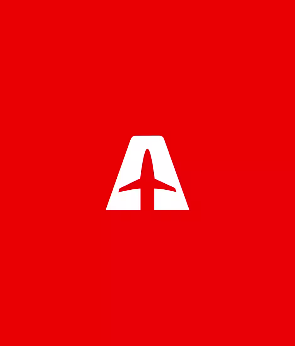
The strong “A” with the aircraft cut through the center wasn’t just a design.
It was a statement; we don’t fly around our identity, we fly through it.
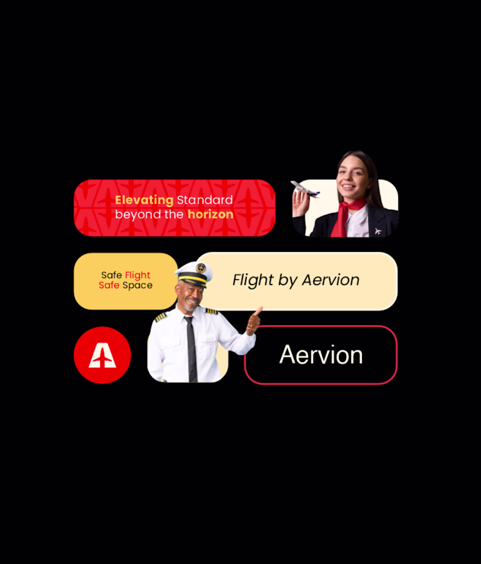
From the logo to the cabin experience, Aervion is built on one promise:
What you see is what you get; every time.
The same confident red on boarding passes.
The same calm, professional tone from crew announcements.
The same smooth booking experience.
The same attention to detail at every airport.
Because in aviation, consistency equals safety in the mind of the passenger.
When someone books Aervion, they don’t wonder what kind of experience they’ll get.
They already know.
And that predictability builds trust.
Trust builds loyalty.
Loyalty builds legacy.
Aervion isn’t just an airline brand.
It’s a consistent experience in the sky.
The network for creativity
Join 1.25M professional creatives like you
Connect with clients, get discovered, and run your business 100% commission-free
Creatives on Contra have earned over $150M and we are just getting started
Related posts
Kids don’t defeat fear by reading advice.
They understand it better when they can see it, shape it, shrink it, rename it, and laugh at it.
That’s the idea behind Monster Movie Studio — a cinematic interactive cartoon experience where children turn big fears into funny little animated monsters.
Instead of building another dashboard or basic kids app, I wanted this to feel like a playable cartoon episode.
A child can:
→ create a clay-like 3D monster
→ choose what made the monster feel big
→ drag magical tools onto it
→ direct a tiny cartoon scene
→ shrink the scary shadow
→ turn a roar into music
→ make the monster dance
→ transform it into a tiny helper
→ print a movie poster
→ share a gentle parent note
The whole experience is designed around one principle:
Every action should speak.
Not just buttons.
Not static cards.
Not a form with cute colors.
A tap should change the scene.
A drag should transform the monster.
A completed action should feel cinematic.
A child should feel like they are directing a tiny animated movie.
Built with Figma Make for the Config Makeathon.
Monster Movie Studio — turn big fears into funny little cartoons.
Love how visual this feels. Not a normal app, more like an interactive animated experience.
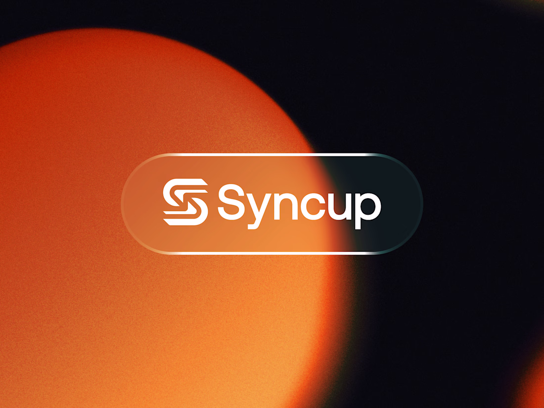
Syncup — Modern "S" Lettermark Logo & Brand Identity
A clean, modern logo and brand identity for Syncup, featuring a bold geometric "S" lettermark built from interlocking rounded forms — symbolizing connection, flow, and synchronization. Paired with a confident, friendly wordmark and presented on a glassmorphism pill badge against a warm gradient backdrop for a fresh, energetic feel.
This identity is designed to feel approachable yet tech-forward, making it versatile across app icons, websites, and digital products.
Hey there! I like to share something I made 😊
Dojo, a daily kendo practice, disguised as a card collection 🤺⚔️⛩️
Kendo is something that been sticking with me last 3 years... mostly get hit with a stick, repeatedly. But the part that sticks isn't the strikes, it's keiko: the same move, the same bow, over and over until they're yours. You don't win in kendo. You just keep showing up.
So I made an app that does the same thing. Dojo gives you one pack of three cards a day. No more, no matter how nicely you ask. Collect cards and you've quietly walk the path of a kendo practitioner!
It not a slot machine. No progress bars, no streak guilt, no confetti cannon at the finish. The grid just fills, one quiet day at a time.
I hope Dojo bows politely and asks you to come back tomorrow. And every card teaches you a little bit of kendo in English and Japanese, so you're learning while you collect.
📌 What to look for
- One pack a day, waiting is a feature, not a bug.
- Shin-Gi-Tai: 36 cards
- Zero dopamine gimmicks
- Bilingual cards a tiny kendo crash course.
📌 How it was made
Pen and paper -> ideas, scribbles
Claude -> to think out loud, plan and organized
Figma -> to design the look, layout and details
Agents / Weave -> to generate the card by theme
Figma Make -> pack it all up in as an interactive experience
Let me know what you think and hope you give Kendo a try! 🙏
https://dojo-kendo.figma.site/
Trending
Claude
Claude has entered the design space. How are you using Claude Design?
Contra University
Learn from expert creatives how to earn more using next-gen AI tools.
MagicPath
The canvas is infinite, and exploration is becoming the workflow. How are you using MagicPath?
creativeaiflow
Creative AI workflows are evolving. What tools do you use, and what are their strengths and weaknesses?
freelancerlife
Freelancer life is wins, pivots, and everything in between. What’s yours right now?