The network for creativity
Join 1.25M professional creatives like you
Connect with clients, get discovered, and run your business 100% commission-free
Creatives on Contra have earned over $150M and we are just getting started
Back to feedPost

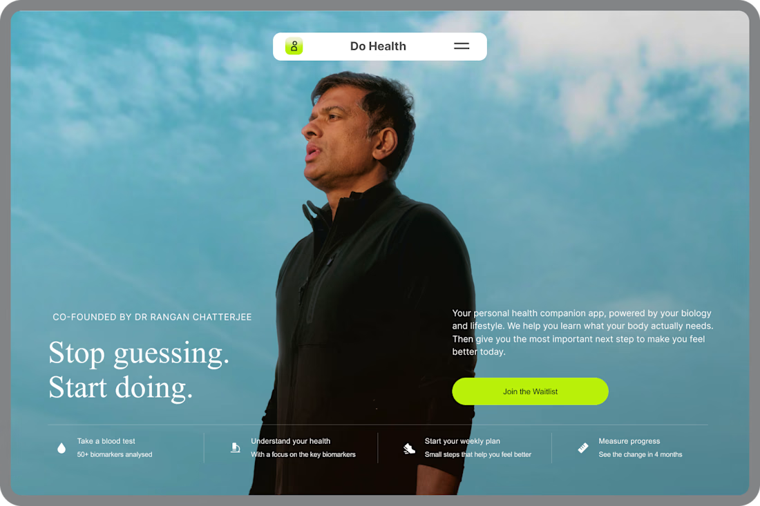
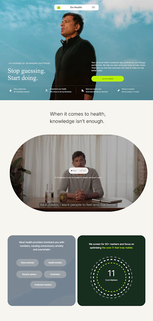
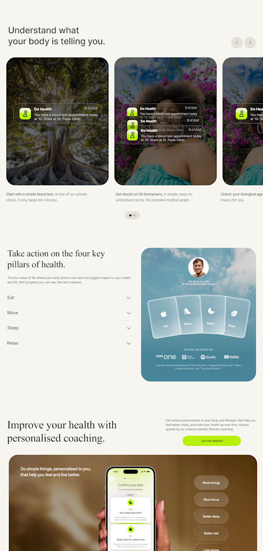
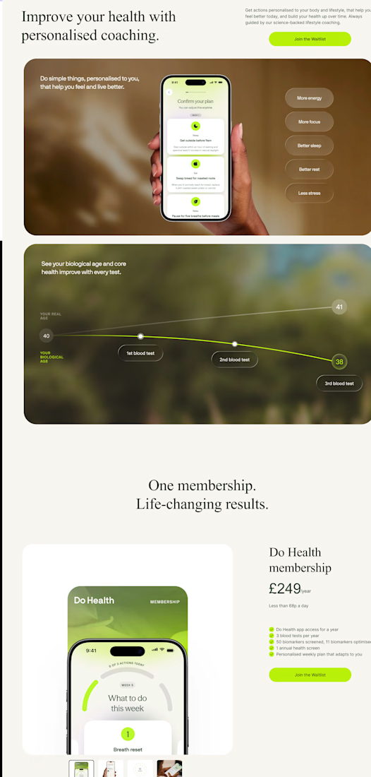
Do Health Landing Page UI Replication
Overview
I recreated the Do Health landing page as a UI design practice to sharpen my skills in crafting modern, conversion-focused web experiences.
Rather than simply copying the interface, I studied the design decisions behind it—understanding how typography, spacing, imagery, color, and layout work together to create a seamless user experience.
This exercise challenged me to pay close attention to every detail while recreating a polished, production-quality interface.
What I Focused On
Pixel-perfect layout recreation
Visual hierarchy
Typography and spacing
Responsive web design principles
Component consistency
Color system
Landing page structure
Healthcare SaaS UI patterns
Tools Used
Figma
Key Takeaways
Replicating exceptional products is one of the most effective ways to improve as a product designer. It helps develop a deeper understanding of design systems, layout composition, and the small details that make great interfaces feel intuitive and premium.
Disclaimer
This is a personal UI replication created solely for learning and portfolio purposes. The original design concept, branding, and intellectual property belong to the Do Health team. No commercial use is intended.
#UI Design #Product Design • Landing Page • Healthcare • SaaS • Figma • Design Practice • Web Design • UI Replication

The network for creativity
Join 1.25M professional creatives like you
Connect with clients, get discovered, and run your business 100% commission-free
Creatives on Contra have earned over $150M and we are just getting started











Related posts

FOCUS — Creative Portfolio & Digital Art Website 🌸✨
A visually expressive website concept for a creative portfolio, built around digital art, bold imagery, and visual storytelling
The design combines vibrant pink tones, soft gradients, experimental typography, and immersive photography to create a distinctive editorial experience
Special attention was given to:
• Bold editorial hero composition
• Vibrant pink and dark color palette
• Experimental typography and visual details
• Immersive photography and digital artwork
• Creative project gallery and navigation
• Responsive mobile experience
• Clean layouts with a strong visual identity
The result is an expressive digital experience that puts creativity, emotion, and visual storytelling at the center of every screen 💗
Looking to create a standout portfolio or website for a creative brand? Let’s connect 🚀






🌲 Nordhaus | Prefab Timber Homes Website (Framer)
Homes that grow quietly with the forest, now on the web. 🏡
Nordhaus is a website for a Latvian builder of prefabricated timber homes, created in Figma and built in Framer as a responsive site for desktop, tablet and mobile. It brings the brand's calm Nordic character through full-screen photography, a scroll-driven process story, a horizontal model gallery and interactive testimonials.
✨ Template coming soon to Framer.


Wonderful design man