The network for creativity
Join 1.25M professional creatives like you
Connect with clients, get discovered, and run your business 100% commission-free
Creatives on Contra have earned over $150M and we are just getting started
Back to feedPost

Every product tells a story.
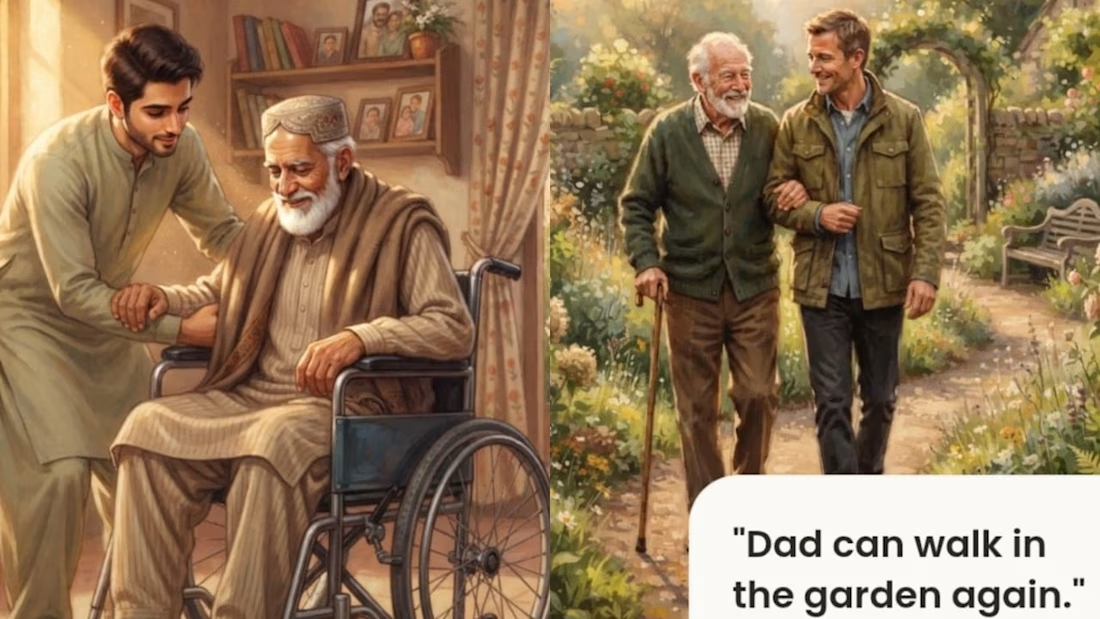
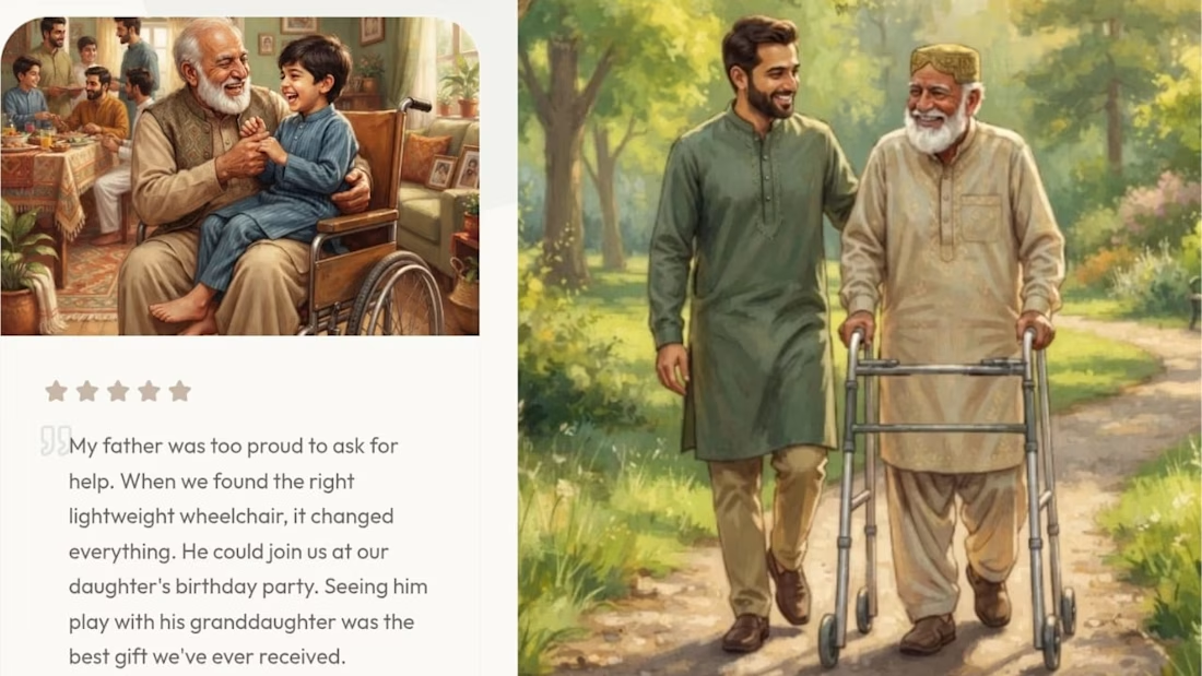
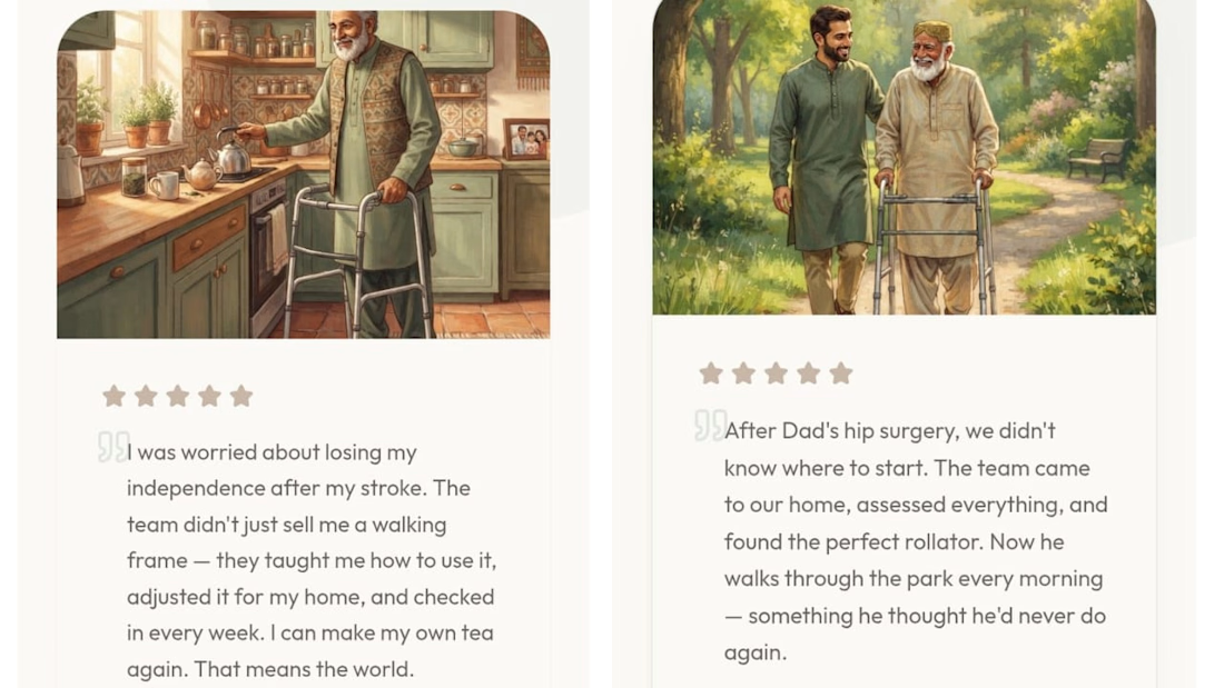
For this redesign, I didn't want to showcase medical equipment—I wanted to show what it means for a family when a loved one regains comfort, confidence, and independence.
These illustrations were created to bring that story to life throughout the experience. They remind us that behind every wheelchair, walker, or hospital bed is a person, a family, and moments that matter. ❤️
Independent concept created for the Base44 Challenge. Not affiliated with or endorsed by Zain Surgicals.
Project Link:
Disclaimer: This is an independent redesign created for the Base44 Challenge. It is not affiliated with or endorsed by Zain Surgicals.
X post Link:
#Base44 #WebDesign #UIDesign #Storytelling #HealthcareDesign


superb !
Thank you
The network for creativity
Join 1.25M professional creatives like you
Connect with clients, get discovered, and run your business 100% commission-free
Creatives on Contra have earned over $150M and we are just getting started



Related posts

A website hero and motion identity concept for Cycle.
The experience takes the viewer through seven historical eras in one continuous forward journey, while the logo, camera path and core composition remain consistent.
The concept explores how a static identity can become a living digital experience through motion, environment and interaction.
Workflow included Spline, Claude via MCP, Midjourney and SeaDance.
Available for brand identity, motion and digital design projects.


I fall in love, It is like Encarta, but 1000% better

2D Motion Landing Page Design
An exploration of motion, visual storytelling, bold typography, and modern web aesthetics.
This landing page concept combines a striking red-and-black visual direction with dynamic elements and a carefully structured layout to create an engaging digital experience.
Design focus:
2D Motion Design
Visual Hierarchy
Typography & Composition
Color & Contrast
Landing Page Design
#2DMotion #LandingPage #WebDesign #UIDesign #MotionDesign


The helmeted figure on the red is a strong hook, and the Stop Waiting card is clear. One friendly catch: the cover title reads "Motoin" and "Sass", worth fixing before clients see it.

Not all designers have enough courage to post rejected concepts, here's mine 😏
I understand that it looks too generic, though it looks like what the client was aiming for,
anyways, working on a new concept rn!

The timber-frame lines in the roof make the carpentry read instantly, which is probably also why it felt safe to the client. Was their feedback about the mark itself, or about wanting one more distinctive detail?