The network for creativity
Join 1.25M professional creatives like you
Connect with clients, get discovered, and run your business 100% commission-free
Creatives on Contra have earned over $150M and we are just getting started
Back to feedPost

Is Your Website Just a Pretty Face? 🧐
Having a beautiful website is great, but if it doesn't show up on Google, it’s like having a billboard in the middle of a desert.
As a WordPress & SEO Specialist, I see many business owners focusing only on the 'look' while ignoring the Technical SEO Audit. To actually rank and get clients, your site needs more than just a 'White Aesthetic'.
Here is what I fixed this week to boost my clients' rankings by +85%:
🚀 Core Web Vitals: Optimized every heavy image and script to ensure a lightning-fast load time (under 2 seconds!).
🛠️ Schema Markup: Added structured data so Google knows exactly what your business is about.
📱 Mobile Responsiveness: Perfected the layout for every screen size, because 60% of your traffic is on mobile.
📈 Rank Math Perfection: Fine-tuned meta tags and keyword density to hit that golden 90+ score.
The Result? More visibility, more clicks, and more conversions.
Don't let technical errors kill your business growth. Let’s audit your WordPress site and make it a ranking machine! 💻✨
Ready to grow? DM me or check my services on Contra!
#WordPressDeveloper #TechnicalSEO #RankMath #WebOptimization #AroojFatima #FreelanceSEO #DigitalGrowth #Contra

The network for creativity
Join 1.25M professional creatives like you
Connect with clients, get discovered, and run your business 100% commission-free
Creatives on Contra have earned over $150M and we are just getting started





Related posts

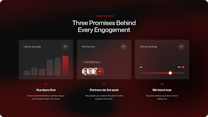
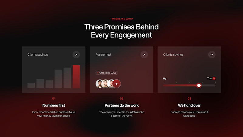
A small UI experiment: Border Radius vs. No Border Radius.
Same layout. Same content. Two different visual personalities.
I explored how the outer container treatment changes the relationship between the section, cards, and surrounding space.
Rounded → softer, more approachable, product-like.
Sharp → cleaner, more editorial, more architectural.
My pick: Sharp.
Sometimes the smallest visual decisions have the biggest impact.
2 voted
50%
2 voted
50%
4 votes
Closed

Voted Sharp too. On a dark red layout with three promises, square corners feel like commitments, while rounded would soften the message. The last line is true, the smallest visual decisions usually decide whether people trust a section.

SaaS Marketplace Website Design
I designed the responsive website experience for PubWhizz, a digital PR and backlink marketplace built around connecting businesses with publishers and high-authority websites.
The design focuses on making a complex marketplace easy to understand while guiding different user types toward the right action.


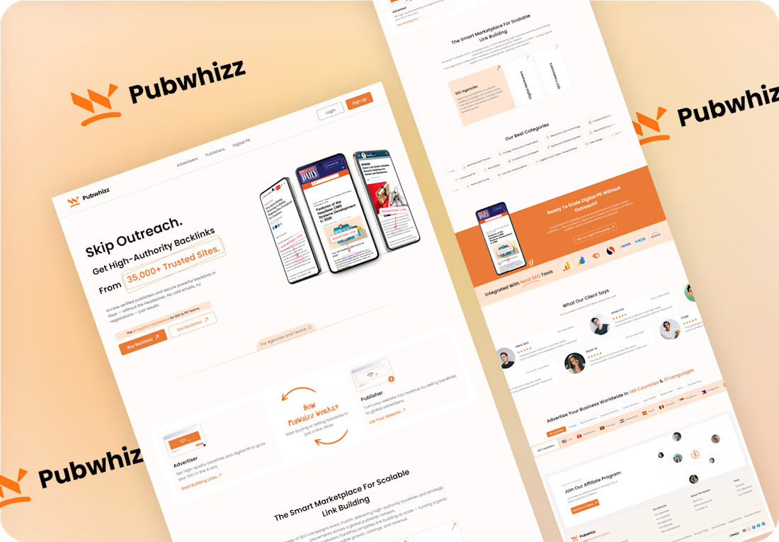
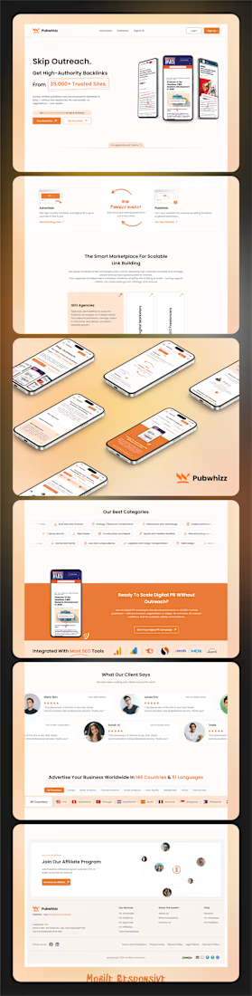

Orange against the warm cream keeps a dense marketplace feeling friendly. How did you guide publishers versus buyers?

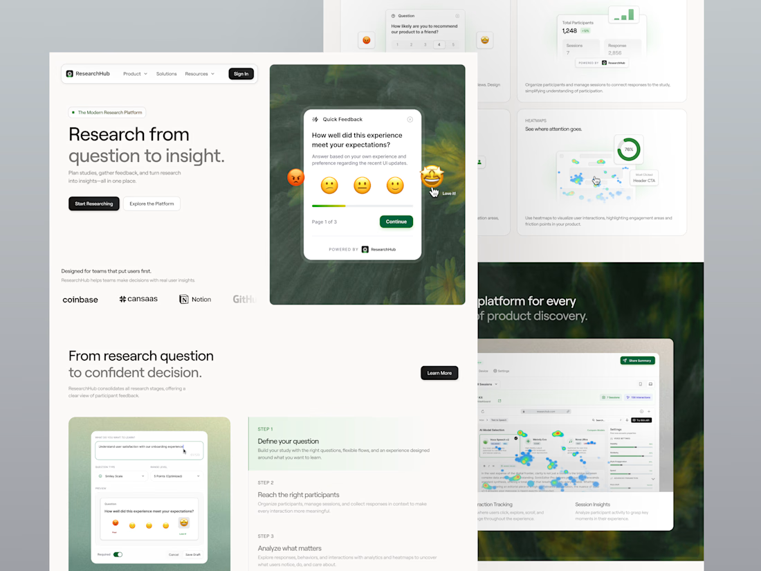
ResearchHub helps product teams plan studies, collect feedback, analyze user behavior, and uncover meaningful product insights in one clean research platform. The landing page combines a minimal white layout, soft green visual direction, survey builder previews, feedback widgets, heatmap analysis, participant insights, trust sections, and clear CTAs to make user research feel more structured, approachable, and decision-ready.
📩 Collaborate with Us? Contra Cansaas Agency
The emoji feedback card floating over the hero is a smart way to show the product. Nice restraint with the green.