The network for creativity
Join 1.25M professional creatives like you
Connect with clients, get discovered, and run your business 100% commission-free
Creatives on Contra have earned over $150M and we are just getting started
Back to feedPost

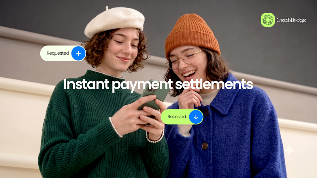
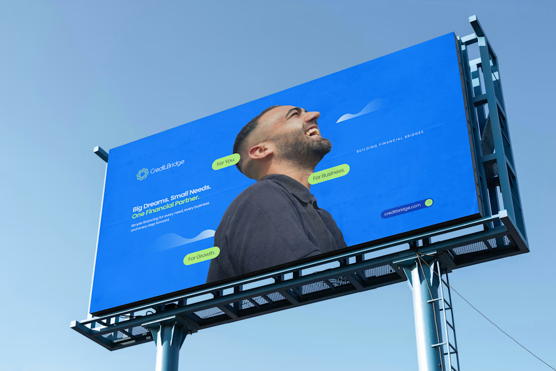
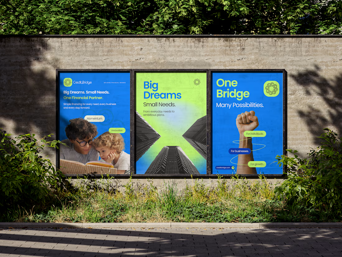
What if a fintech brand could show the idea of connection without using the usual arrows, networks or boring finance clichés?
That was the challenge behind Credit Bridge.
So we took something as simple as a coin, played with repetition, movement and connection and turned it into the core of the identity.
The interesting part is what happened when that idea met the wordmark.
Take a look - https://www.behance.net/gallery/255186365/Credit-Bridge-Fintech-Brand-Identity


The network for creativity
Join 1.25M professional creatives like you
Connect with clients, get discovered, and run your business 100% commission-free
Creatives on Contra have earned over $150M and we are just getting started
Trending
retrofuturism
Share your favorite designs from the past exploring the distant future. Or your own take on the aesthetic 🚀
halftone
Dots. Texture. Grain. Let's see your designs using the halftone technique.

Midjourney
Creatives are showing off what they're making with Midjourney.
colorgrade
Video editors sound off: How do you enhance the mood of your video in color grading?





Related posts


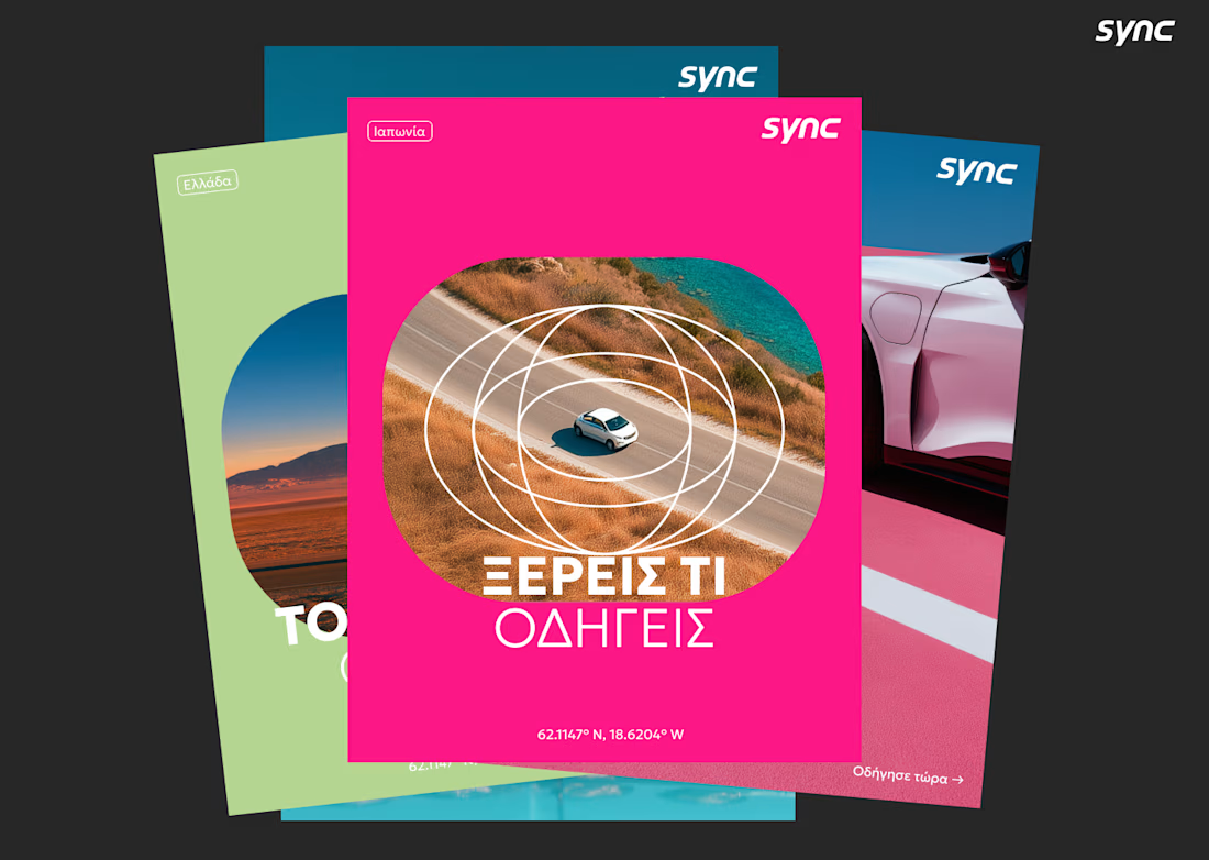
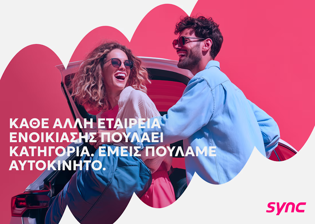
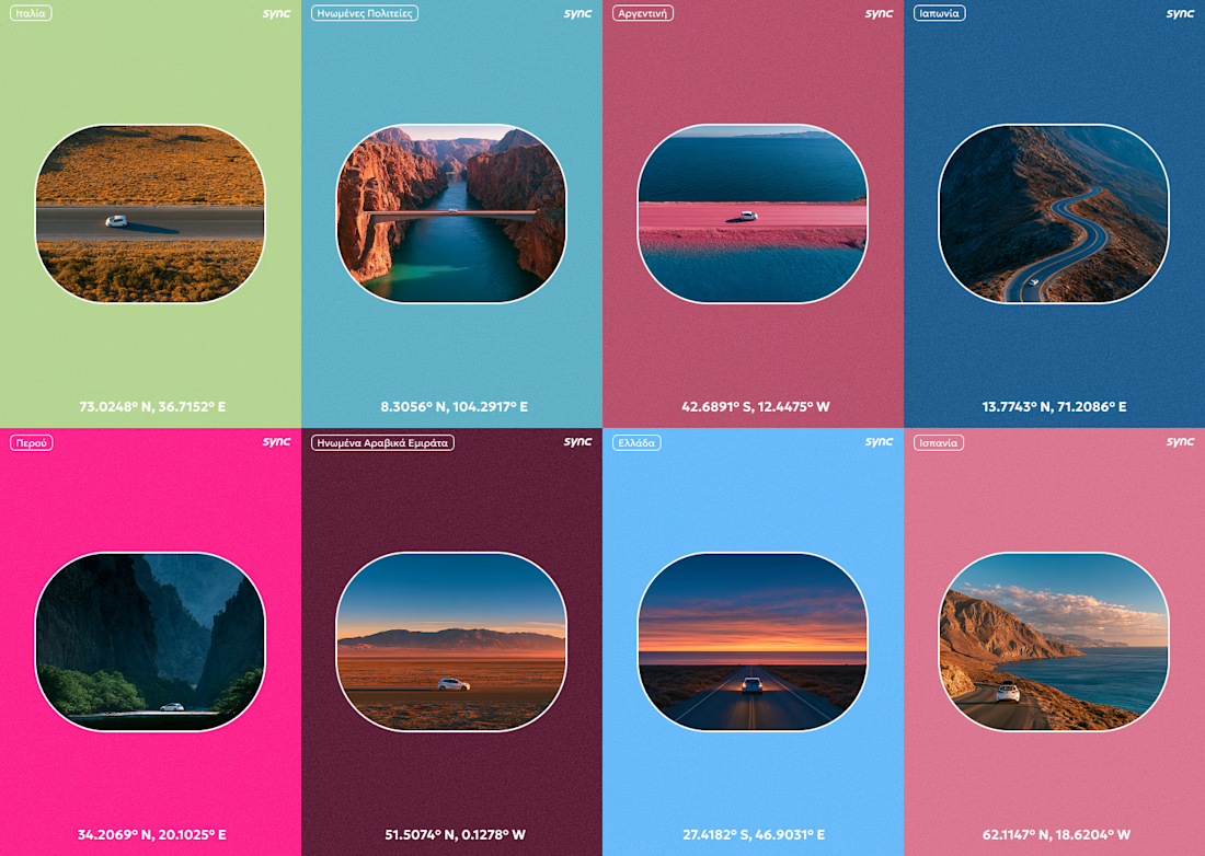
I don't speak any Greek, but I still made it work.
This is a part of the original exploration for an Athens based car rental company called Sync. The final identity looks a lot different and I cant wait to be able to share it as well.

Great Great work!!



This is such a standout piece.


working on logo animation for Spark Studios


T O P 🙌