The network for creativity
Join 1.25M professional creatives like you
Connect with clients, get discovered, and run your business 100% commission-free
Creatives on Contra have earned over $150M and we are just getting started
Back to feedPost

Great digital products aren’t built in one attempt.
They evolve through iteration, testing, and refinement.
At Codative Labs, we believe in progress over perfection — building, improving, and evolving until the experience feels right.

The network for creativity
Join 1.25M professional creatives like you
Connect with clients, get discovered, and run your business 100% commission-free
Creatives on Contra have earned over $150M and we are just getting started



Related posts

Growth shouldn’t feel locked behind a pitch deck.
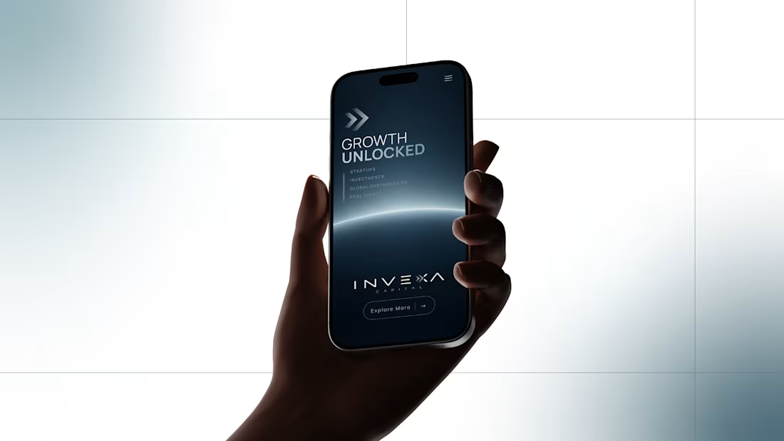
This is the mobile web design I created for INVEXA Capital, an operator-led growth platform that pairs capital with hands-on expertise to help technology companies scale.
The hero leads with the brand idea, Growth Unlocked:
The forward arrows from the INVEXA X logo open the screen with momentum
A deep slate background and a glowing horizon line suggest what comes next
A clean, widely spaced wordmark keeps the brand confident and institutional
Focused, minimal navigation guides investors and founders straight to action
It brings the brand to the screen investors check most: their phone.
If your fintech or investment brand needs a digital presence as sharp as its strategy, let’s talk.
#brandidentity #fintechbranding #webdesign #venturecapital


Before I look at colors, typography, animations, or whether the hero needs a redesign, I’d check three things first.
Can I understand what the product does?
Not after reading five sections. Within the first few moments.
Can I understand why it matters?
Features explain what a product has. Value explains why someone should care.
And finally:
Why should I believe you?
That might come from real product visuals, results, customers, expertise, data, or simply a much clearer explanation of how the product works.
If those three things aren’t working, polishing the interface won’t solve the core problem.
Visual design matters a lot.
But it works best when there is already something clear and convincing underneath it.
Before asking how the homepage should look, I’d first ask what it needs to make people understand, believe, and do.

IcedCoffee.work, 0 to 1 Product Building with AI

