The network for creativity
Join 1.25M professional creatives like you
Connect with clients, get discovered, and run your business 100% commission-free
Creatives on Contra have earned over $150M and we are just getting started
Back to feedPost

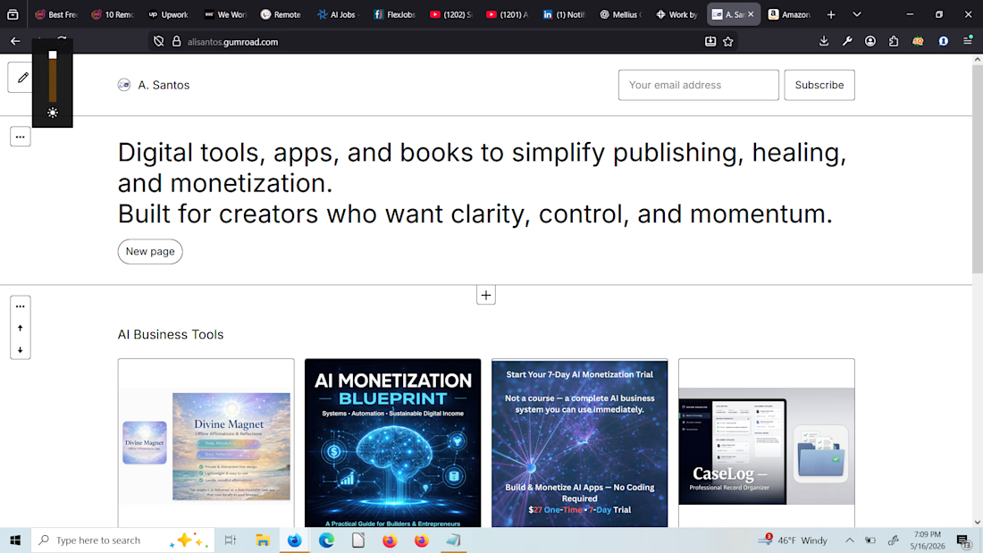
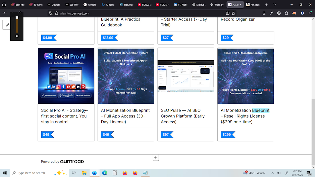
Digital tools, apps, and books to simplify publishing, healing, and monetization. Built for creators who want clarity, control, and momentum.


The network for creativity
Join 1.25M professional creatives like you
Connect with clients, get discovered, and run your business 100% commission-free
Creatives on Contra have earned over $150M and we are just getting started
Challenges
View all


Related posts


I built my site like it’s 2005 and I regret nothing.
There’s a snake game on the 404 page that actually moves. A terminal that types itself out. And somewhere underneath all that — 14 years of UI/UX work and a design subscription, if you’re into that sort of thing. Vibe-coded, made with love.
anfalova.art. Go press buttons.


Wow , you got one of my goats 🐐

Skincare Product Advertising & Social Media Design
A clean, modern advertising concept designed to showcase skincare products through appealing visuals, clear typography, and thoughtful product placement. Created to help beauty brands present their products professionally across digital platforms.


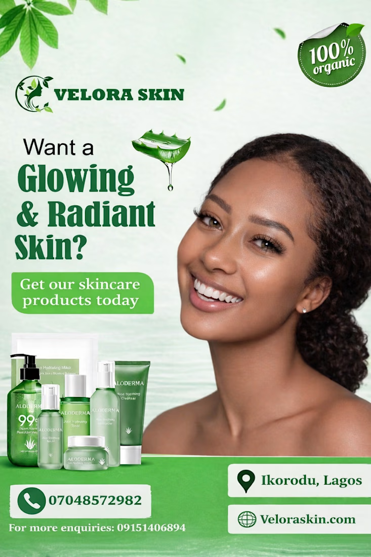
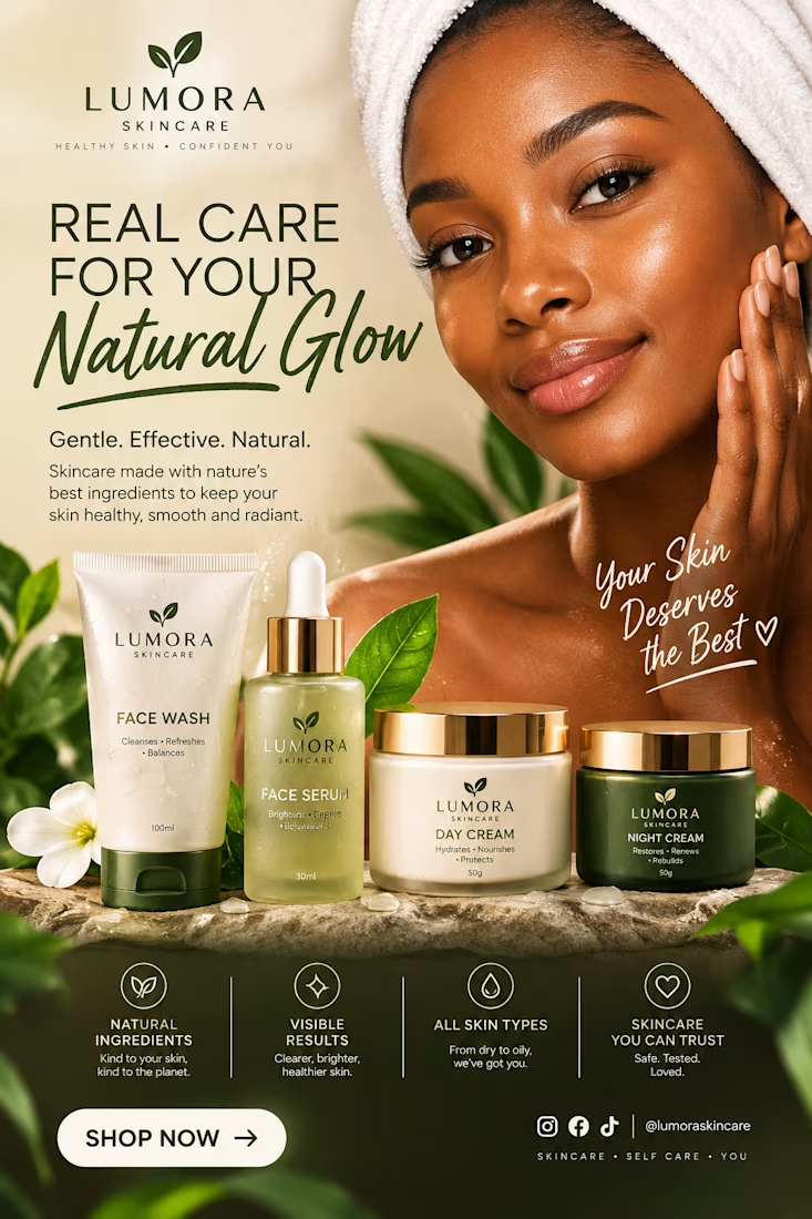

Blending tools like ChatGPT and Canva into a Photoshop workflow is a smart way to speed up concepting. It lets a designer test different visual directions quickly without starting from a blank canvas every time.