The network for creativity
Join 1.25M professional creatives like you
Connect with clients, get discovered, and run your business 100% commission-free
Creatives on Contra have earned over $150M and we are just getting started
Back to feedPost


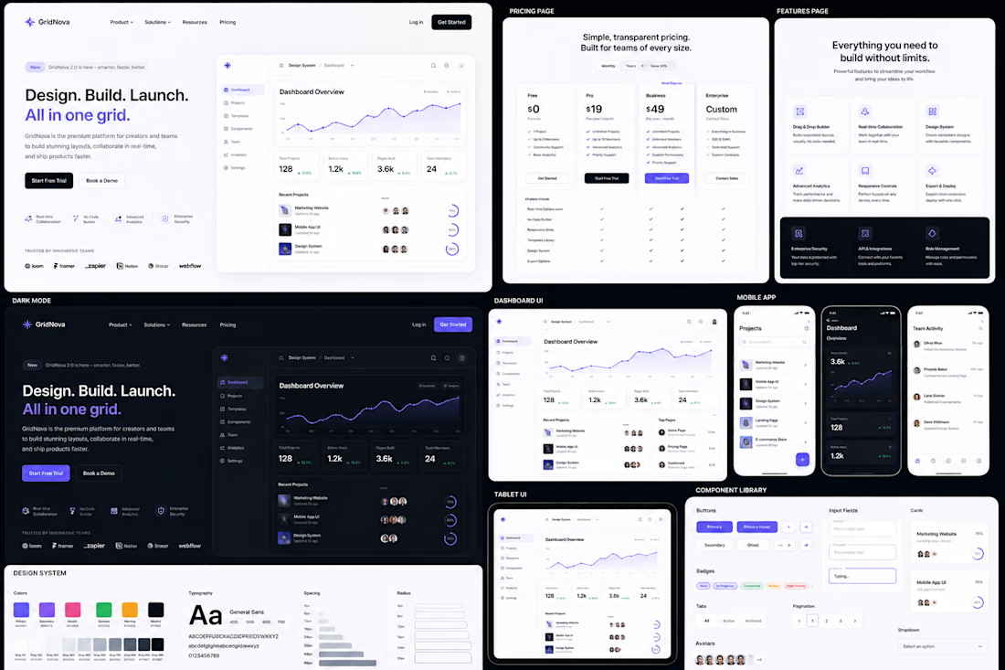

The dark theme with those pops of color in the design system swatches makes the whole SaaS kit feel really cohesive. Was cross-platform consistency the hardest constraint to design around, or was it something else?

Thank you! That means a lot. The biggest challenge wasn't just consistency, it was creating a flexible design system that could scale across desktop, tablet, mobile, and dark mode without feeling repetitive or disconnected. The goal was to make every screen feel like part of one unified product ecosystem.
The network for creativity
Join 1.25M professional creatives like you
Connect with clients, get discovered, and run your business 100% commission-free
Creatives on Contra have earned over $150M and we are just getting started





Related posts

Light or refined - which E-Bike product breakdown section design would you choose?
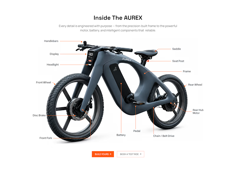
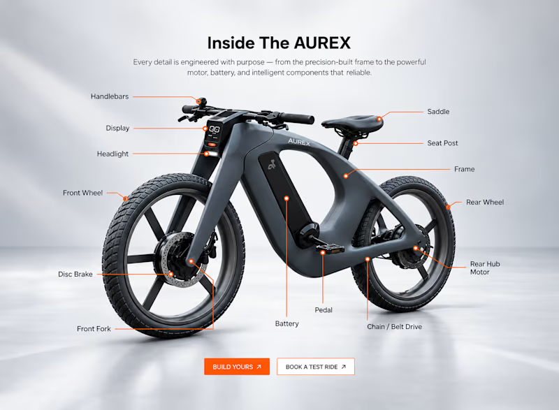
Two concepts for the same AUREX e-bike. Same product, same components, two different presentation styles:
A - Soft Studio: subtle gray depth, larger product focus, and a more premium visual feel.
B - Clean Minimal: bright white background, tighter spacing, and a more technical editorial layout.
Which direction feels stronger for a premium e-bike brand and why?

5 voted
31%
11 voted
69%
16 votes
Closed

A feels more premium to me. The soft gray depth and bigger product focus make the bike feel like something special. B is great for specs, but A sells the feeling

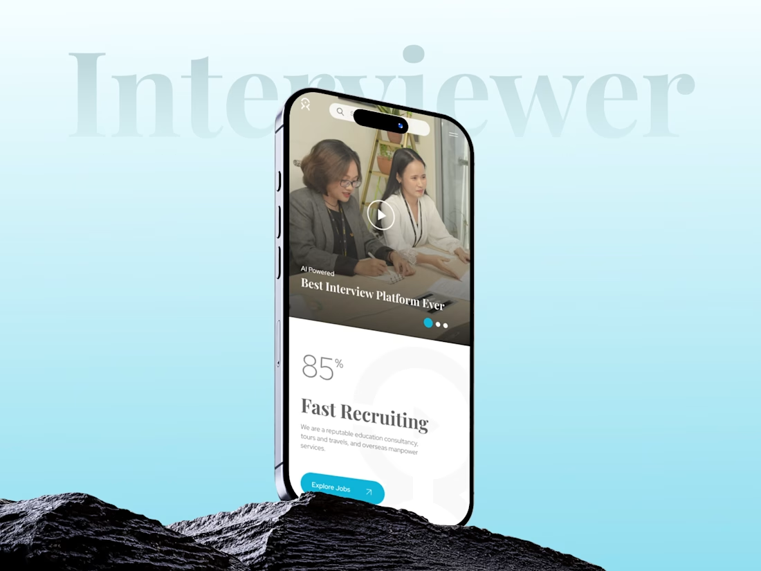
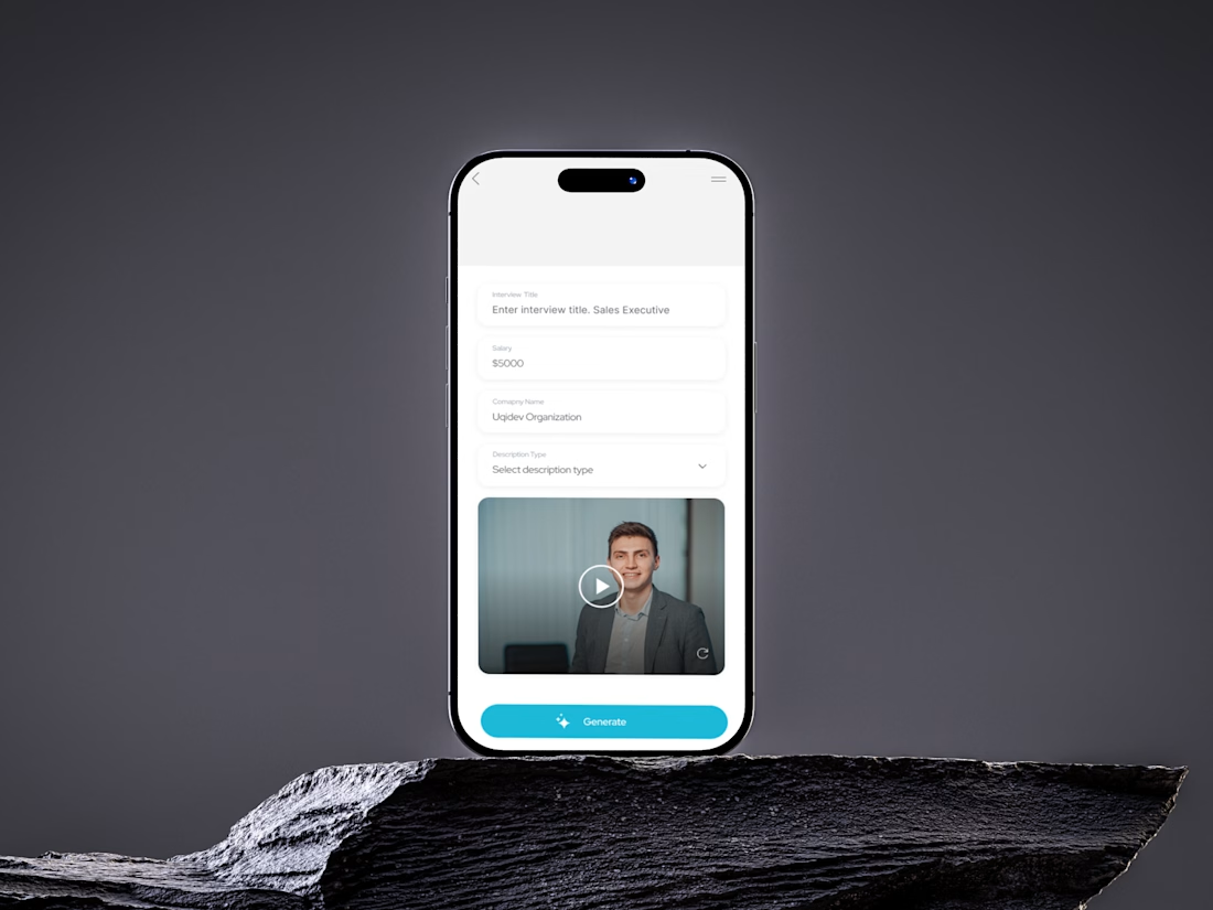
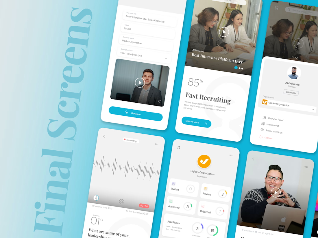
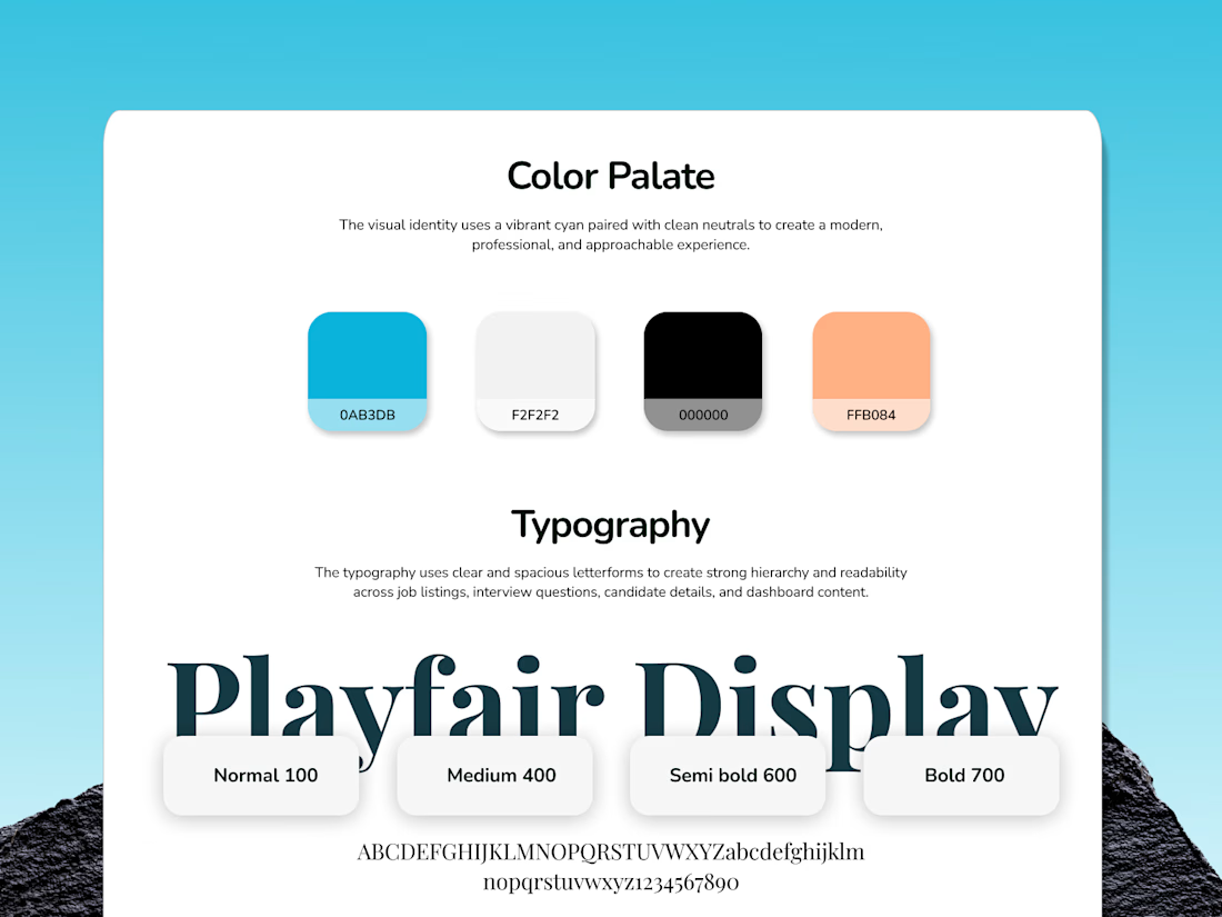
INTERVIEWER — AI-Powered Recruitment & Interview App
Designed a clean, modern mobile app experience with a bold blue visual identity, intuitive layouts, and a strong focus on usability.
From concept & branding to AI-powered interview flows and recruitment screens, every detail was crafted to create a simple, engaging, and seamless hiring experience.
What do you think of the direction? 👇

This is really well done!

LumaClean was losing hours to manual quoting, scheduling, confirmations, rescheduling, and follow-up. LumaFlow turns that entire process into one automated booking workflow.
I built LumaFlow for a fictional Chicago cleaning business, LumaClean.
The problem was simple: too much back-and-forth just to turn a customer inquiry into a confirmed booking.
So I built a workflow that handles the journey:
→ Instant quote
→ Smart availability
→ $40 deposit
→ Booking confirmation
→ Reminders
→ Rescheduling
→ Booking recovery
The goal wasn't to build another pretty booking page.
It was to give the owner less work to do.


Vert nice