The network for creativity
Join 1.25M professional creatives like you
Connect with clients, get discovered, and run your business 100% commission-free
Creatives on Contra have earned over $150M and we are just getting started
Back to feedPost
Taste Test
Why does one design feel more professional than another? Not because of different content.
The difference is in the details:
• spacing
• typography hierarchy
• visual balance
• alignment
• consistency
Each change is barely noticeable on its own. But when combined, they completely transform how the website is perceived.
Good design isn't about making dramatic changes. It's about refining every detail.
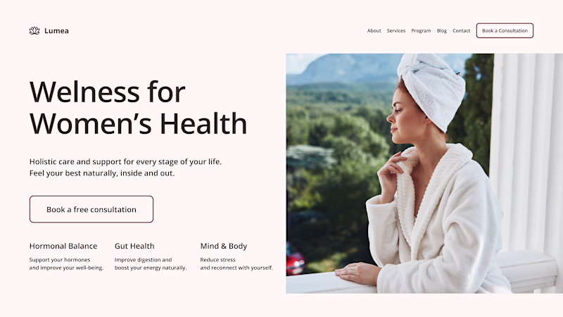
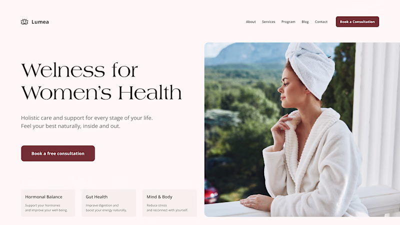
Which version would you trust more?
19 votes
Ends in 1d
Option 2, because on a lighter background, CTAs and 3 boxes are standing out more with a good visual balance and hierarchy
Only option 2: the vibe is better and has a contrast button.
Going with option 2
Option 2
The network for creativity
Join 1.25M professional creatives like you
Connect with clients, get discovered, and run your business 100% commission-free
Creatives on Contra have earned over $150M and we are just getting started
Related posts
Recently refreshed my website and would love your feedback. Which version do you like better?
13 voted
33%
27 voted
67%
40 votes
Closed
Lovely concept

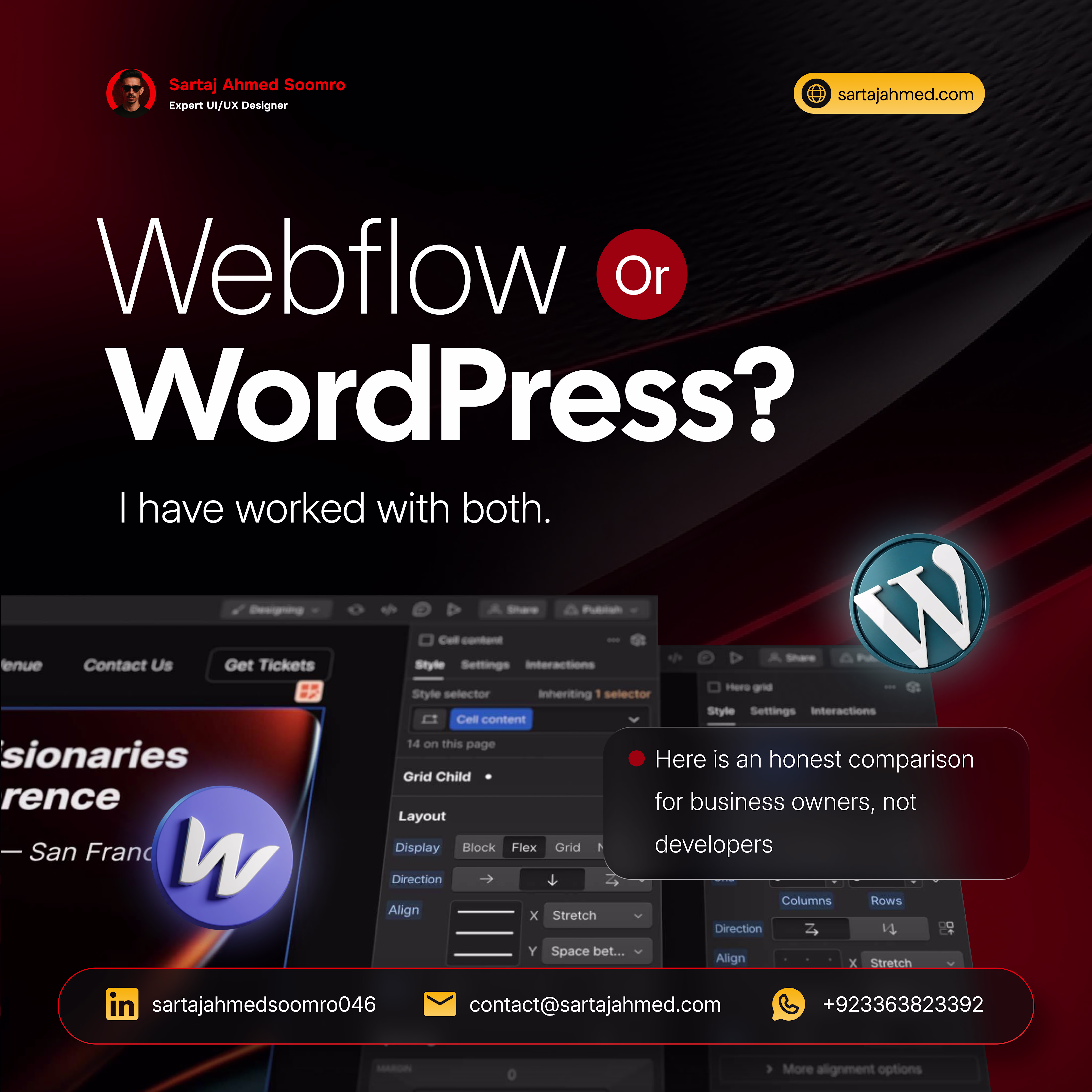
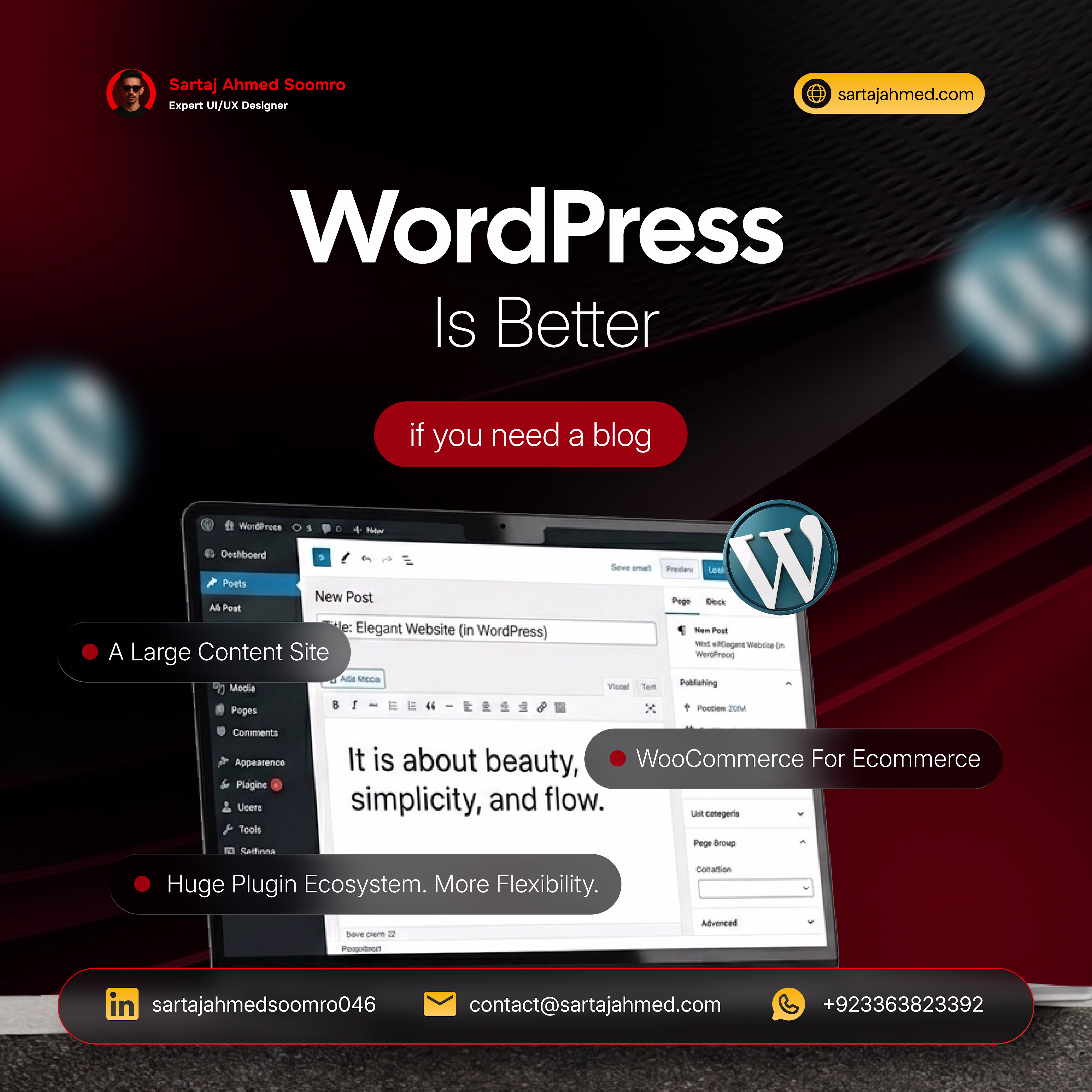
𝙒𝙚𝙗𝙛𝙡𝙤𝙬 𝙤𝙧 𝙒𝙤𝙧𝙙𝙋𝙧𝙚𝙨𝙨?
I have worked with both. Here is an honest comparison for business owners, not developers.
𝙒𝙤𝙧𝙙𝙋𝙧𝙚𝙨𝙨 𝙞𝙨 𝙗𝙚𝙩𝙩𝙚𝙧 if you need a blog, a large content site, an e-commerce store with WooCommerce, or a website with a huge plugin ecosystem and maximum flexibility.
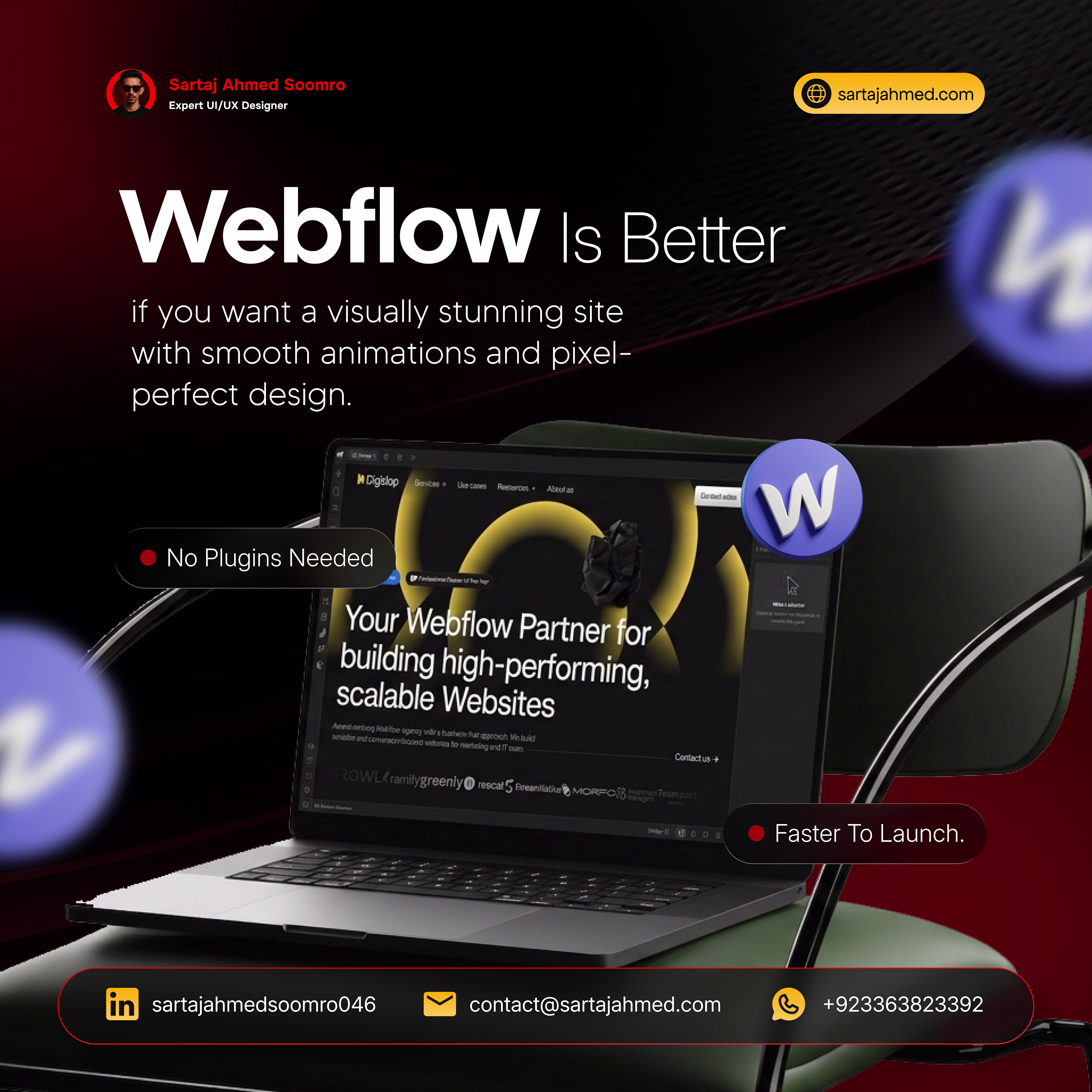
𝙒𝙚𝙗𝙛𝙡𝙤𝙬 𝙞𝙨 𝙗𝙚𝙩𝙩𝙚𝙧 if you want a visually stunning site with smooth animations and pixel-perfect design. No plugins needed. Faster to launch. Cleaner code from day one.
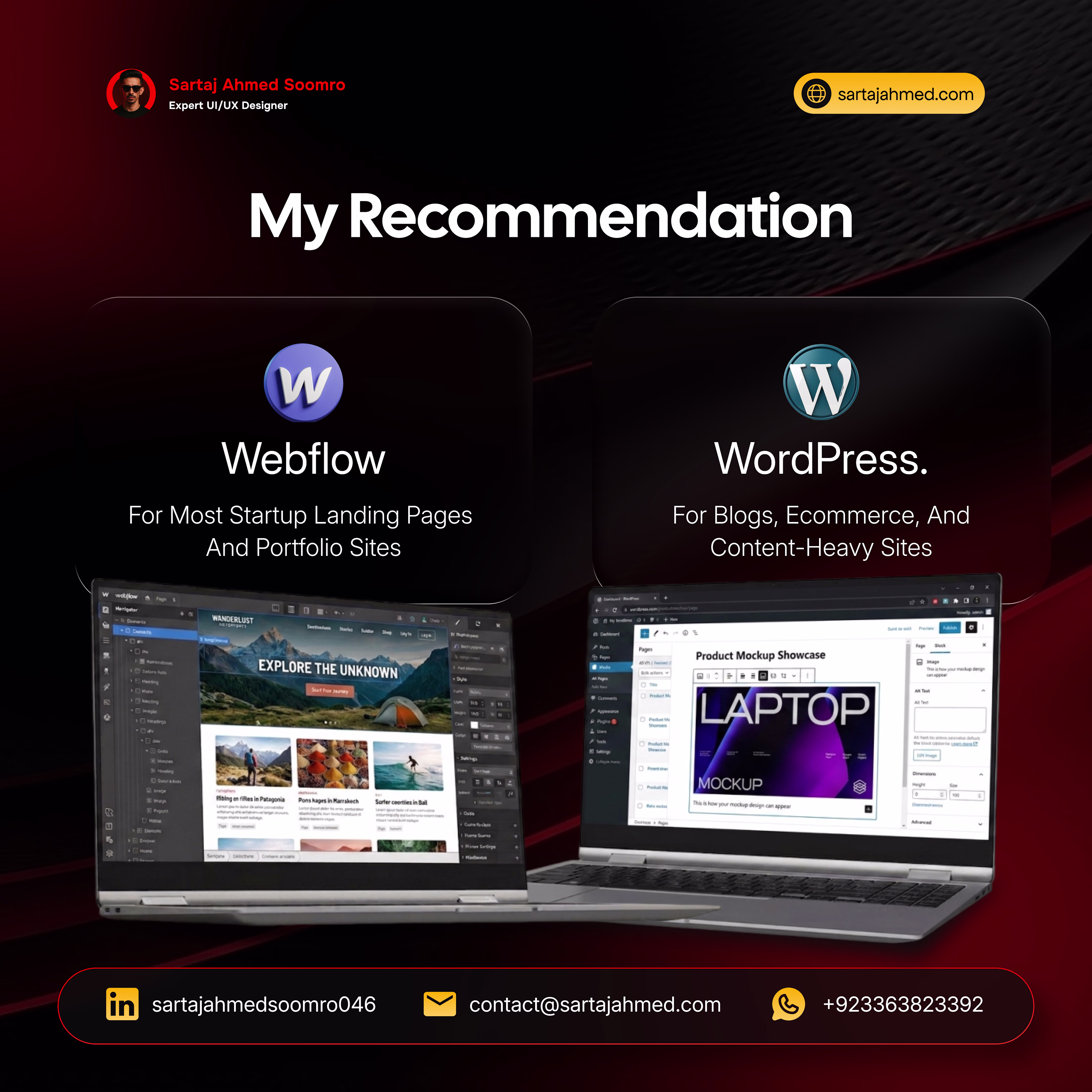
𝙈𝙮 𝙧𝙚𝙘𝙤𝙢𝙢𝙚𝙣𝙙𝙖𝙩𝙞𝙤𝙣 𝙞𝙨 𝙨𝙞𝙢𝙥𝙡𝙚.
Choose Webflow for most startup landing pages and portfolio sites. Choose WordPress for blogs, e-commerce, and content-heavy sites.
Not sure which one is right for your specific situation? Send me a direct message, and I will give you a straight answer based on your actual needs. 𝙑𝙞𝙨𝙞𝙩 https://sartajahmed.com/ 𝙩𝙤 𝙨𝙚𝙚 𝙢𝙮 𝙬𝙤𝙧𝙠 𝙤𝙣 𝙗𝙤𝙩𝙝 𝙥𝙡𝙖𝙩𝙛𝙤𝙧𝙢𝙨.
Good Insight
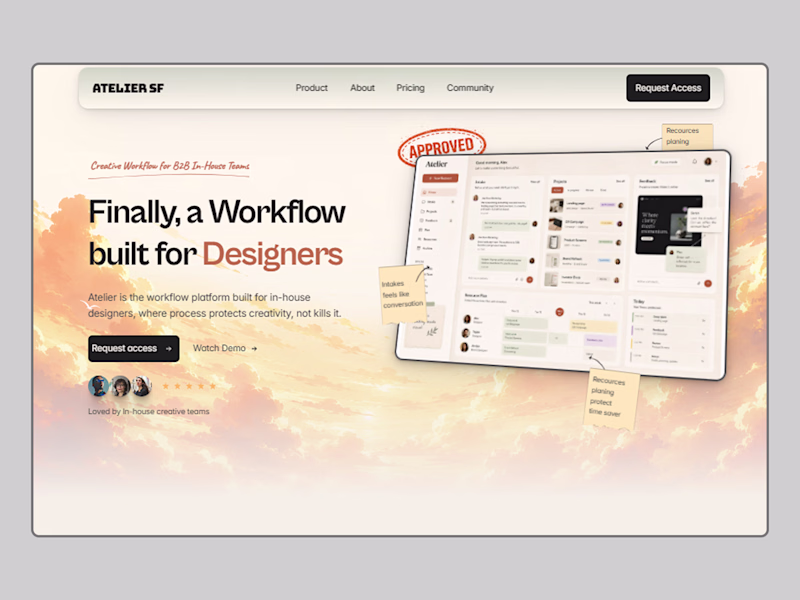
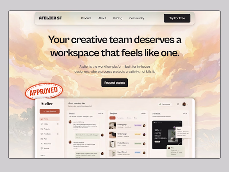
Designed a hero section for a landing page concept: Atelier SR DesignOps & Creative Workflow platform for B2B in-house teams.
The challenge: make operational software feel handcrafted and human. I built two directions around a "Paper & Pasteboard" design system, editorial typography, tactile textures, collage UI elements, and a dashboard that actually shows the product.
Which direction do you prefer? 👇
4 voted
67%
2 voted
33%
6 votes
Closed
Right now, the left design definitely feels like the cleaner. That said, the layout on the right has a ton of potential if you also correct the button padding and increase the top padding of the hero section so the content isn't hugging the header so tightly. What do you think?
Trending
Claude
Claude has entered the design space. How are you using Claude Design?
Contra University
Learn from expert creatives how to earn more using next-gen AI tools.
MagicPath
The canvas is infinite, and exploration is becoming the workflow. How are you using MagicPath?
creativeaiflow
Creative AI workflows are evolving. What tools do you use, and what are their strengths and weaknesses?
freelancerlife
Freelancer life is wins, pivots, and everything in between. What’s yours right now?