The network for creativity
Join 1.25M professional creatives like you
Connect with clients, get discovered, and run your business 100% commission-free
Creatives on Contra have earned over $150M and we are just getting started
Back to feedPost


The network for creativity
Join 1.25M professional creatives like you
Connect with clients, get discovered, and run your business 100% commission-free
Creatives on Contra have earned over $150M and we are just getting started
Challenges
View all


Related posts

A Rust and WebAssembly based PDF tools site





PrettyClever designed the Maximize website and hired me to build it 1:1 in Framer. Check it out below.


When to leave lo-fiWhen the structure is agreed and the remaining questions are visual, motion, or brand. That’s mid/high-fi:
type, color, components, real copy, device accurate spacing.Common failureSpending days making “pretty wireframes.”
If it looks finished, people review it like a finished UI.
Keep it ugly on purpose.If you want to go deeper, we can do: mobile app flows, design-system lo-fi kits, how to run a critique, or a worked example (e.g. a checkout or onboarding).
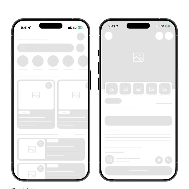
What are you designing?Low-fidelity design is the sketch stage: structure first, polish later. It’s wireframes, boxes, grayscale, dummy text, rough flows.
You’re answering what goes where and how someone moves through it, not how pretty it looks.
What it’s for Test layout and hierarchy before visual design locks you in
Align a team cheaply (“is this the right screen at all?”)
Find missing states: empty, error, loading, edge cases
Move fast when the problem is still fuzzy
What it usually looks likePaper, whiteboard, or simple digital frames
Rectangles for images, lines for text
No brand colors, no real photos, no custom components
Annotations: “tap → checkout,” “if error → this”
Why it works High fidelity makes people argue about button color. Low fidelity makes them argue about the product. Feedback stays on flow, content, and priority. Good rules One job per screen.
Show real content length, even if the words are fake “Lorem” that doesn’t wrap like the real copy will lie to you.
Design the unhappy path early (fail, empty, permission denied).
Keep fidelity consistent in a set. Mixing a polished hero with box-wireframes confuses reviewers.
Label interactions.
A static box isn’t a prototype unless you say what happens.