The network for creativity
Join 1.25M professional creatives like you
Connect with clients, get discovered, and run your business 100% commission-free
Creatives on Contra have earned over $150M and we are just getting started

The network for creativity
Join 1.25M professional creatives like you
Connect with clients, get discovered, and run your business 100% commission-free
Creatives on Contra have earned over $150M and we are just getting started







Related posts

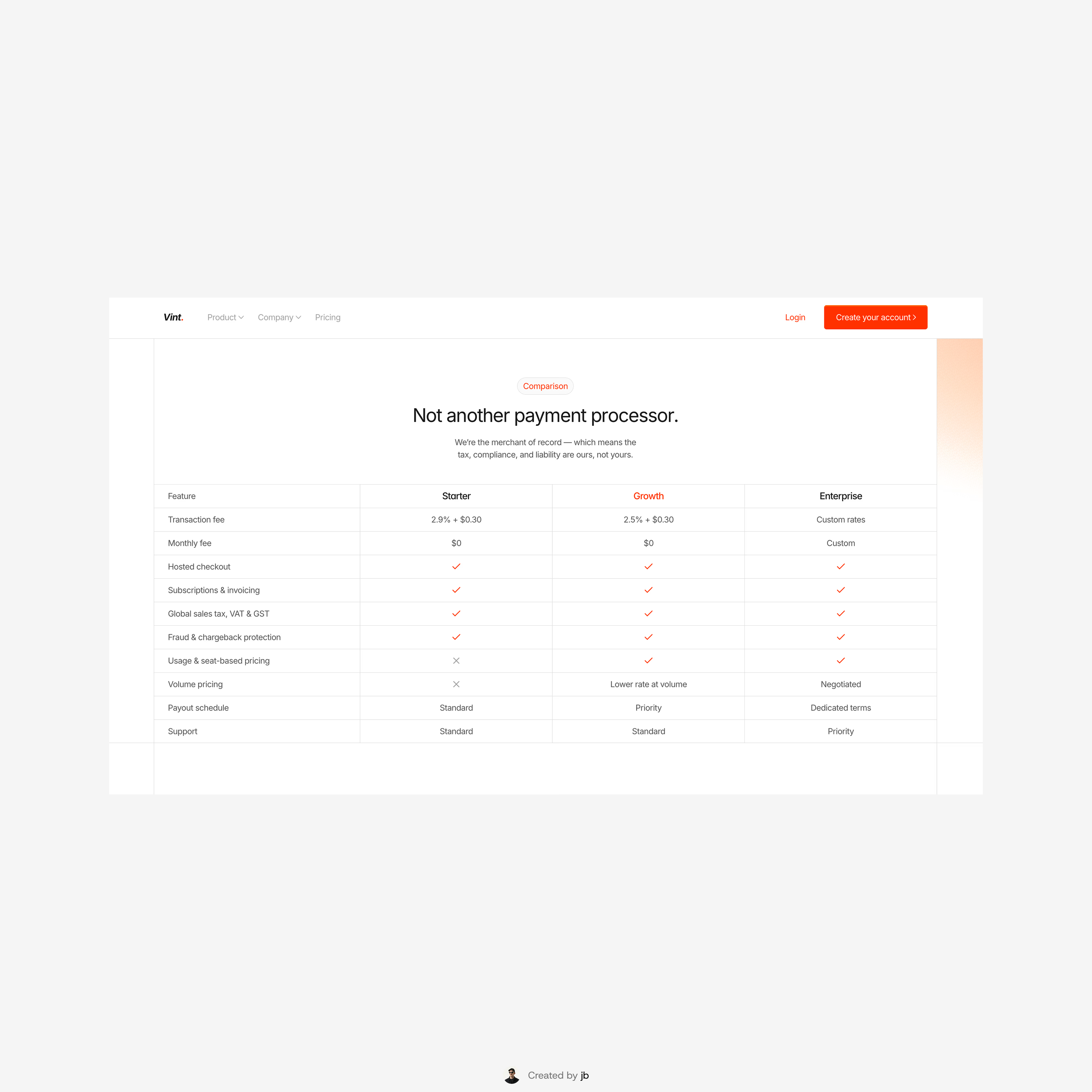
Features comparison section from Vint




PaperKit is an all-in-one, privacy-first PDF toolkit. Easily merge, compress, convert, edit, sign, and analyze PDFs—all in one simple browser-based platform.
