The network for creativity
Join 1.25M professional creatives like you
Connect with clients, get discovered, and run your business 100% commission-free
Creatives on Contra have earned over $150M and we are just getting started
Back to feedPost

Flow — Stablecoin Settlement App for Freelancers
End-to-end product design for Flow—a premium fintech mobile application that bridges Web3 liquidity and local daily spending for African freelancers via L2 stablecoins and physical Visa debit cards.
Full Project Description (Copy & Paste for Contra "Tell us a bit about your work")
Overview
African freelancers earn millions in USD-pegged stablecoins (USDC/USDT), but face immense friction off-ramping to local currency—enduring manual P2P trading risks, opaque exchange rates, and up to 5% slippage per transaction.
Flow solves this by acting as an "invisible Web3" settlement layer. It combines non-custodial Layer-2 wallets (Base, Polygon, Arbitrum) with a physical Visa debit card that auto-converts crypto to local Naira instantly at the point of sale (POS or ATM).
As the Senior Product Designer, I designed the end-to-end mobile experience from zero to high-fidelity prototype, prioritizing radical transparency, physical-digital card continuity, and trust-building UX patterns.
Key Design & Product Solutions
Payment Intentionality & FX Transparency
Designed a conversion storytelling model where every transaction visually breaks down the USD amount spent, live FX rates ($1 = ₦1587), network fees, and settled Naira.
Auto-Convert & Asset Priority Engine
Designed a drag-and-drop Spending Priority interface that allows freelancers to set custom asset deduction order (e.g., spend USDC balance first, fallback to USDT automatically).
Tactile Card Center & Precision Controls
Crafted a realistic matte-black card hero with live status toggles, freeze overlays, and dual slider + numeric keypad controls for setting precision spending and ATM limits.
Real-time Reassurance & Micro-interactions
Built instant post-swipe POS notification overlays featuring live balance countdown animations to provide immediate psychological closure after daily purchases.
Serious Financial Analytics
Created a non-crypto exchange-style analytics hub focusing purely on inflow/outflow balance tracking, weekly net changes, and filtered stablecoin transaction histories.


The network for creativity
Join 1.25M professional creatives like you
Connect with clients, get discovered, and run your business 100% commission-free
Creatives on Contra have earned over $150M and we are just getting started



Related posts

Dark Mode 🖤 or Light Mode 🤍?
Which one matches your vibe? 👀
15 voted
54%
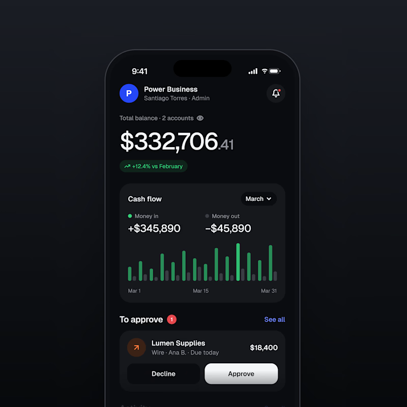
13 voted
46%
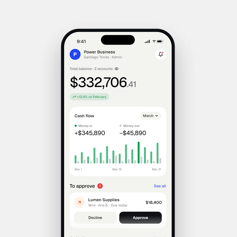
28 votes
Closed

Both are nice clean designs...for me,Dark mode!


Which brand showreel preview design would you choose - Silver & Ropes or Purple Stones? ⚡
Lynksen is cooking something fire...
and we need your expert eyes on this one 🔥😎
Vote and tell why! 👇


12 voted
24%
37 voted
76%
49 votes
Closed

Going with Purple Stones. It feels more distinctive and memorable for a showreel, Silver & Ropes is clean but a bit safer.

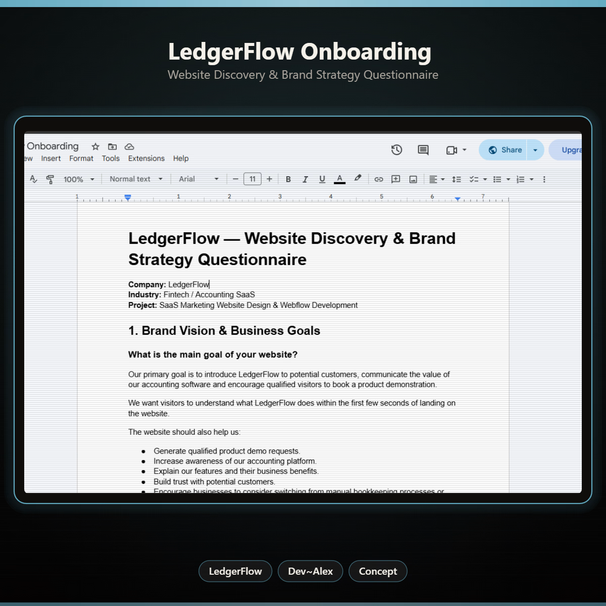
The first thing I created for LedgerFlow wasn't a screen.
It was a set of questions.
I'm kicking off a new concept project: **LedgerFlow, an accounting and financial management SaaS platform for small businesses, freelancers and independent business owners.
The goal is to design a website that helps visitors understand what the product does, how it helps their business, and why they should book a demo.
But before opening Figma, I needed to understand the business.
So I created a website discovery and brand strategy questionnaire.
It covers:
→ Brand vision and business goals.
→ Target audience.
→ Website goals and user experience.
→ Branding and visual direction.
→ Services and offers.
→ Project direction and logistics.
I want to understand things like:
Who exactly are we designing for?
What problem does the product solve?
What makes it different from traditional accounting software?
What should visitors understand within the first few seconds?
And what would make them confident enough to book a demo?
Because the answers will influence the website's messaging, content, visual hierarchy and calls to action.
You can't design a clear experience when you don't understand what the business needs to communicate.
LedgerFlow is a concept project, but I'm treating the process like a real client engagement.
I'll be sharing the journey from discovery to website structure, UI design and Webflow development.
And if you're building a SaaS product or need a website that communicates your business value clearly, I'm open to website design and Webflow projects.
Let's talk about what you're building. 🤝

Starting with a discovery questionnaire instead of a screen is how good briefs begin, and "explain what LedgerFlow does in the first seconds" is the right goal to design around. Will the answers become a one page brief?