The network for creativity
Join 1.25M professional creatives like you
Connect with clients, get discovered, and run your business 100% commission-free
Creatives on Contra have earned over $150M and we are just getting started
Back to feedPost

A dashboard needs a “last updated” label more than it needs another chart.
I’ve seen reports where every number looked right and every formula was correct, but nobody could tell whether the data was from this morning or from three weeks ago. So people stopped trusting it, or worse, made decisions off stale figures without knowing.
A few small additions fix most of this. Show the date of the last refresh somewhere visible. Note the source next to any number that comes from outside the main table. Flag partial periods, like a month that isn’t over yet, so a dip doesn’t get read as a trend. And add one check cell that compares a total against a known figure, so a broken refresh shows up right away.
None of it makes the dashboard look more impressive. It makes it something people can rely on without asking you whether the numbers are current.
A report that says how fresh it is gets used. One that doesn’t gets double-checked, or ignored.
When someone opens your report, can they tell how old the data is?
The network for creativity
Join 1.25M professional creatives like you
Connect with clients, get discovered, and run your business 100% commission-free
Creatives on Contra have earned over $150M and we are just getting started





Related posts

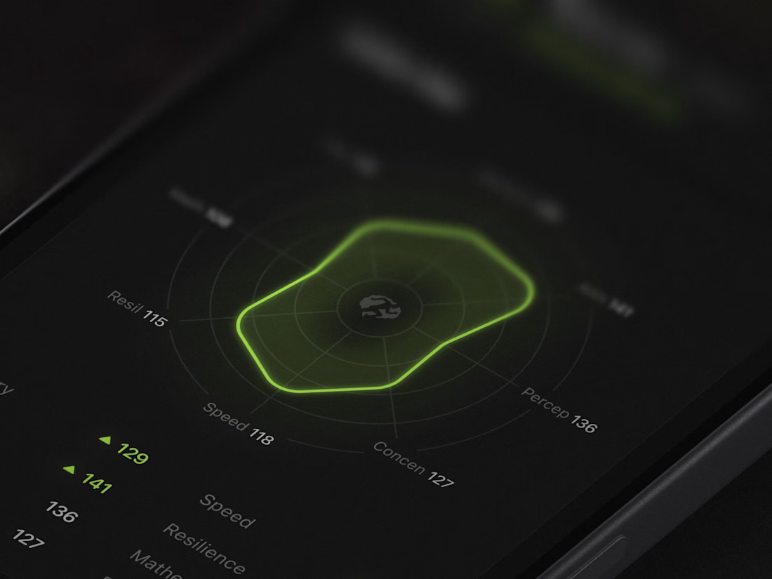
Designed the analytics dashboard screen that users get after finishing a brain training session 🔥


What if your admin dashboard told you what matters before you had to look for it?
ATLAS, a travel ops concept: the next 14 days of departures at a glance.


The next 14 days of departures is a strong default for a travel-ops dashboard—it puts upcoming decisions ahead of a wall of metrics. The React/Tailwind concept sounds clean and practical.

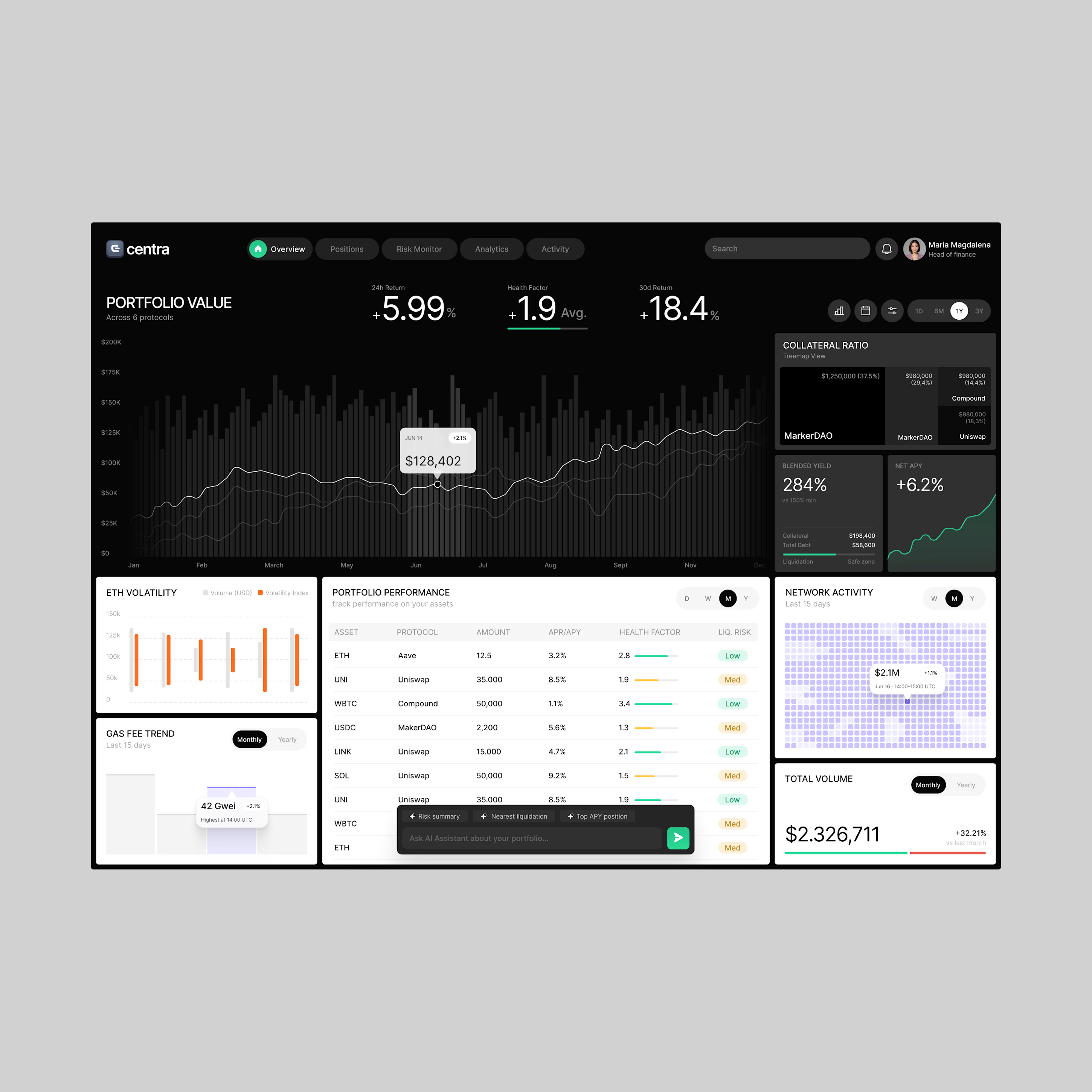
Making complex DeFi data easier to manage. Centra brings portfolio insights and risk analytics into one clean dashboard.
Want to create something like this?
Let's Talk!