The network for creativity
Join 1.25M professional creatives like you
Connect with clients, get discovered, and run your business 100% commission-free
Creatives on Contra have earned over $150M and we are just getting started
Back to feedPost
My entry for the Contra × Squarespace challenge.
This was my first time building a website with Squarespace, and I honestly loved the experience. It was surprisingly easy to create something that feels premium without writing any code.
For this project, I explored the new Finish Layer features, including Block Animations and Block Transforms, to make the website feel more dynamic and polished.
Sharing both the final website and a behind-the-scenes video of the process.
Check it out: https://pigeon-carillon-nw53.squarespace.com/


Love the Renaissance style. Good luck!

Thank you!


This looks clean and well thought out. How long did it take you to bring everything together?
Thank you. It took me around 4 days to put everything together from the moodboard, design concept, preparing the assets, learning how to use Squarespace, and finally build it.
Great work!

Using Renaissance paintings to sell a second brain app is such an unexpected pairing, and it works because the whole point of those hands reaching toward each other is about weight and effort, which ties right back into your invisible weight line.
Thank you. You're spot on because that's the concept I finally decide to go to. Really appreciate it.
The network for creativity
Join 1.25M professional creatives like you
Connect with clients, get discovered, and run your business 100% commission-free
Creatives on Contra have earned over $150M and we are just getting started



Related posts

Great web design goes beyond visual appeal. It's about delivering the purpose it was built to serve.
I'm excited to share my work and connect with the creative community here on Contra.
As a web designer specializing in Framer, my focus is on creating modern, responsive websites that bring together thoughtful UI/UX, seamless interactions, and distinctive visual identities.
I believe an effective website should not only reflect a brand's identity but also fulfill its intended purpose—whether that's building trust, communicating value, generating leads, or turning visitors into customers.
Looking forward to connecting with fellow creatives, collaborating on meaningful projects, and helping businesses strengthen their digital presence.

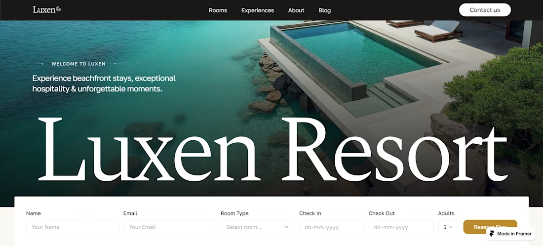

The big serif Luxen Resort over the pool photo with the booking bar built into the hero shows you designed for the purpose you describe. One challenge on that same test: the bar asks for Name and Email before Check In and Check Out. A first-time visitor wants to know if their...

Don't just make Ecommerce 2d boring site. Make something that your users remembers😎
built by nextJS, Framer Motion, Lenis, Gsap, TailwimdCSS
Framer Website DesignwebdesignsaaswebsiteNext.jsInteractive DesignWeb DesignFramerVisual Studio Code


100+ ad creatives in 2 hours. 🤯 Mental right?:
That’s a normal day now with Claude, Figma and MCP, working for a paid ads brand. Every concept comes in multiple ratios (4:5, 9:16 and more), so each platform gets exactly what it needs. I finished early, and the quality held up.
Every frame is an editable Figma layer, not a flat export.
AI can be a threat if you don’t know how to use it. Learn it, and it’s a treat. ✨
How would you spend the time you got back?
Want this speed and quality on your ads? I’m open to work. Message me here on Contra and let’s talk. 📩


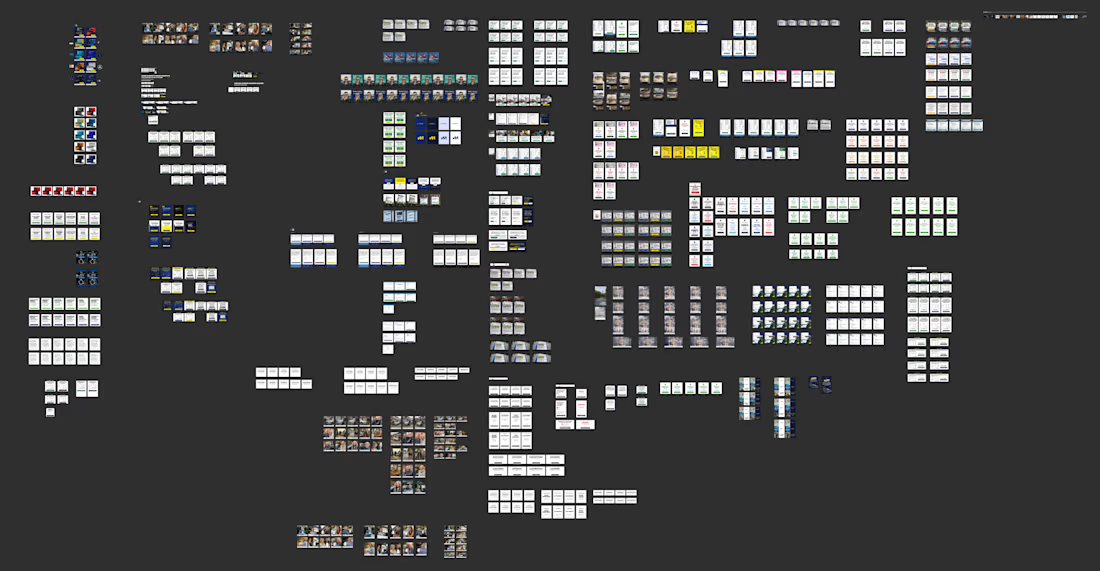

Editable Figma layers instead of flat exports is what makes 100+ variants usable. I'd spend the saved time on a clean test plan, so the ad data actually tells you which concept won.