The network for creativity
Join 1.25M professional creatives like you
Connect with clients, get discovered, and run your business 100% commission-free
Creatives on Contra have earned over $150M and we are just getting started
Back to feedPost

UI/UX Concept for Prize & Competition Site
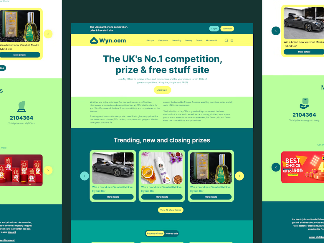
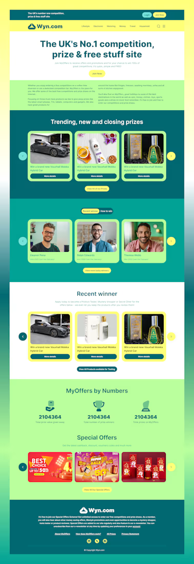
Here is a concept exploration for Wyn.com, the UK's premier destination for competitions and free product testing.
The Challenge: To move away from the "spammy" aesthetic often associated with sweepstakes sites and create a look that feels legitimate, modern, and exciting.
The Solution:
Color Blocking: We utilized a Deep Teal and Lemon Yellow palette to balance professional trust with the excitement of winning.
Clear Hierarchy: Large typography and distinct sections help users differentiate between entering competitions, viewing past winners, and signing up for product testing.
Card Architecture: A unified card system displays trending prizes and winners cleanly across different background environments.
Let me know what you think of the color contrast!

The network for creativity
Join 1.25M professional creatives like you
Connect with clients, get discovered, and run your business 100% commission-free
Creatives on Contra have earned over $150M and we are just getting started




Related posts


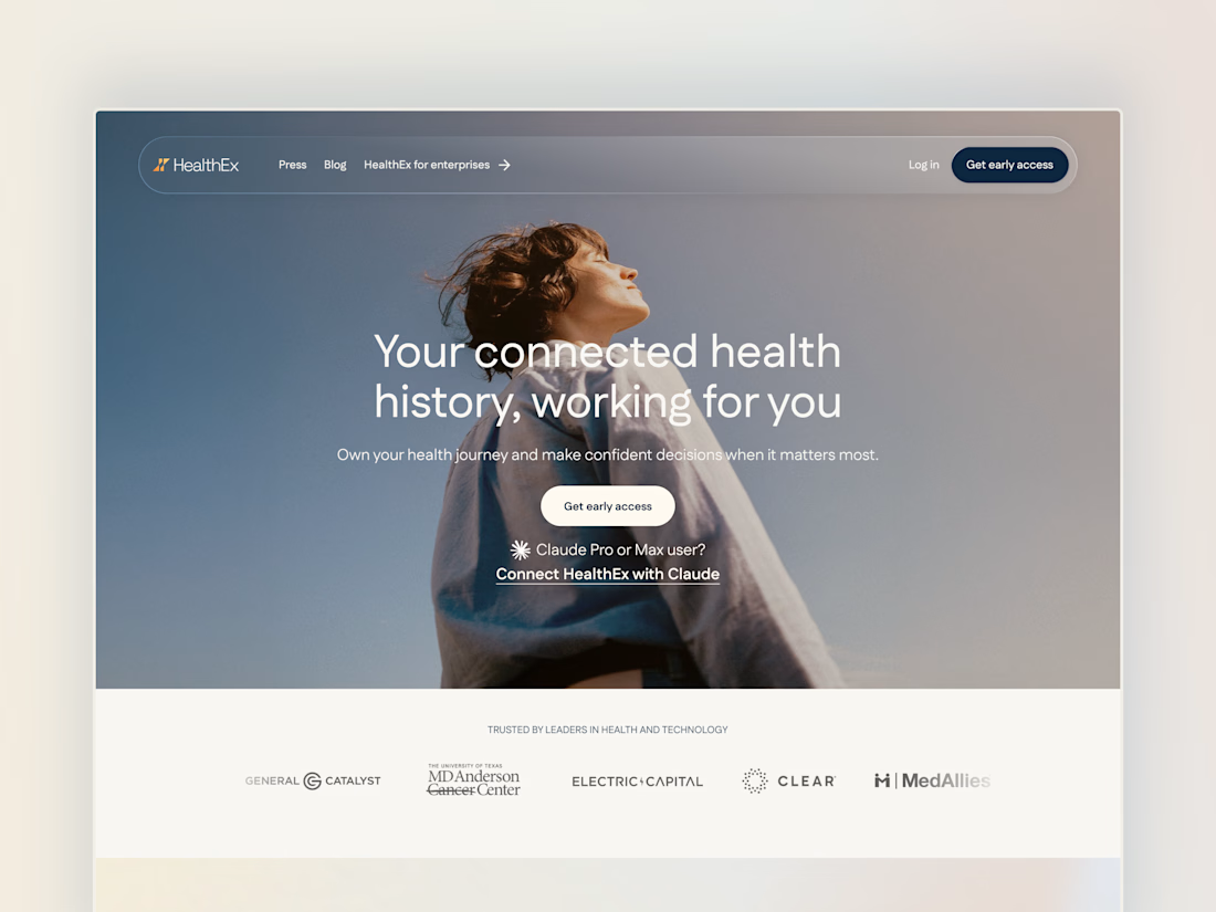
Project back from December 2025: Secret City designed the HealthEx website and hired me to build it in Framer.
P.S. they've gone through several site restructures since then (so it looks different from my snapshots), but it goes to show how easy Framer makes it for clients to manage and update their site independently.


Awesome😍

Meriot Netherlands-based product designer portfolio
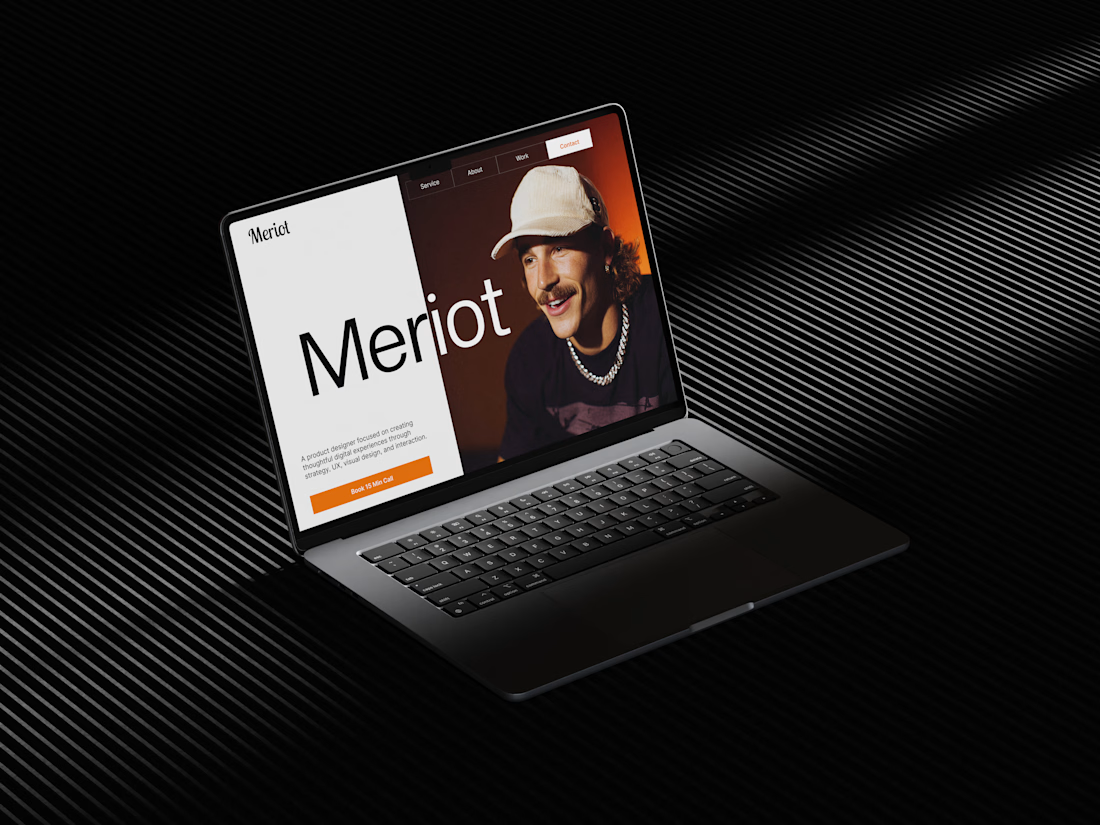
I explored a portfolio website for Meriot, a product designer based in the Netherlands who wanted a digital presence that felt more personal, editorial, and design-focused.
The challenge was to avoid the typical portfolio formula and create something that communicates personality within the first few seconds.
The direction
→ Bold editorial typography
→ Strong personal photography
→ Minimal black-and-white foundation
→ Warm orange accent for CTAs
→ Simple, structured navigation
→ Clear positioning as a product designer
→ A portfolio experience that feels like a personal brand
The idea was to make the website feel confident without being complicated.
Rather than leading with a long introduction, the hero immediately communicates who Meriot is, what he does, and where the visitor should go next.

Nice design broooo

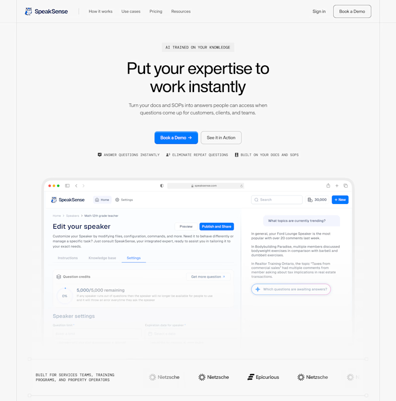
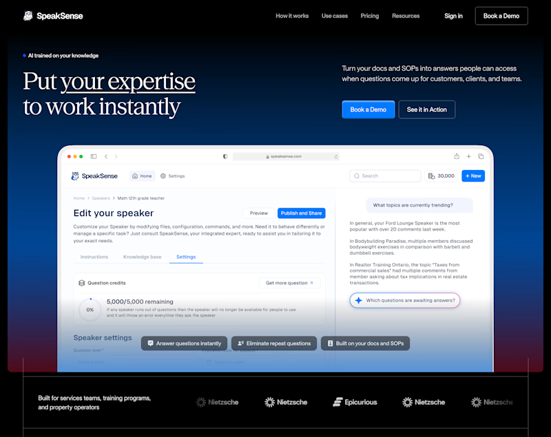
Swiss-clean or midnight-premium? Same content, different vibe. Which one looks better? 🤔
9 voted
33%
18 voted
67%
27 votes
Closed