The network for creativity
Join 1.25M professional creatives like you
Connect with clients, get discovered, and run your business 100% commission-free
Creatives on Contra have earned over $150M and we are just getting started
Back to feedPost

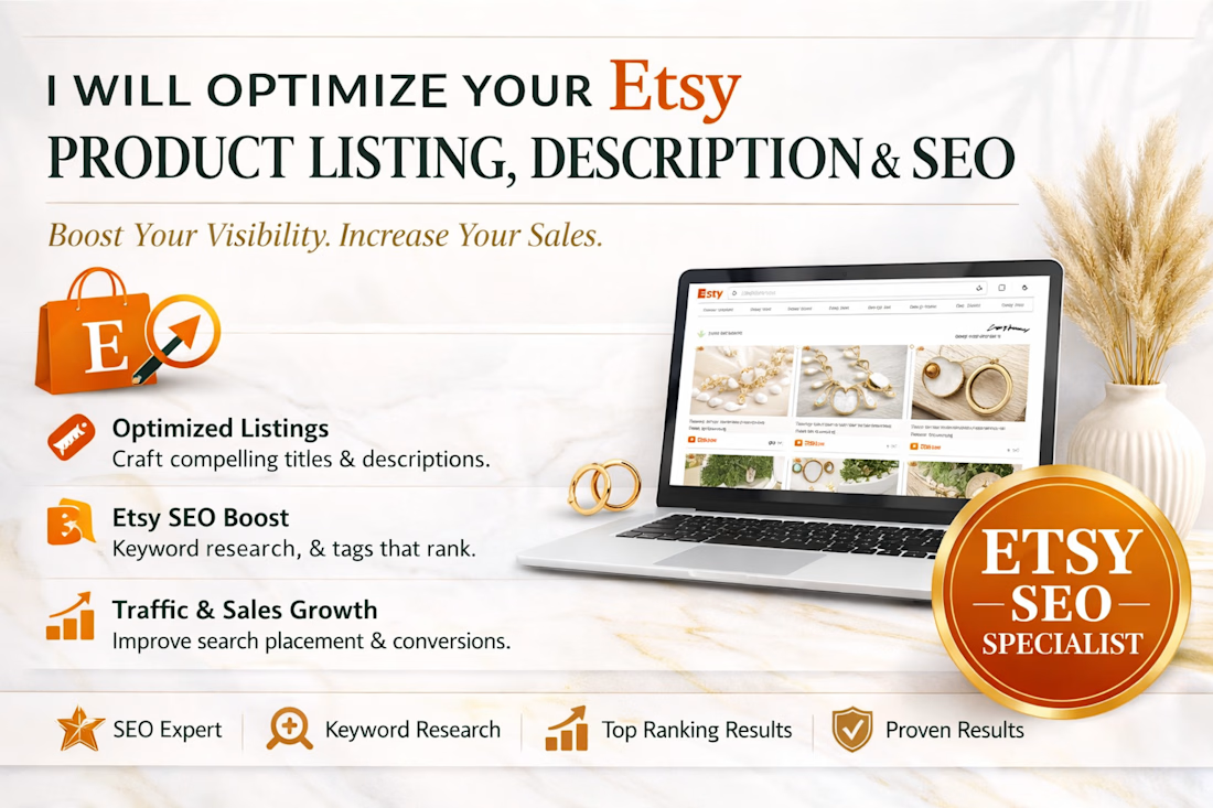
I will optimize your Etsy product listing and Shopify description & seo


The network for creativity
Join 1.25M professional creatives like you
Connect with clients, get discovered, and run your business 100% commission-free
Creatives on Contra have earned over $150M and we are just getting started
Challenges
View all


Related posts

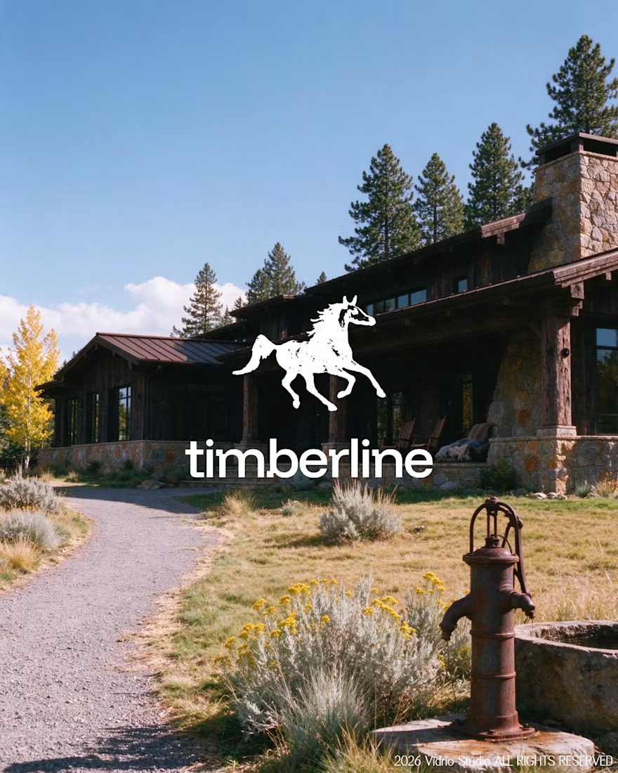
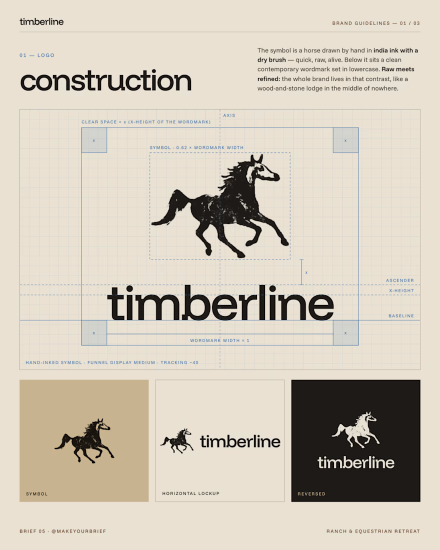
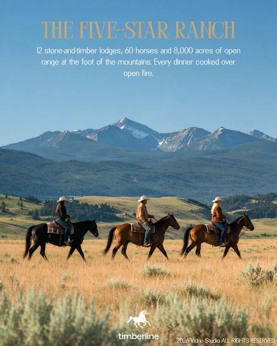
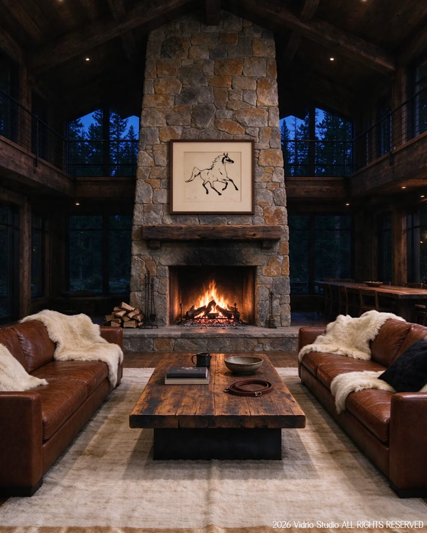
I worked on Brief 05 of the @makeyourbrief challenge: a brand identity for Timberline, a luxury ranch and equestrian retreat. I hand-drew the horse symbol with a marker, paired it with a clean modern wordmark and an earthy palette, and extended it into merch and lodge photography using AI under my own art direction, with retouching by hand.
Would you stay here? Tell me which image sold you.



That's really incredible great job Andreu❤️❤️


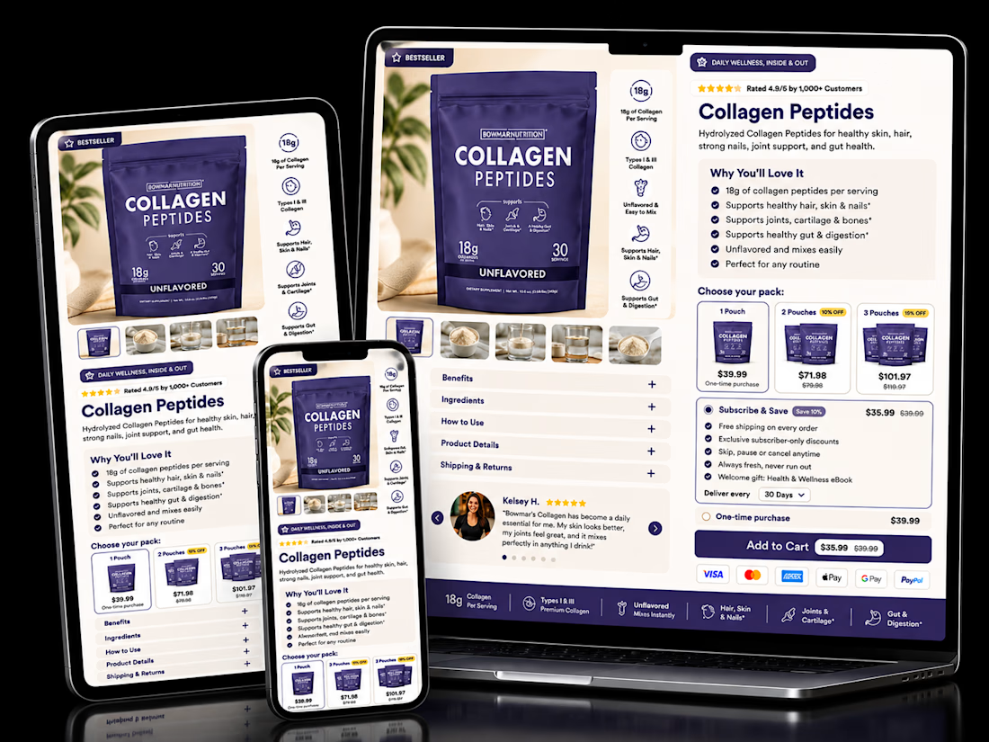
A good product page doesn’t just show the product — it makes the buying decision easier.
I recently worked on this Collagen Peptides eCommerce PDP concept, focusing on the areas that can directly influence conversion:
→ Clear product benefits above the fold
→ 1, 2 & 3-pack options to support higher AOV
→ Subscribe & Save for retention
→ Strong social proof
→ Easy-to-scan product information
→ Shipping, guarantee & secure checkout signals
→ Clear Add to Cart experience
→ Responsive UX across desktop, tablet & mobile
Every section has a job: reduce friction, answer objections, build trust, and move the customer closer to purchase.
This is the kind of thinking I bring to every eCommerce product page I design.
UI/UX + CRO + eCommerce Strategy. 🚀
#eCommerce #CRO #Shopify #ProductPage #UIUX #WebDesign


The pack-size tiers sitting right next to Subscribe & Save is the right order. Anyone already comparing 1, 2 or 3-pack is primed to pick a cadence too, so showing both choices together nudges toward the higher-LTV option without it feeling like an upsell.


One of the final things I worked on in my last company.
Amazing how much you can do with Sonnet 5.5, with enough steering and direction.
Anyone want a short tutorial on tools & workflow? 🤔


Looks amazing! 🚀🚀