The network for creativity
Join 1.25M professional creatives like you
Connect with clients, get discovered, and run your business 100% commission-free
Creatives on Contra have earned over $150M and we are just getting started
Back to feedPost

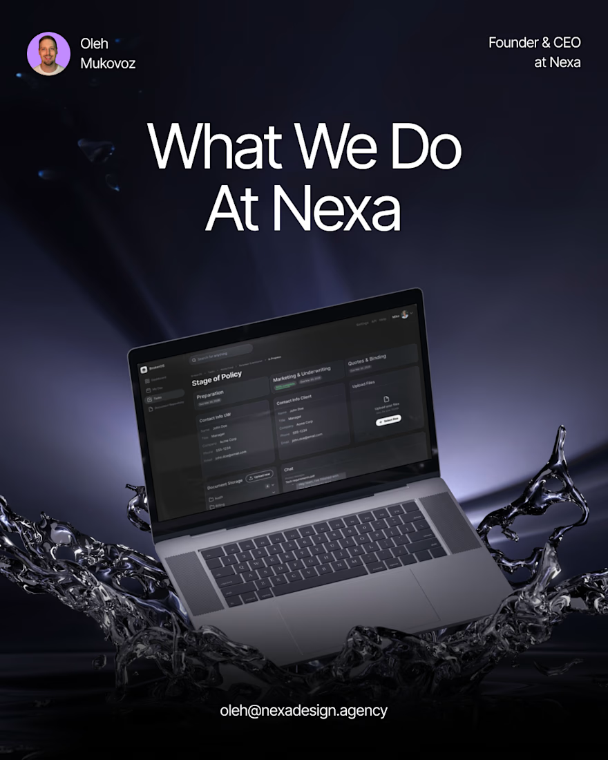
What we do at Nexa, in plain terms.
We’re a UX/UI design studio. 14 people — designers, PMs, a BA, a team lead. We design web and mobile apps for SaaS and B2B companies.
In the last few months we’ve shipped: a dual-portal system for a security company, a 15-module GRC platform redesign with a full design system, a fintech checkout with Paysafe and KYC flows, an interactive investor prototype for an insurance startup, and a multi-sided influencer marketing platform.
We handle the full design scope — research, requirements, wireframes, high-fidelity UI, prototypes, design systems, and developer handoff. We don’t do development.
🤝 If you’re a founder or CTO building a SaaS product and you need a design team that runs like a studio, not a freelancer — check out our work at nexadesign.agency or send me a message.
The network for creativity
Join 1.25M professional creatives like you
Connect with clients, get discovered, and run your business 100% commission-free
Creatives on Contra have earned over $150M and we are just getting started






Related posts



Super clean work!

Interactive AI Analytics Dashboard | SaaS Product Design
A modern, animated AI-powered eCommerce analytics dashboard designed to help businesses track sales performance, monitor revenue, understand customer behavior, and make data-driven decisions.
The design combines a clean SaaS interface, intuitive data visualization, interactive dashboard elements, and smooth animations to create a more engaging user experience. Every section is designed to make complex analytics easier to understand while maintaining a professional, scalable, and user-friendly layout.

Super clean work!

Ask a coding agent to "make the UI look premium", and you get whatever it felt like building that day.
I give mine constraints instead.
I keep a list of sites that generate design markdown files for AI builds. Typography, colours, spacing, radius, shadows, components, states, responsive behaviour. A full design system in a single file.
The workflow, before any screen gets built:
Pick a visual direction. Generate the .md against what the product actually does and the outcome it needs to hit. Drop it into Claude Code or Codex or Kimi or Cursor. Use /design to fix what stays consistent across every screen.
Now the agent follows a spec, not a mood.
That file, plus a folder of five or six visual references, is the first thing I prepare before a client build.
The sites:
https://www.typeui.sh/
https://design-md.hyperbrowser.ai/
https://neuform.ai/
https://www.aura.build/
https://www.designmd.supply/
https://open-design.ai/
https://designmd.me/
Enjoy. Build. Ship.
Cheers.

This is so true! 🔥 "Make it premium" is the most subjective prompt ever - every agent has its own version of premium haha! Giving constraints like typography, colors, spacing, radius, shadows, components, states is the real pro move. That's how you get consistent design...