The network for creativity
Join 1.25M professional creatives like you
Connect with clients, get discovered, and run your business 100% commission-free
Creatives on Contra have earned over $150M and we are just getting started
Back to feedPost
Taste Test

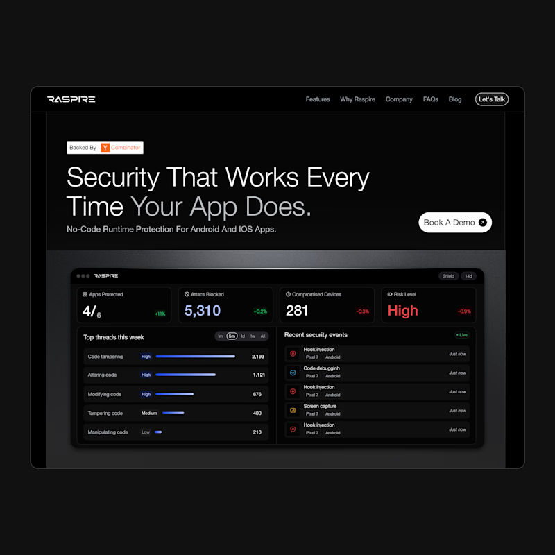
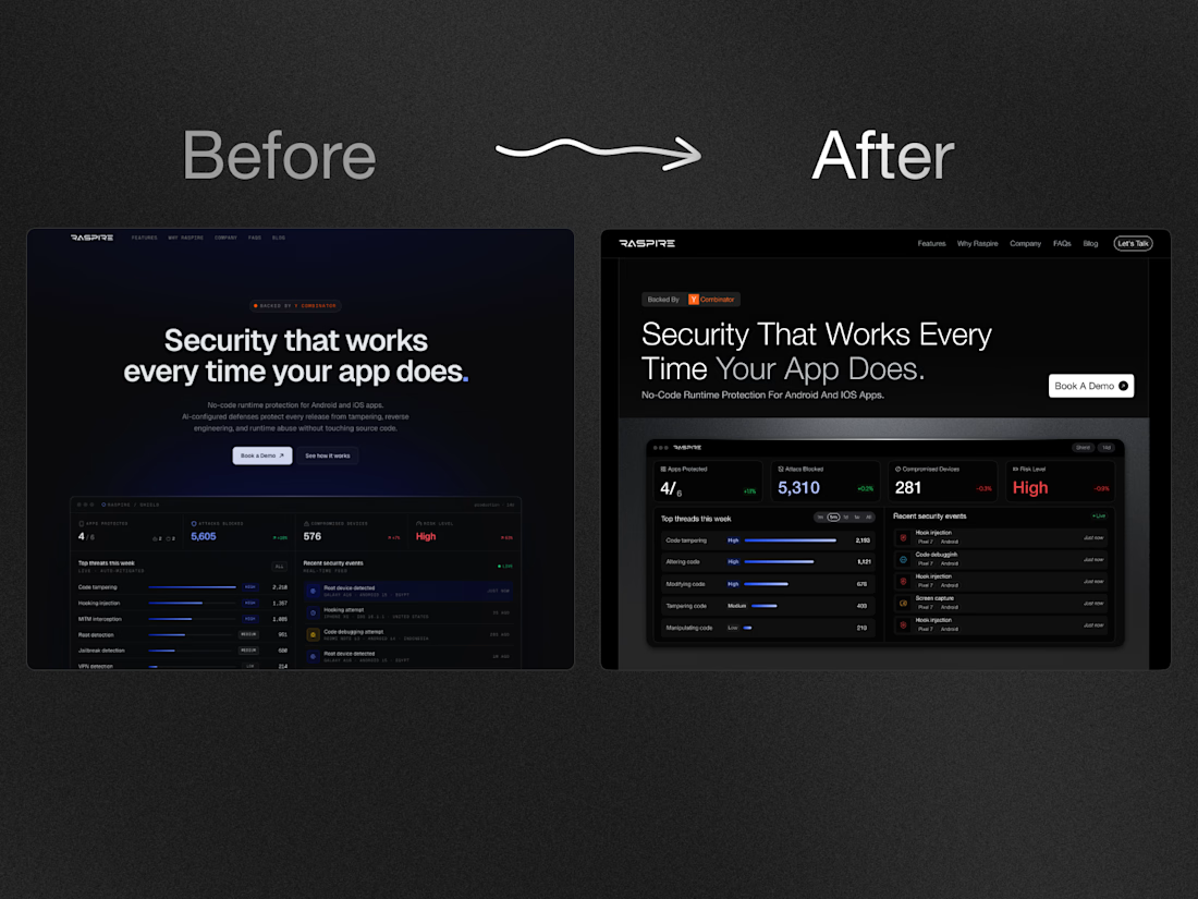
Designed this clean hero section
Which looks better A or B?



1 vote
Ends in 1d

B — the brighter sky gives the headline real contrast and lets the black CTA pop, so the eyebrow → headline → subtext → button hierarchy actually reads. A mutes the whole background and the white copy starts fighting the sky, which flattens the hierarchy; if you want that darker...
The network for creativity
Join 1.25M professional creatives like you
Connect with clients, get discovered, and run your business 100% commission-free
Creatives on Contra have earned over $150M and we are just getting started

Challenges
View all


Related posts





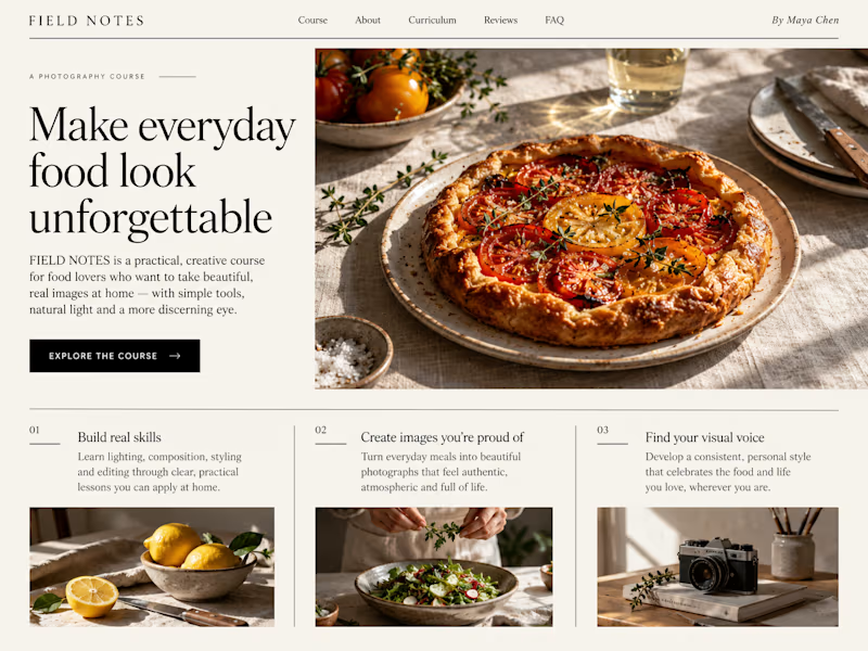
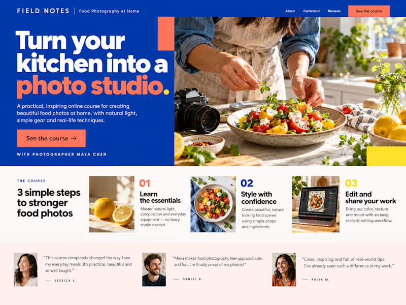
Which Kajabi sales page design would you choose for this course? Vote for A or B and tell me what made the difference.

23 voted
50%
23 voted
50%
46 votes
Closed

B still could be polished though...maybe try giving the text section little bit more real estate..I don't know

Which brand style fits Yicora?
I'm crafting a brand book for an AI platform targeting for creators.
16 voted
53%
14 voted
47%
30 votes
Closed

A feels more professional great job 🎉🎉