The network for creativity
Join 1.25M professional creatives like you
Connect with clients, get discovered, and run your business 100% commission-free
Creatives on Contra have earned over $150M and we are just getting started
Back to feedPost


Hey friends, we recently finished Arch Studio, a super clean Framer template for architects and designers to show off their work like a quiet digital gallery.
We work in the architecture niche and see how studios are stepping up to really stand out online, so the timing couldn’t be better.
Lots of white space, smooth motion, and everything designed to make projects pop. Honestly, with how fast Framer is growing, this could be a solid revenue opportunity.
The network for creativity
Join 1.25M professional creatives like you
Connect with clients, get discovered, and run your business 100% commission-free
Creatives on Contra have earned over $150M and we are just getting started

Challenges
View all


Related posts

I just put my first two Framer templates out into the world 🙌
Alder21 is a free landing page for real estate launches. Floor plans for every unit type, a payment-plan calculator you can actually play with, and a form to book visits.
Selects is a portfolio for photographers, built like a 35mm contact sheet. The film strips move on their own, and when you hover a project a red grease-pencil circle draws itself around it.
Both are up on Contra and the Framer Marketplace. Templates are new territory for me, so I'd really like honest feedback. What would you change first?


the payment plan calculator is the standout, id make it visible before the unit details


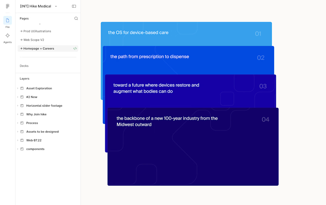
This card stack transition combining the SVG of each card to the sticky position is giving my brain really satisfying scratches 😘👌
--
I've been doing a lot more Framer developments lately where I don't do the design, I think one of the big advantages of having a strong background in design is that I can see the designers vision to translate it into the web obsessing over the details.
I.e. see Figma design screenshot in the comments how each card had the same SVG but in irregular placements, I saw it as an opportunity to perfectly align them on scroll and add a bit of a transparency reveal at the end. It feels way more intentional and ties everything together.
Design by @Iverson developed by me
Figma design handoff

Building a multi-page website in Framer?
Use Templates for elements you need on multiple pages, like your navbar, footer or FAQ section.
Instead of updating each page separately, you can edit the Template once, and the changes will apply everywhere it’s used.
This saves time and makes it easier to keep everything consistent across your website.

Do you let clients edit the shared Templates after handoff?