The network for creativity
Join 1.25M professional creatives like you
Connect with clients, get discovered, and run your business 100% commission-free
Creatives on Contra have earned over $150M and we are just getting started
Back to feedPost
Acme, Visual Identity for an AI Infrastructure Brand!
For Acme, I built the mark around a triangular growth form — three overlapping peaks that read as both an "A" and an ascending signal, a quiet metaphor for infrastructure scaling upward.
I developed the full system from there: wordmark, icon mark, a deep teal-and-acid-yellow palette, and mockups across pitch decks, brand patterns, app icons, and campaign photography — showing the brand holding its identity across every touchpoint, from boardroom to home screen.
Powering the Next Generation of AI, One Deliberate Detail at a Time.
Web Banner DesignsaaslogoBrand DesignVisual DesignAdobe Creative SuiteAdobe IllustratorAdobe Photoshop


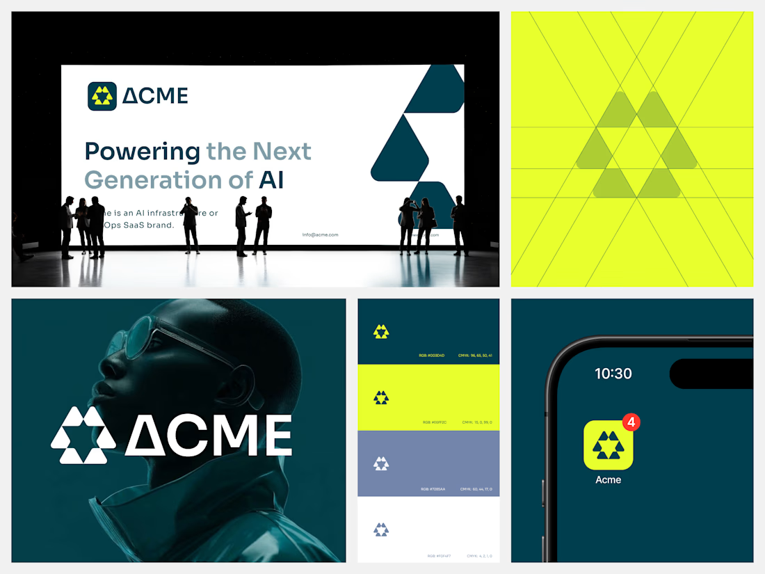

Dual-reading marks tend to cost you something at one end of the scale — the "A" usually wins big, the ascending signal wins small, and one of them quietly stops working. Which reading did you protect when it got down to the app icon?

Good catch! at icon size I let the "A" lead since it needs to read instantly at 40px. The ascending/signal idea shows up more at larger sizes, like the pattern work and decks, where there's room to notice the overlapping peaks.
The network for creativity
Join 1.25M professional creatives like you
Connect with clients, get discovered, and run your business 100% commission-free
Creatives on Contra have earned over $150M and we are just getting started
Trending
retrofuturism
Share your favorite designs from the past exploring the distant future. Or your own take on the aesthetic 🚀
halftone
Dots. Texture. Grain. Let's see your designs using the halftone technique.

Midjourney
Creatives are showing off what they're making with Midjourney.
colorgrade
Video editors sound off: How do you enhance the mood of your video in color grading?
Challenges
View all


Related posts



Took up this project a few weeks ago. The brief was simple, design an identity that doesn't need to scream luxury, but speaks for itself. A private collection of 17 residences.
The logomark draws inspiration from Spanish architectural heritage, specifically the Draped Arch, one of the most distinct and revered forms in Spanish design. Chosen not only for its visual elegance, but for what it symbolises: a sacred threshold. A portal marking the transition into something new. The creation of a home. A new standard of living.
The arch was then studied alongside the architecture of the residence itself, drawing from shared elements of form and proportion. Spanish architectural language meeting the building's own design, producing a mark that feels both rooted and original.
The result is an icon that does not need to announce itself. It simply speaks, quietly, confidently, and with purpose.
The full identity reveal is coming soon.


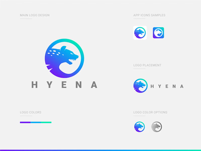
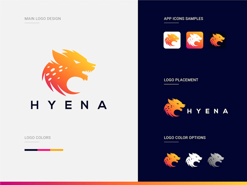
Which Hyena Vector Logo You Guys Like Most?
These 100% Handmade Vector Logos Are Also Available For Purchase With Exclusive Copyrights Transfer Ownership, Feel Free To Contact Us.
6 voted
46%
7 voted
54%
13 votes
Closed


gotta be A