The network for creativity
Join 1.25M professional creatives like you
Connect with clients, get discovered, and run your business 100% commission-free
Creatives on Contra have earned over $150M and we are just getting started
Back to feedPost
Overview
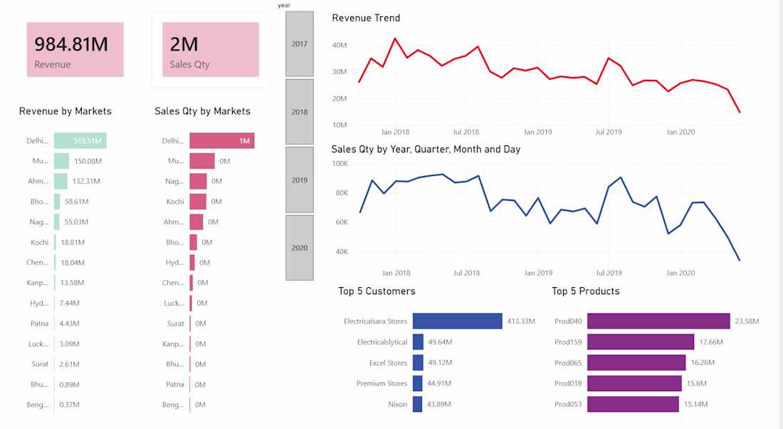
For this project, I transformed raw, fragmented sales data, from a dataset from Github, into a high-impact interactive dashboard. This wasn't just about visualization; it was about building a reliable data journey. I handled the entire process from querying the raw database to cleaning the records and finally designing a user-centric interface that identifies market leaders and revenue trends.
The Tech Stack & Workflow
• Data Extraction & Initial Cleaning (MySQL): I used SQL to extract the relevant datasets and perform the initial "heavy lifting." This involved filtering out noise and identifying structural errors within the database.
• Quality Assurance (Excel): I utilized Excel for rapid error-checking and data validation, ensuring that the numbers were accurate before moving into the visualization phase.
• Transformation & ETL (Power Query): Using Power Query within Power BI, I performed data modeling and transformation to ensure the relationship between "Revenue" and "Sales Quantity" was seamless across different timeframes.
• Visualization (Power BI): Developed an interactive UI that tracks KPIs such as Revenue Trends, Top 5 Products, and Market-specific performance.
Key Features:
• Drill-Down Capabilities: Users can filter by year (2017–2020) to see how market dynamics shifted over time.
• Market Analysis: Instant visibility into top-performing regions like Delhi and Mumbai.
• Product & Customer Insights: Side-by-side comparisons of the top 5 revenue-generating products and customers.
Strategic Improvements:
While the dashboard provides a clear historical view, I have identified the following areas for future optimization to provide even deeper business value:
Profit Margin Analysis: Integrating "Cost of Goods Sold" (COGS) to move from tracking Revenue to tracking actual Profitability.
Predictive Forecasting: Implementing DAX-based forecasting to predict future sales trends based on the 2017-2020 historical data.
Data Label Optimization: Refining display units for smaller markets to ensure granular visibility across all regions.
The network for creativity
Join 1.25M professional creatives like you
Connect with clients, get discovered, and run your business 100% commission-free
Creatives on Contra have earned over $150M and we are just getting started
Related posts
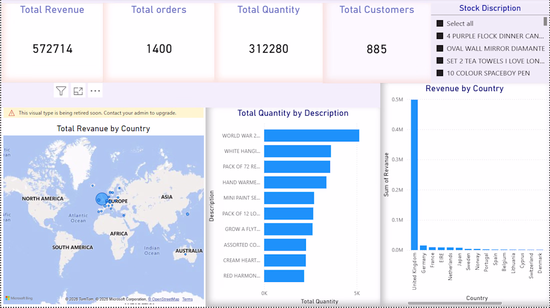
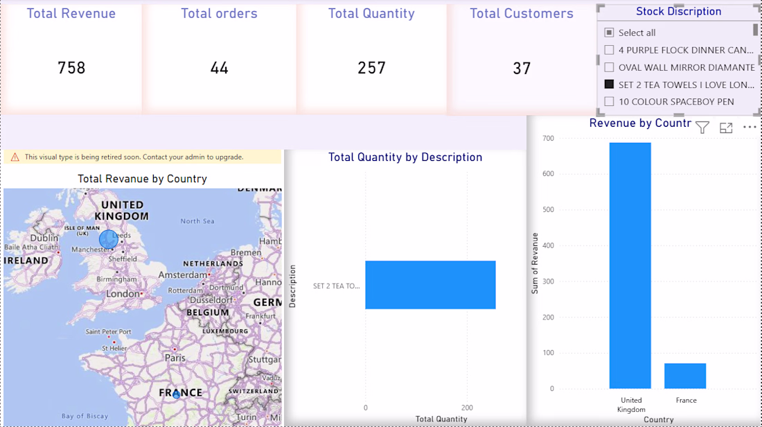
Financial Trend Analysis & Customer Churn Dashboard
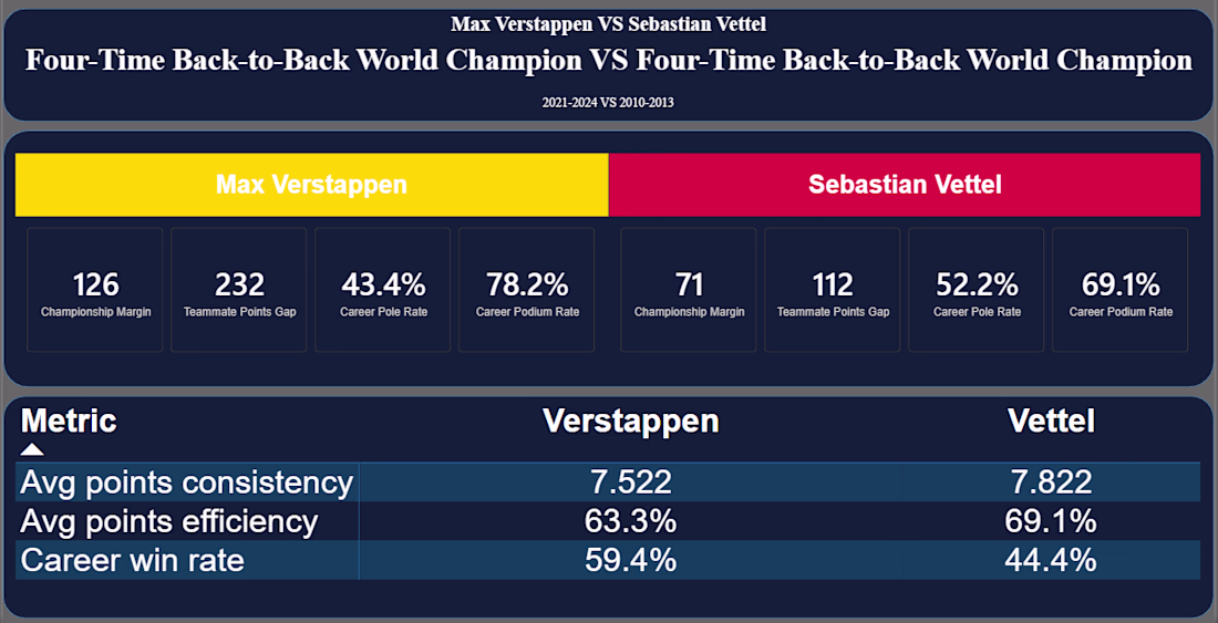
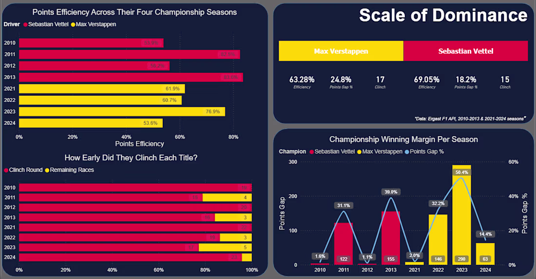
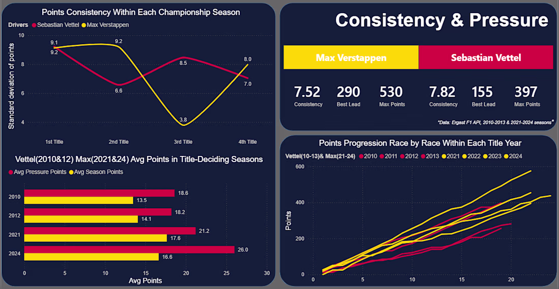
F1 Data Analysis: Vettel vs Verstappen — SQL & Power BI
A SQL + Power BI comparison of Sebastian Vettel's (2010–2013) and Max Verstappen's (2021–2024) four-title runs at Red Bull Racing — same team, different eras, very different paths to the top.
Built on the Ergast F1 database: 14 SQL queries across 5 categories (dominance, race execution, consistency, teammate benchmarking), visualized in a 5-page Power BI dashboard.
Key finding: Vettel converted a higher share of available points on average (69.05% vs Verstappen's 63.28%), despite winning fewer races overall.
Tech Stack
SQL Server · DBeaver · Power BI · Excel
Full project: github.com/MZT49/four-time-champions-vettel-vs-verstappen
Great visualization! Which library or tool did you use to create this?
Trending
Claude
Claude has entered the design space. How are you using Claude Design?
Contra University
Learn from expert creatives how to earn more using next-gen AI tools.
creativeaiflow
Creative AI workflows are evolving. What tools do you use, and what are their strengths and weaknesses?
freelancerlife
Freelancer life is wins, pivots, and everything in between. What’s yours right now?