The network for creativity
Join 1.25M professional creatives like you
Connect with clients, get discovered, and run your business 100% commission-free
Creatives on Contra have earned over $150M and we are just getting started
Back to feedPost
PAUCEK | Brand Identity
A complete brand identity designed for PAUCEK, combining a bold geometric logo with a modern green colour system to create a distinctive and consistent visual presence.
The identity was built around three core values: Innovation, Reliability, and Human Connection.
Project includes:
• Logo & logo variations
• Colour palette
• Typography
• Custom brand pattern
• Stationery system
• Business cards & letterhead
• Brand applications
• Digital brand assets
The result is a clean, modern, and scalable identity designed to work consistently across both digital and physical touchpoints.
Tools: Canva, Adobe Illustrator & Photoshop
#BrandIdentity #Branding #LogoDesign #VisualIdentity #GraphicDesign #BrandDesign


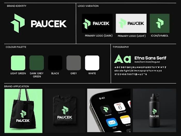
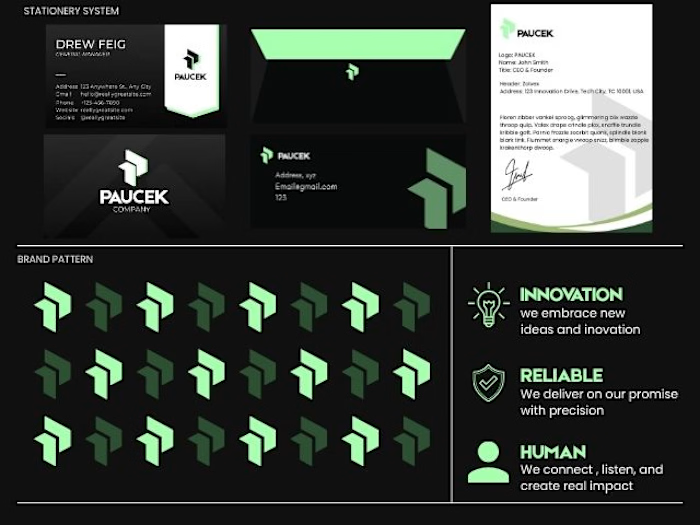

Three values is usually one too many for a single mark to express, so the interesting part is the split - the geometry seems to be carrying reliability while the green does the human warmth. Was that division deliberate, or did it fall out of iteration?

Yes, the split was intentional to an extent. I actually started with the letter “P” and transformed it into a geometric mark using simple shapes. The geometry naturally gave the logo that sense of structure and reliability, while the green added a more human and innovative feel....
The network for creativity
Join 1.25M professional creatives like you
Connect with clients, get discovered, and run your business 100% commission-free
Creatives on Contra have earned over $150M and we are just getting started





Related posts

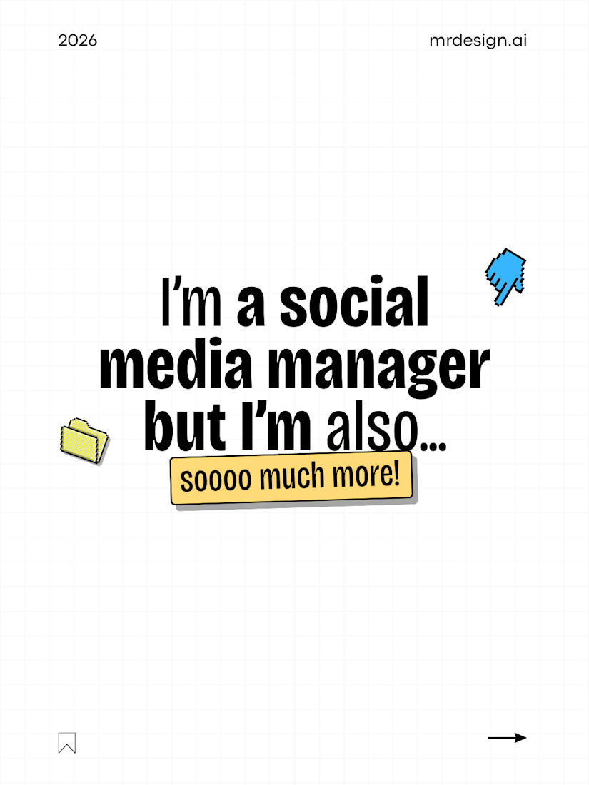
I’m definitely not just one thing either… 🤭
Building @mrdesign.ai means wearing many different hats.
I started with visual design. Along the way, I grew into content strategy, copywriting, audience research, AI, automation, and everything else needed to make content work for business coaches.
It can feel like a lot sometimes, but combining these skills is also what makes this work so creative and meaningful 👨🏻💻✨
I’m still learning, building, and becoming better with every project and every post.
Now tell me… what role did I miss? How many hats do you wear in your business? 👀

Love this. Wearing multiple hats definitely keeps the work interesting! 👏

It's been a while since I made one of these, but here's my latest design. A thrilling victory by George Russell at Baku!

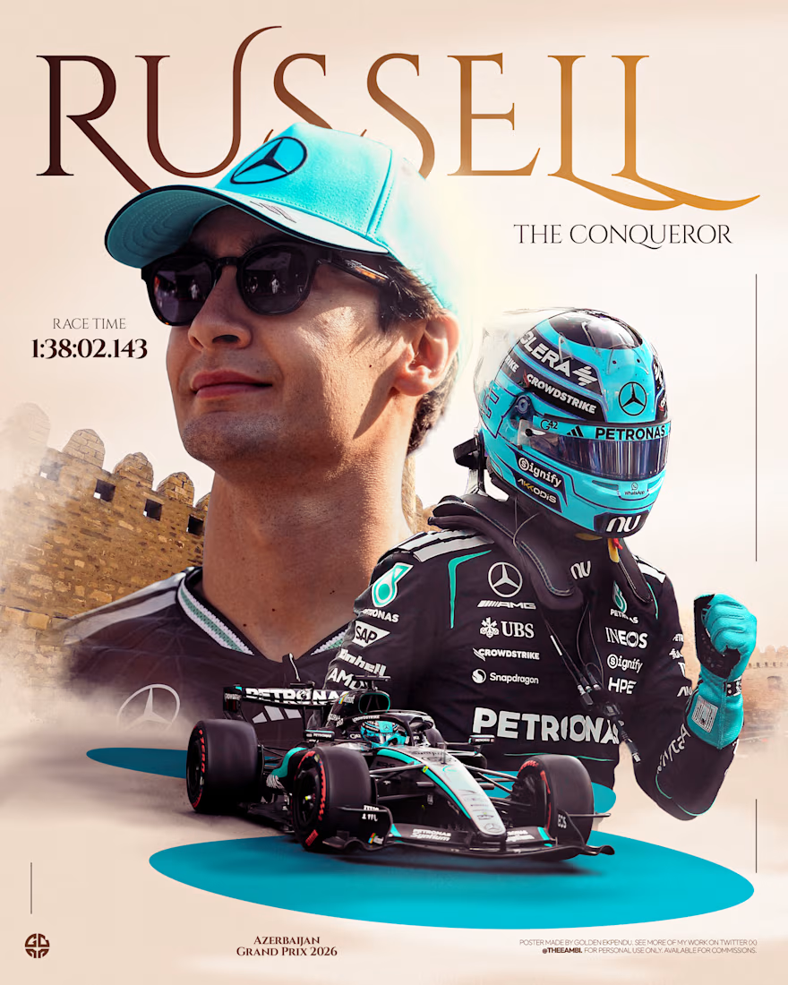


that serif RUSSELL wordmark with the baku walls behind is so good

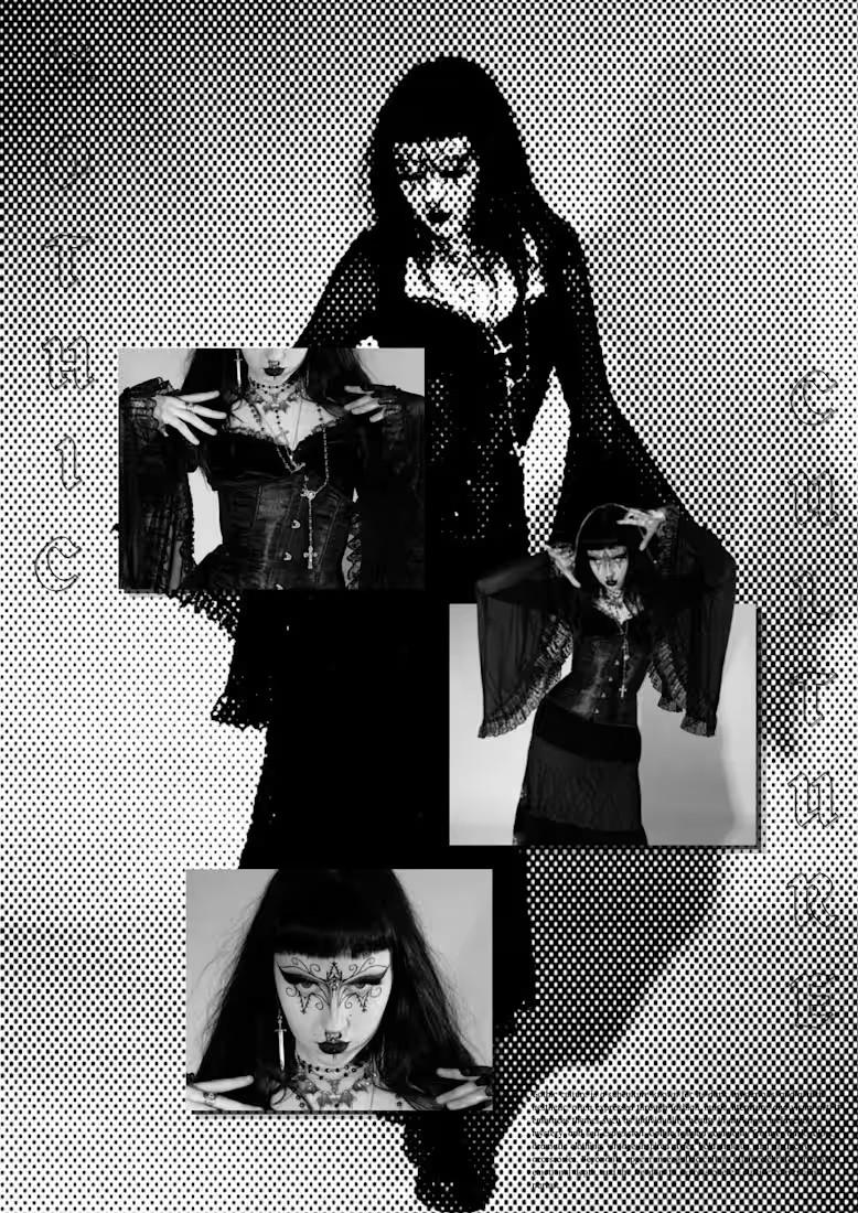
Gothic Culture — Dark, Bold & Unapologetic.
A visual exploration of gothic fashion, identity, and self-expression through halftone textures, monochrome imagery, and editorial typography. I wanted to capture the mysterious yet artistic side of the culture while giving the composition a raw, contemporary edge.
Designed to turn a mood into a visual story. 🕸️
Available for editorial designs, moodboards, posters, social media visuals & brand campaigns
halftoneditherhalftonegraphicsdesigningGraphic DesignPhoto EditingTypographyAdobe PhotoshopCanvaFigma