The network for creativity
Join 1.25M professional creatives like you
Connect with clients, get discovered, and run your business 100% commission-free
Creatives on Contra have earned over $150M and we are just getting started
Back to feedPost

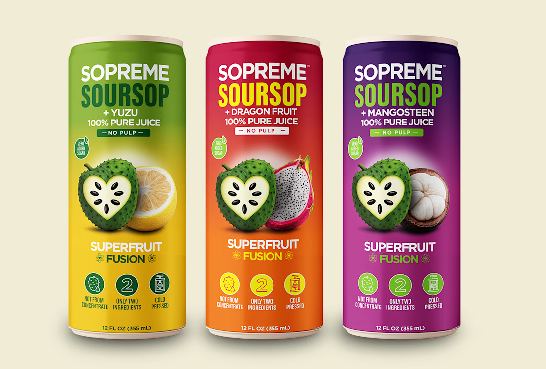
Can packaging design for SOPREME’s Soursop Fusion range: Yuzu, Dragon Fruit, and Mangosteen. Each flavor pairs vibrant color gradients with prominent fruit imagery, while consistent typography and layout hold the collection together.
My work focused on label design, flavor differentiation, and product mockups.


The network for creativity
Join 1.25M professional creatives like you
Connect with clients, get discovered, and run your business 100% commission-free
Creatives on Contra have earned over $150M and we are just getting started
Related posts

🍔 BITE BOX — Where Every Bite Brings a Smile! 🧡
A fun, fresh, and memorable logo concept designed for a modern fast-food brand. The smile icon represents happiness, while the bold typography creates a friendly and recognizable identity. 🍟✨
#LogoDesign #FoodBranding #GraphicDesign #BrandIdentity #LogoDesigner

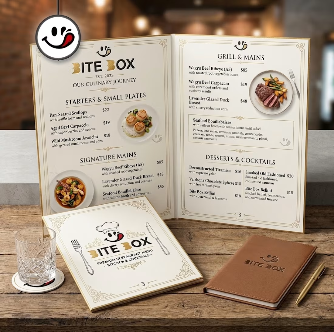
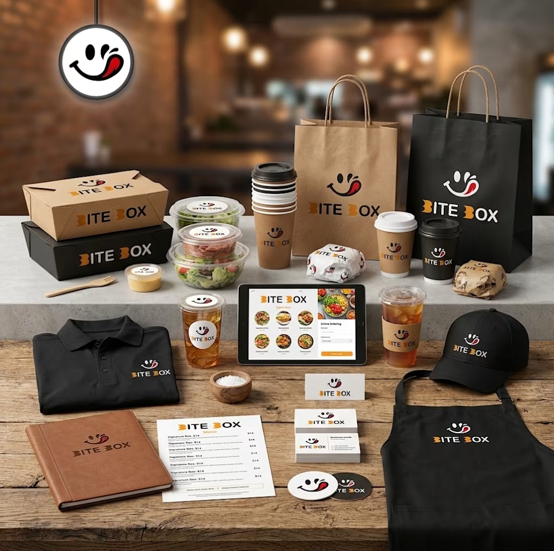
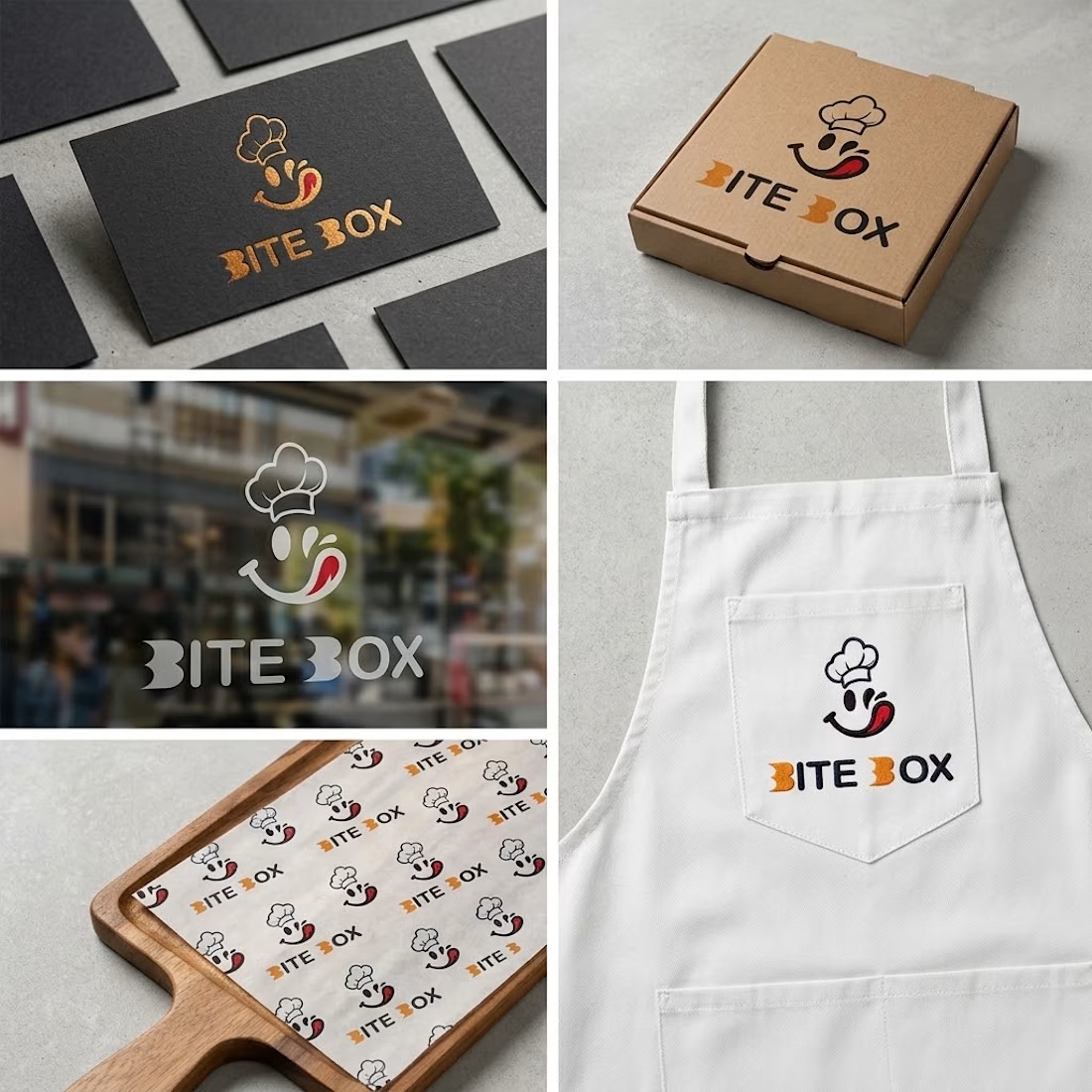
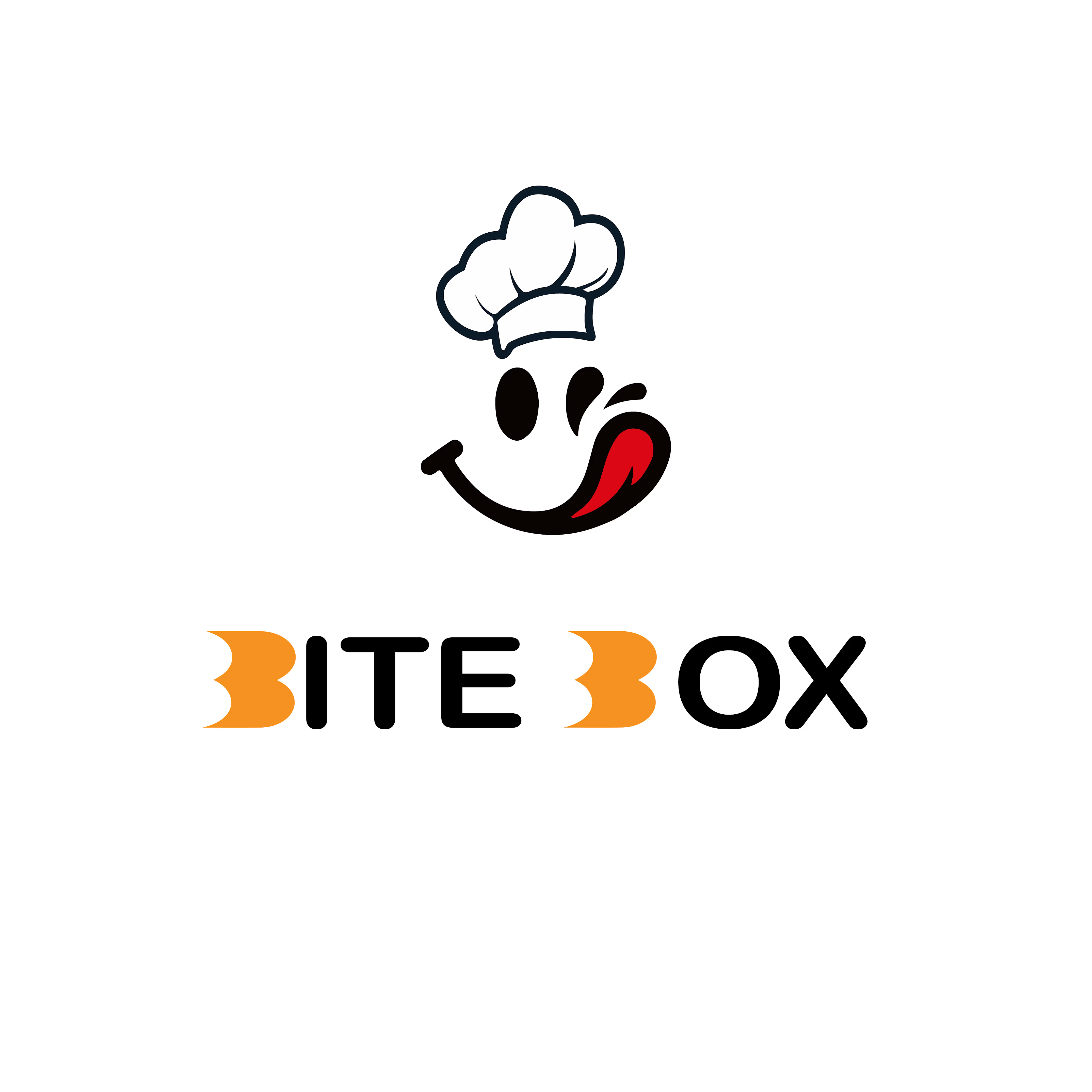

Creative concept with a fun and memorable brand identity!

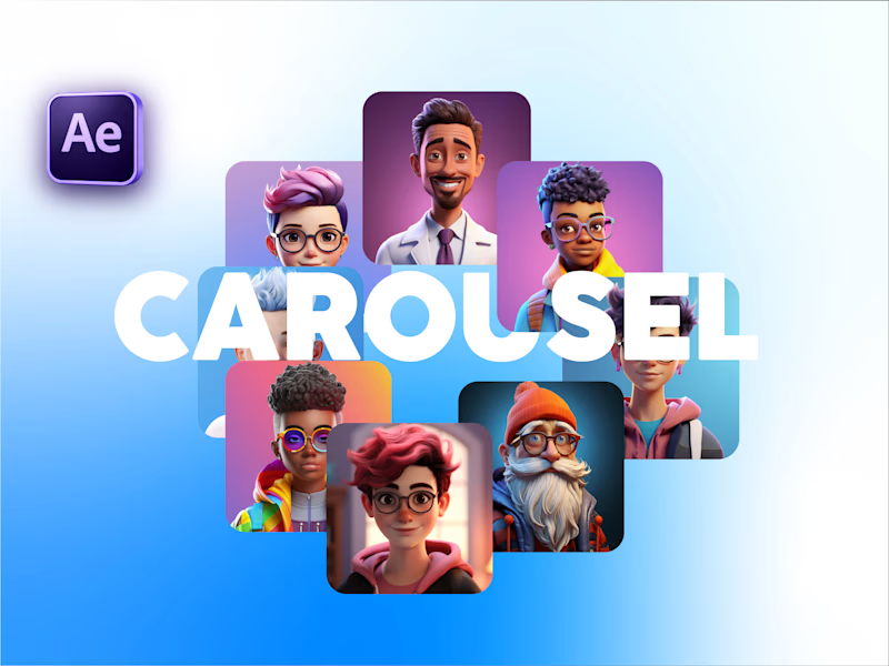
Carousel Animation vs Thumbnail
Description: A quick test to see how the animation and thumbnail work together. What do you think?


5 voted
71%
2 voted
29%
7 votes
Closed

Nice test Salman! The thumbnail to carousel transition works really well - that blue gradient is smooth and the character cards pop nicely. The animation preview feels clean and engaging, definitely works together with the thumbnail. Great After Effects execution!🔥♥️