The network for creativity
Join 1.25M professional creatives like you
Connect with clients, get discovered, and run your business 100% commission-free
Creatives on Contra have earned over $150M and we are just getting started
Back to feedPost

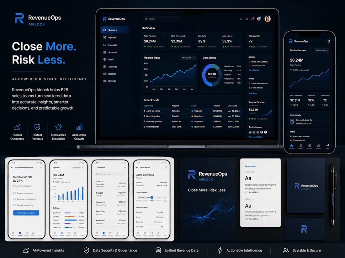
A recent SaaS UI project focused on turning complex revenue data into a clearer, more actionable product experience.
For RevenueOps Airlock, I designed a cohesive visual system across dashboard, web, and mobile interfaces—balancing data density with strong hierarchy, reusable components, and a clean modern aesthetic.
The goal was simple: make critical revenue insights easier to scan, understand, and act on.
Tools: Figma • Adobe Illustrator • Adobe Photoshop
When designing data-heavy SaaS products, what matters most to you first—clarity, speed, or visual hierarchy?


The network for creativity
Join 1.25M professional creatives like you
Connect with clients, get discovered, and run your business 100% commission-free
Creatives on Contra have earned over $150M and we are just getting started







Related posts


Another set of mockups for Bakedwell
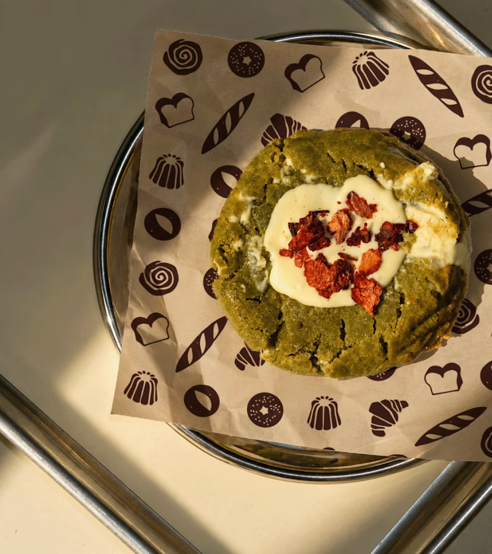
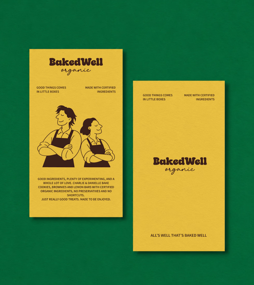
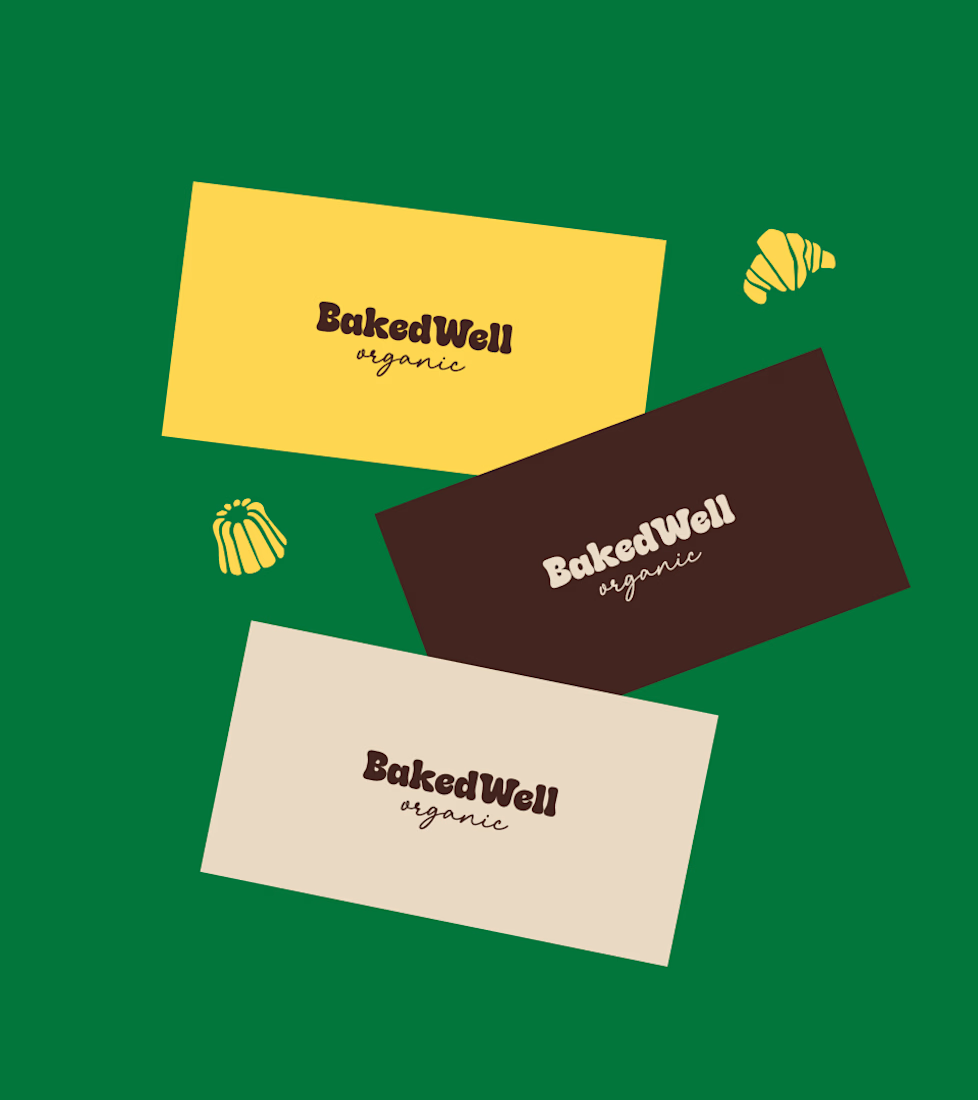
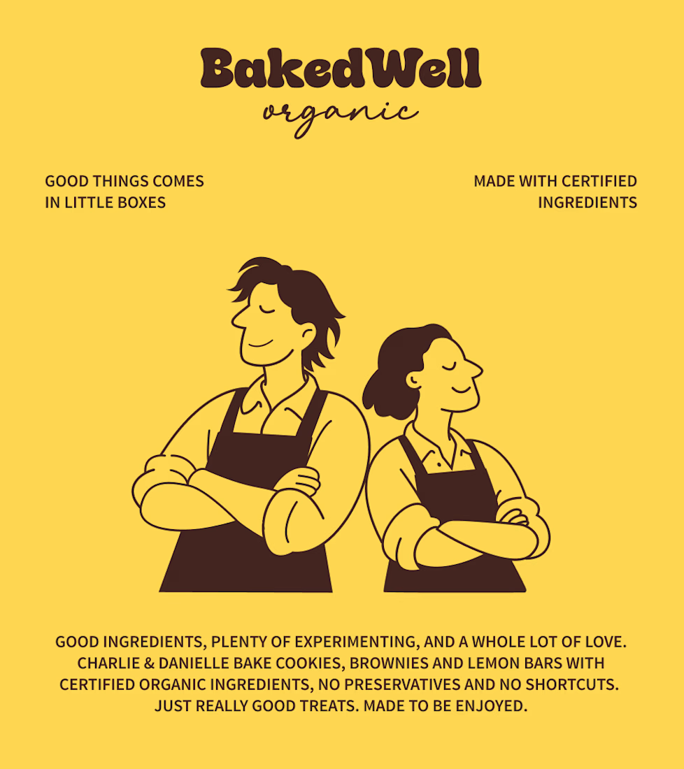

Forest green and mustard with the two bakers in flat illustration is a warm, confident pairing, and the cards read clearly. Contrarian take: the illustrated pair is the strongest asset here, stronger than the wordmark. If I owned BakedWell, I would put those two on the bag and the window and let the logo go smaller.

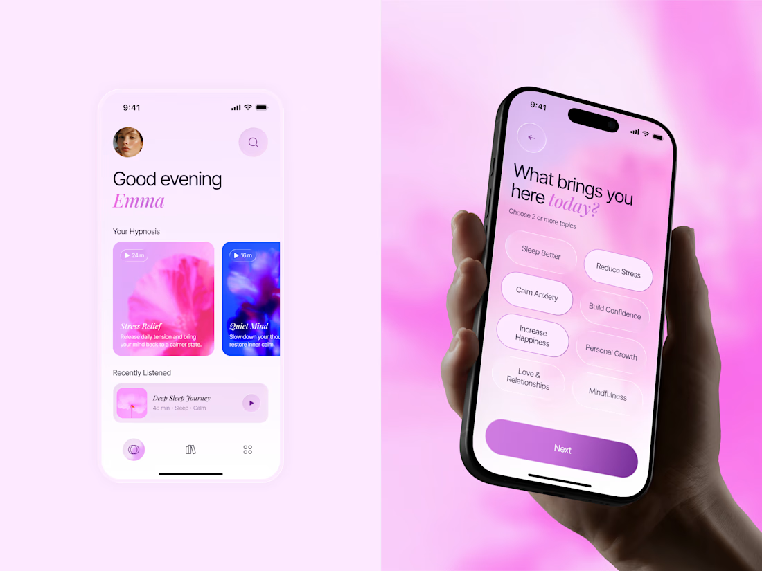
🌸 A little more calm, a little less noise.
Meet Inner Bloom — a hypnosis app concept designed to help people sleep better, reduce stress, and feel more confident.
For this project, I explored a softer visual direction with dreamy pink and lilac tones, frosted glass, and floral imagery to create a calming experience that feels warm and personal.

Great concept with soft colors ❤️🎉

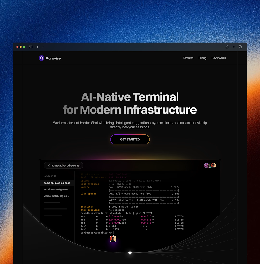
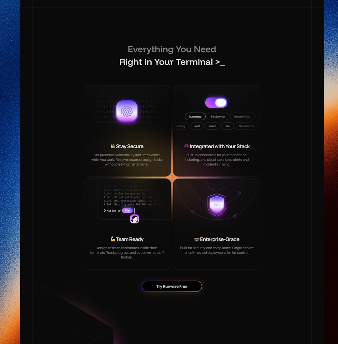
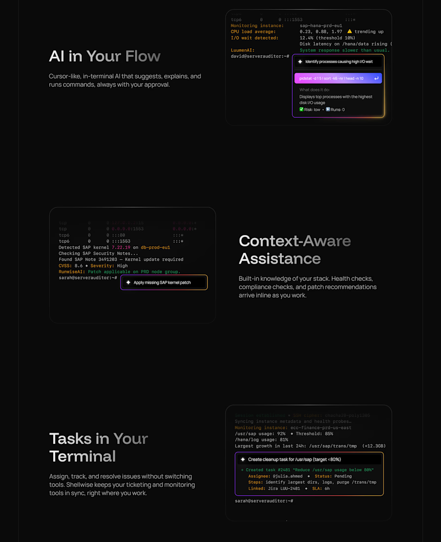
Landing page for an AI-native terminal platform