The network for creativity
Join 1.25M professional creatives like you
Connect with clients, get discovered, and run your business 100% commission-free
Creatives on Contra have earned over $150M and we are just getting started
Back to feedPost

Okay so.
I keep seeing this happen.
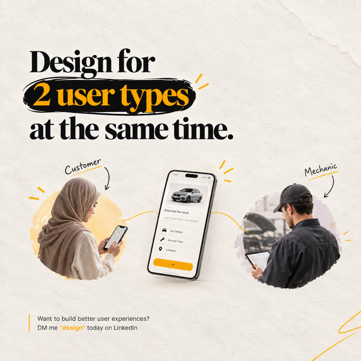
Your product has two users.
One screen.
Both at once.
A customer.
A mechanic.
You fix it for one.
The other side breaks a little.
I ran into this myself.
On a mechanic-booking marketplace.
Customers don't know car terms.
They can't describe the problem right.
Mechanics need real detail though.
Or the quote is a guess.
So you're stuck in the middle.
Design for the customer -
mechanics get vague, useless requests.
Design for the mechanic -
customers feel interrogated before booking.
Your first instinct is simplify.
Shorten the form.
Make it feel easier.
But shorter isn't the same as clear.
A shorter form that still confuses the mechanic?
Didn't fix anything.
Just moved the confusion downstream.
Here's what actually works.
It's not about length.
It's about order.
What each side sees.
And when.
So neither one is left guessing.
If you're building anything two-sided -
a marketplace, a platform, even a simple request flow -
this is the part worth slowing down for.
Before you touch a single screen.
So tell me -
on your product, right now -
whose confusion are you solving first?
And whose are you quietly leaving for later?
The network for creativity
Join 1.25M professional creatives like you
Connect with clients, get discovered, and run your business 100% commission-free
Creatives on Contra have earned over $150M and we are just getting started





Related posts

A cursor doesn't have to disappear into the interface.
In INKY, the custom cursor isn't just feedback. It becomes part of the visual language of the portfolio.
A small interaction can change how the entire interface feels — without adding more content or more UI.
Interaction can be part of the identity.

Love the direction

More from ARDA®, a look at the desktop experience.
A, editorial approach to presenting architecture, built around typography, grid and imagery.


after presenting more brand directions than I can count, one thing I’ve learned: I never jump straight into showing the visuals.
first I want to establish what we're actually trying to solve.
what we heard from the client. what they want to be known for. where they sit in the market. what needs to feel different.
then the big idea, and how it translates into type, colour, imagery and graphic elements.
only then the designs.
context changes how you judge the work.