The network for creativity
Join 1.25M professional creatives like you
Connect with clients, get discovered, and run your business 100% commission-free
Creatives on Contra have earned over $150M and we are just getting started
Back to feedPost

Addictive animated website for a car brand 🔥
3dfrontenddesignersoftwarewebsitedesignBackend DevelopmentFull Stack DevelopmentWeb DevelopmentBlenderNode.jsReact


That's amazing! Where was it designed?
Cool 🔥
The network for creativity
Join 1.25M professional creatives like you
Connect with clients, get discovered, and run your business 100% commission-free
Creatives on Contra have earned over $150M and we are just getting started

Challenges
View all


Related posts

My portfolio is live
I'm Daniel, a Design Engineer. I have designed, built, and scaled products from 0 to thousands of users and figures in revenue.
I can own any product phase, from concept and design to build, launch, and growth.
I'm open to product, brand, motion, and web design and development roles.
V1: https://danielbryte.com
Designed and developed by me.


I love the left panel on the case study page. 😍

A website should make the product easy to understand.
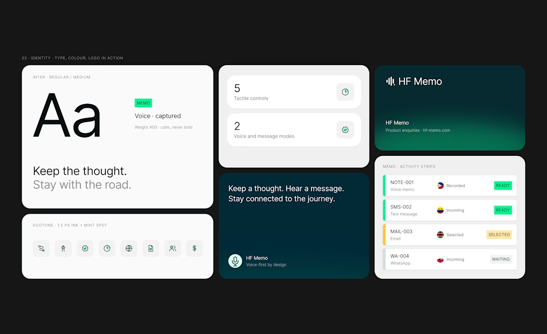
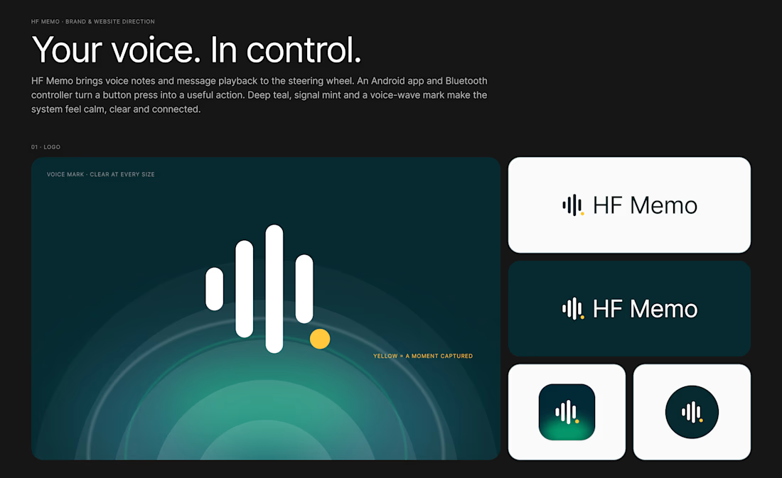
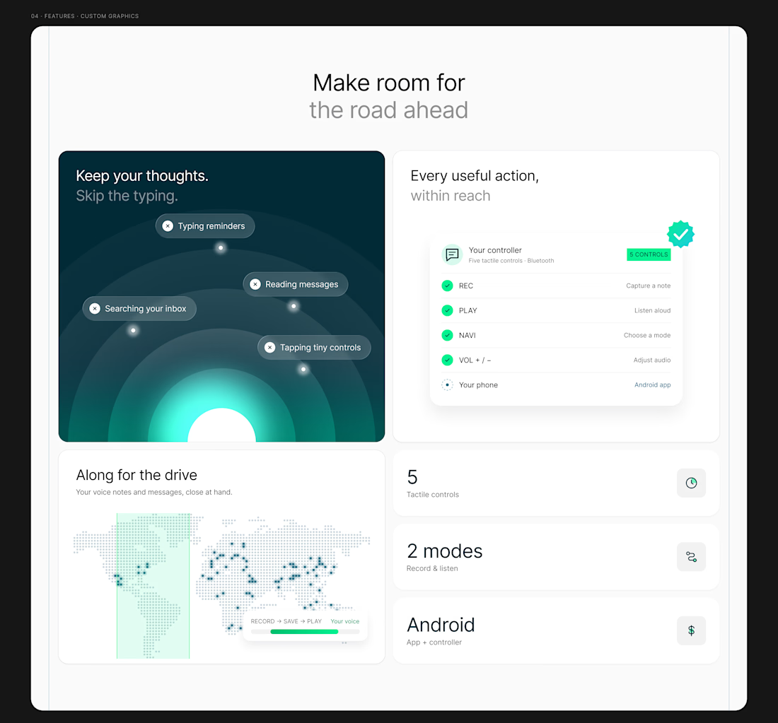
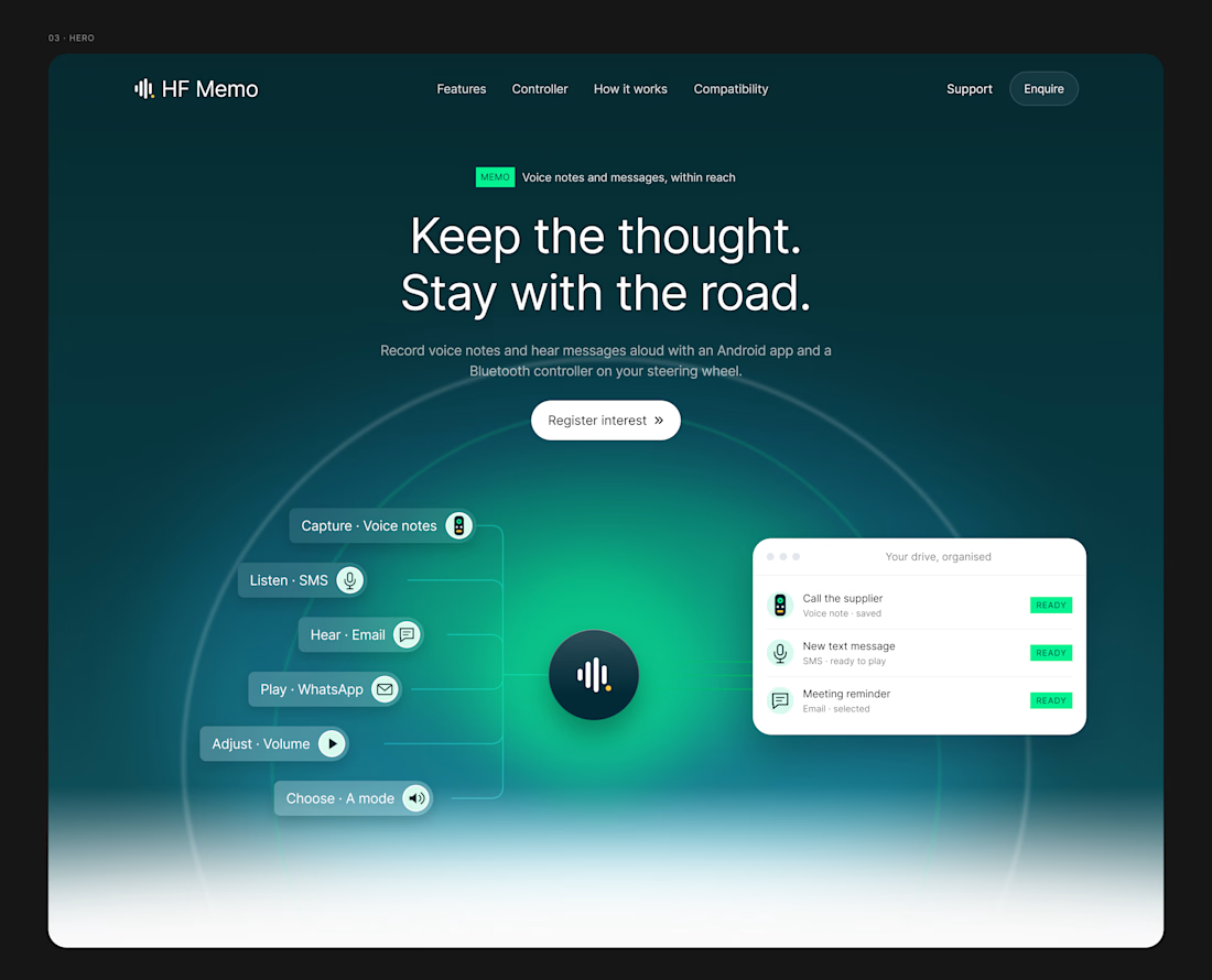
My latest redesign concept explores a new direction for HF Memo—an Android app and Bluetooth controller for recording voice notes and hearing messages aloud.
I focused on showing the experience: capture a thought, replay a recording, and understand what each controller button does.
Clean typography, light backgrounds, and lime accents give the product room to tell its story.
Designed in Figma, with editable layouts and custom graphics.
Have a product that needs a clearer website? Let’s connect.
#webdesign #uidesign #figma #productdesign



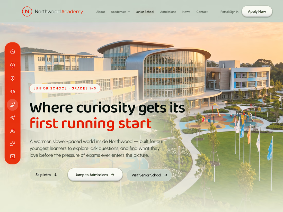
Northwood Academy: one school, two experiences 🏫
A school website that speaks to two different audiences. The Senior School and the Junior School each get their own interface and colour theme, so every visitor feels the site was made for them.
The goal: present the school's programmes, campuses and admissions in a polished, easy-to-follow way that builds trust at first glance.
What I designed and built:
✦ Senior School interface: a refined, mature look with a cinematic homepage and scroll-driven animation
✦ Junior School interface: a brighter, more playful design in its own colour theme, with a dedicated interactive layout
✦ Two distinct colour themes that clearly separate the Senior and Junior sections while staying part of one brand
✦ Clear navigation for academics, admissions and campus information
✦ A fully responsive design for phones, tablets and desktops
My role: UI/UX design and full front-end development, from concept to live site.
Built with: Next.js, React, Tailwind CSS and GSAP.
🔗 Live site: Northwood Academy: one school, two experiences 🏫
A school website that speaks to two different audiences. The Senior School and the Junior School each get their own interface and colour theme, so every visitor feels the site was made for them.
The goal: present the school's programmes, campuses and admissions in a polished, easy-to-follow way that builds trust at first glance.
What I designed and built:
✦ Senior School interface: a refined, mature look with a cinematic homepage and scroll-driven animation
✦ Junior School interface: a brighter, more playful design in its own colour theme, with a dedicated interactive layout
✦ Two distinct colour themes that clearly separate the Senior and Junior sections while staying part of one brand
✦ Clear navigation for academics, admissions and campus information
✦ A fully responsive design for phones, tablets and desktops
My role: UI/UX design and full front-end development, from concept to live site.
Built with: Next.js, React, Tailwind CSS and GSAP.
🔗 Live site: https://northwood.axiom-stem.com
Need a website that serves more than one audience, without looking like a template? Let's talk.
Need a website that serves more than one audience, without looking like a template? Let's talk.



Are the Junior and Senior sections sharing React components with different theme tokens, or are they separate layouts? Curious how you kept the navigation consistent between them.