The network for creativity
Join 1.25M professional creatives like you
Connect with clients, get discovered, and run your business 100% commission-free
Creatives on Contra have earned over $150M and we are just getting started
Back to feedPost

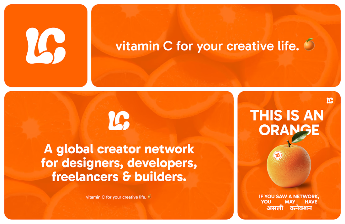
Branding done for @thelinkage.club
https://whatis.thelinkage.club
The network for creativity
Join 1.25M professional creatives like you
Connect with clients, get discovered, and run your business 100% commission-free
Creatives on Contra have earned over $150M and we are just getting started





Related posts

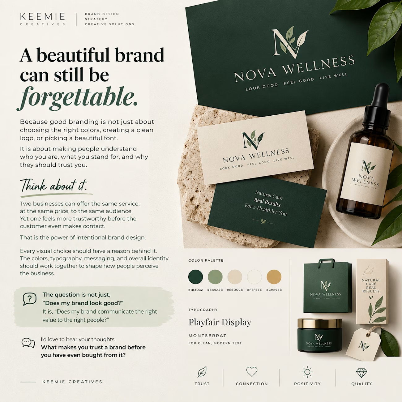
A beautiful brand can still be forgettable.
Because good branding is not just about choosing the right colors, creating a clean logo, or picking a beautiful font.
It is about making people understand who you are, what you stand for, and why they should trust you.
Think about it.
Two businesses can offer the same service, at the same price, to the same audience. Yet one feels more trustworthy before the customer even makes contact.
That is the power of intentional brand design.
Every visual choice should have a reason behind it. The colors, typography, messaging, and overall identity should work together to shape how people perceive the business.
The question is not just, “Does my brand look good?”
It is, “Does my brand communicate the right value to the right people?”
I'd love to hear your thoughts: What makes you trust a brand before you have even bought from it?



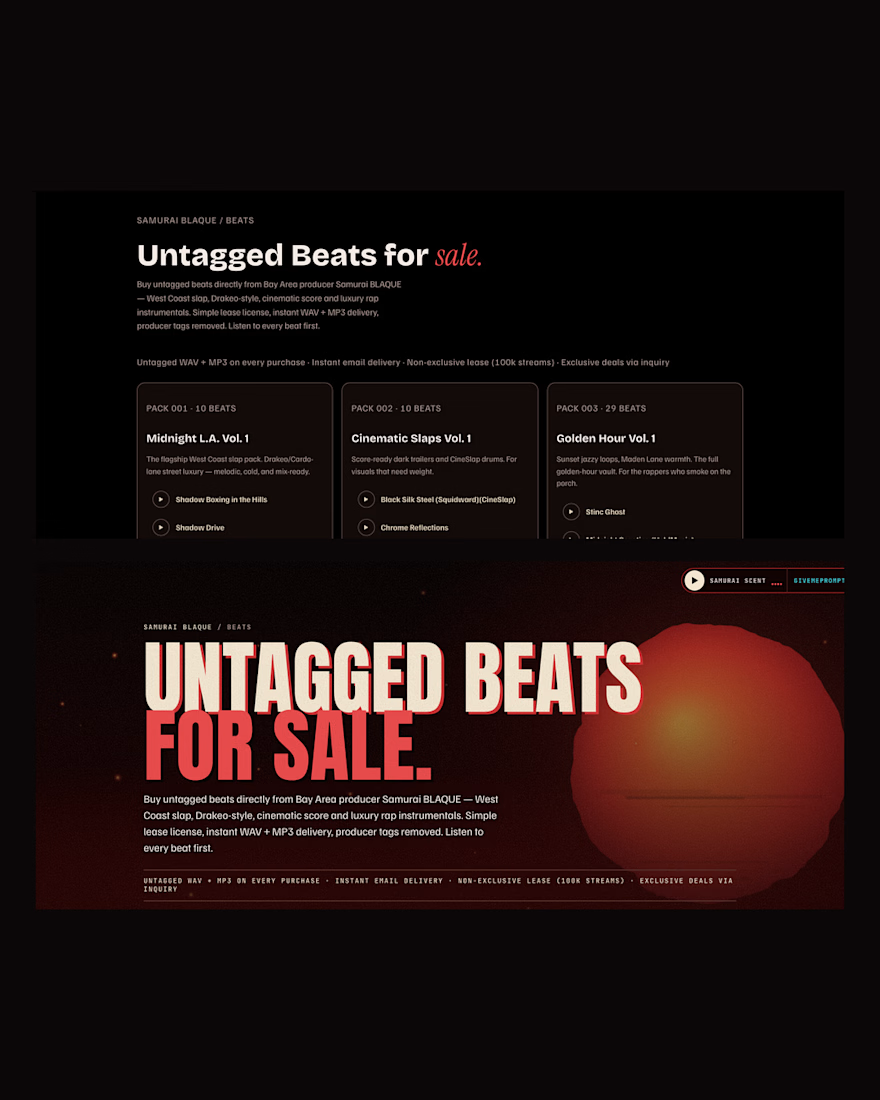
Same beat catalogue, a store that finally looks like the label
Top: the store that sells today
Bottom: the JavaScript remake in preview
Owned checkout, no marketplace cut, and now the brand on every card
https://contra.com/p/FZRsbZP6
#WebDesign #MusicBranding #BeatStore #BeforeAndAfter
Studio: https://givemeprompts.com