The network for creativity
Join 1.25M professional creatives like you
Connect with clients, get discovered, and run your business 100% commission-free
Creatives on Contra have earned over $150M and we are just getting started
Back to feedPost

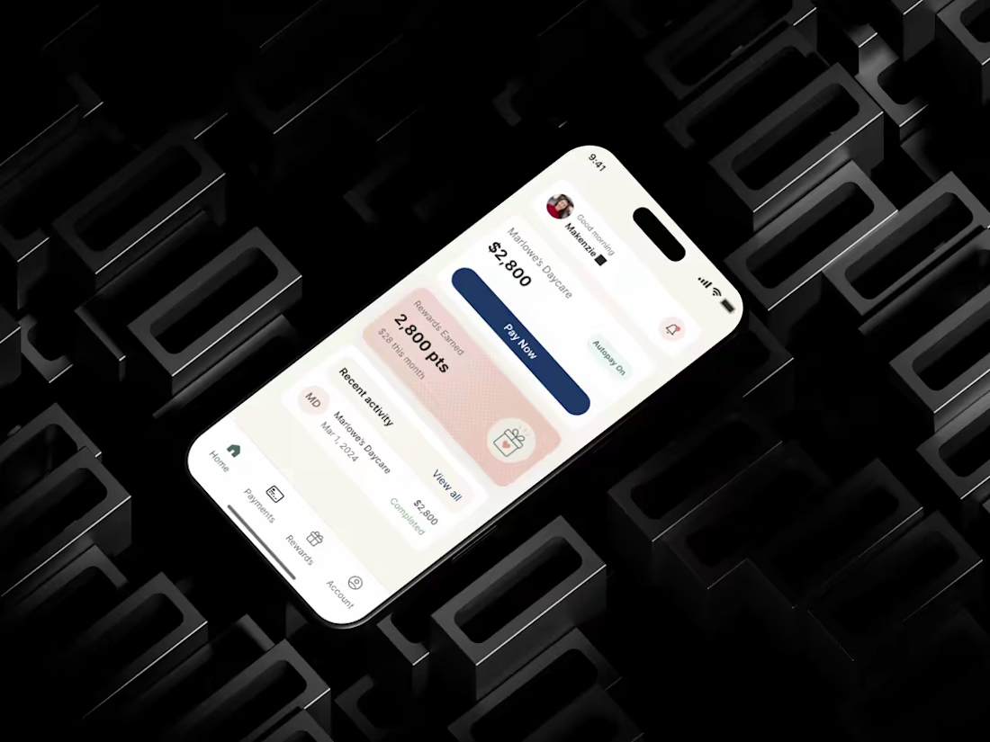
𝗔 𝗳𝗼𝘂𝗻𝗱𝗲𝗿 𝗵𝗮𝗱 𝟯 𝘄𝗲𝗲𝗸𝘀 𝘁𝗼 𝗽𝗶𝘁𝗰𝗵 𝗶𝗻𝘃𝗲𝘀𝘁𝗼𝗿𝘀. 𝗡𝗼 𝗽𝗿𝗼𝗱𝘂𝗰𝘁 𝘆𝗲𝘁, 𝗷𝘂𝘀𝘁 𝗮𝗻 𝗶𝗱𝗲𝗮 𝗮𝗻𝗱 𝗮 𝗱𝗲𝗮𝗱𝗹𝗶𝗻𝗲. ✅
That's how Cubbi started.
I sat down with her, mapped out what actually mattered for that pitch, and designed a product that looked and felt ready not just "in progress."
She walked into that room with something investors could actually see and trust. Left a 5-star review after.
This is the kind of pressure I like taking on at Aktivated Designs. Tight timelines, big stakes, and a product that has to work the first time.
If you're racing toward a deadline too, let's talk.
hashtag#UIUXDesign hashtag#ProductDesign hashtag#StartupDesign hashtag#DesignAgency hashtag#Fintec


The network for creativity
Join 1.25M professional creatives like you
Connect with clients, get discovered, and run your business 100% commission-free
Creatives on Contra have earned over $150M and we are just getting started





Related posts




Option B feels nothing but premium




Which hero visual feels right for this brand?
While working on the homepage for Halfspace, a website design and SEO agency, I explored two different hero visuals for the same headline and layout. Same message, same structure, just a different visual metaphor and mood.
Option 1 - Rocket Launch. Bold, literal, and energetic, visually reinforcing the "launch your business" message with motion and fire.
Option 2 - Glass Cube. Abstract, sleek, and premium, giving a more refined, tech-forward feel without relying on a literal metaphor.
Would love your honest UX/UI take, which direction feels more impactful, memorable, and aligned with a web design/SEO brand, and why?
11 voted
41%
16 voted
59%
27 votes
Closed

Both design are great; it's hard to choose one