The network for creativity
Join 1.25M professional creatives like you
Connect with clients, get discovered, and run your business 100% commission-free
Creatives on Contra have earned over $150M and we are just getting started
Back to feedPost

I reviewed 50 Shopify stores this year. 43 of them had the same problem.
It wasn’t the product. It wasn’t the price. It wasn’t the ads.
It was the page.
Bad mobile layout. Weak typography. A product page that made the brand look unfinished before the customer even read the description. The owners all thought they had a marketing problem so they kept spending on ads. Meanwhile the page was quietly killing every conversion.
The 7 stores that were converting had one thing in common, the page answered every question before the customer thought to ask it. Trust signals in the right places. Clean hierarchy. A mobile experience that felt intentional.
Same products. Same budgets. Completely different results. The difference was never the marketing. It was always the page.
I do UX & Design Audits for Shopify stores. Full written breakdown of every issue with specific fixes prioritized by impact. Three days. $200.


The network for creativity
Join 1.25M professional creatives like you
Connect with clients, get discovered, and run your business 100% commission-free
Creatives on Contra have earned over $150M and we are just getting started






Related posts

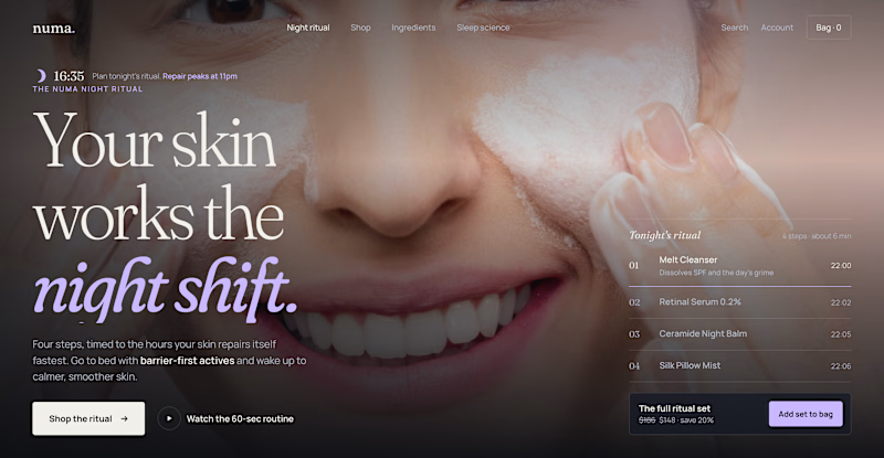
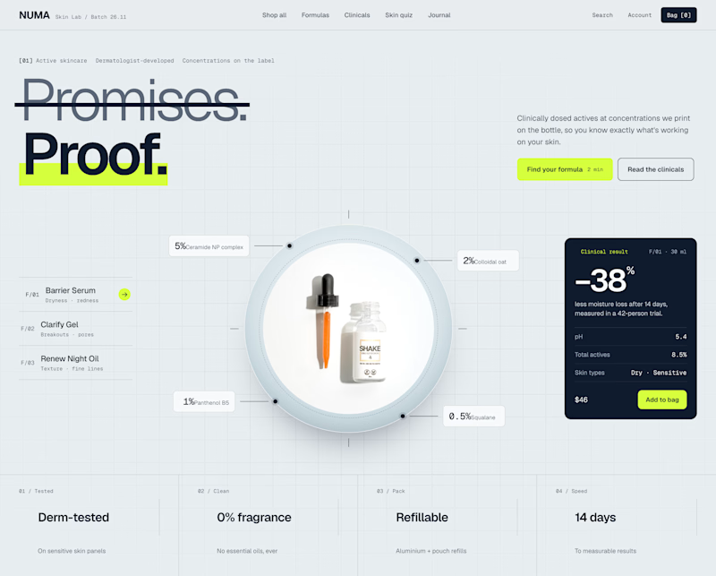
Two Shopify hero sections. Same skincare brand. Two different approaches.
Which one would you choose?
Option A: Night Ritual
Immersive photography, emotional storytelling, and a complete skincare routine with a direct add-to-cart option.
Option B: Lab Specimen
Bold typography, ingredient breakdowns, clinical information, and a clear path to purchase.
Both serve the same brand but take different approaches.
A builds an emotional connection and sells the experience.
B builds trust through product transparency and helps shoppers understand the formula.
But which approach would drive more conversions?
If you were designing this Shopify storefront, which would you choose?
A: Lifestyle & Storytelling
B: Product & Science
And why?
2 voted
18%
9 voted
82%
11 votes
Closed

I'd go with Lab Specimen! 🔥 The bold typography and clean, futuristic layout really stand out. Night Ritual looks beautiful too, but Option B feels more unique and memorable.

Dashboard design for AllWays Holiday.
Clarity is what makes a good dashboard.
Every section, metric and action should help users understand what's happening and what needs their attention.
Designed to make managing travel operations easier.

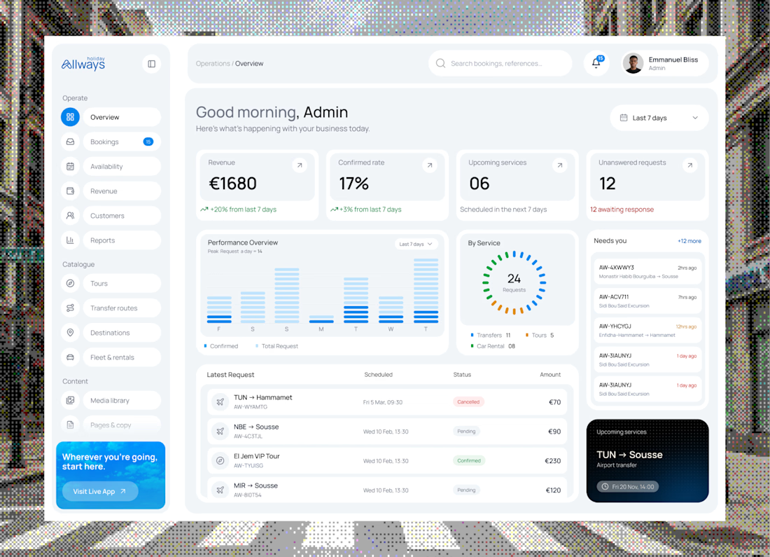

"What needs their attention" is the part most dashboards miss. Clean KPI cards up top, then the list below makes it easy to act. Did you consider pulling urgent bookings or issues into their own highlighted block, so ops teams see problems before they scroll?


We designed and built the launch site for Daewoo's Velocipedo in Framer.
It's an electric trike, so the product had to carry the page. The hero is the trike parked under a rock arch, seen from a few angles, and the copy stays out of its way.
Anyone else find product-first sites harder to get right than they look?

Awesome