The network for creativity
Join 1.25M professional creatives like you
Connect with clients, get discovered, and run your business 100% commission-free
Creatives on Contra have earned over $150M and we are just getting started
Back to feedPost

Most color and type pairings fail quietly.
Not because they’re bad, but because they’re mismatched.
When both carry the same mood, design decisions feel effortless.
The network for creativity
Join 1.25M professional creatives like you
Connect with clients, get discovered, and run your business 100% commission-free
Creatives on Contra have earned over $150M and we are just getting started



Related posts

Dark Mode 🖤 or Light Mode 🤍?
Which one matches your vibe? 👀
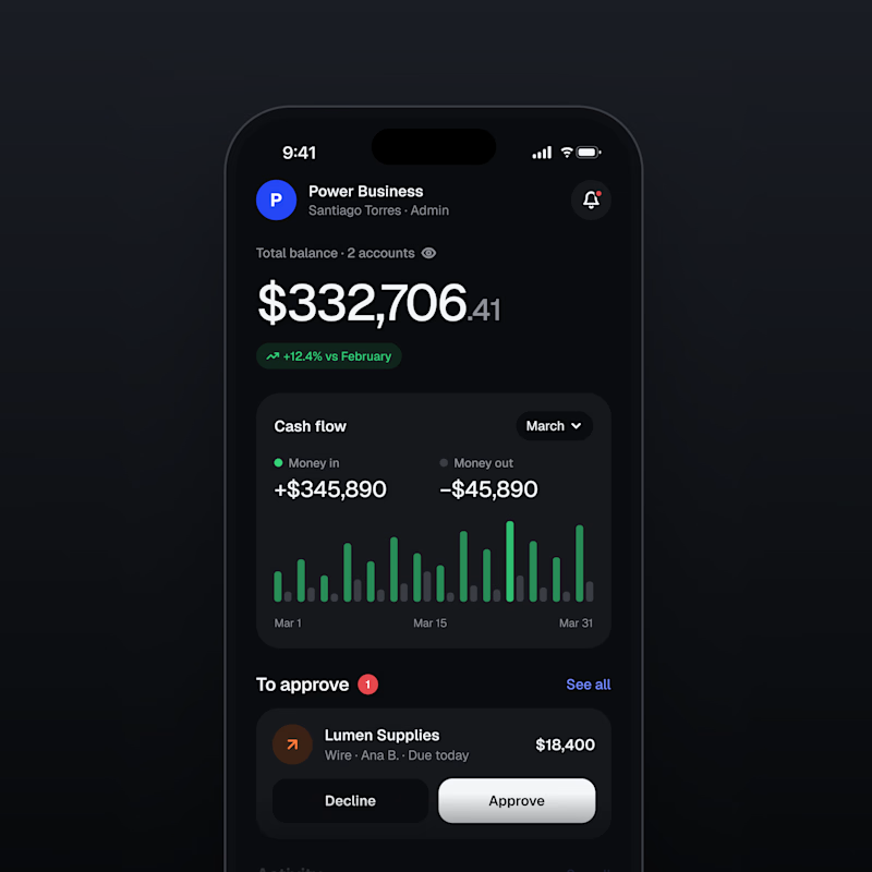
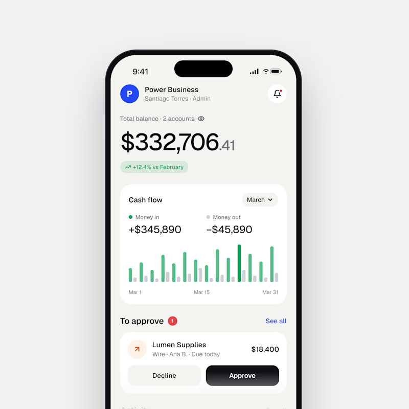
28 votes
Ends in 37m

Both are nice clean designs...for me,Dark mode!

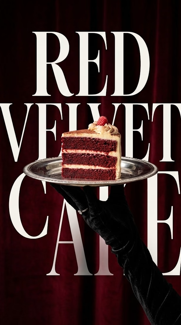
"Where typography meets taste. 🍰🍷
Conceptualizing a luxury dessert brand identity. The goal was to create something that feels rich, vintage, and elegant—using bold serif typography mixed with high-end editorial photography.
What do you think of this visual balance? Let me know below! 👇



Watch this website build itself.
The Milemarker homepage, replayed in about 9 seconds from the live site: wireframe, layout, content, live.
Milemarker connects every system a wealth management firm runs, so data turns into context, action and automation. I built their site in Framer with a calm, editorial feel.
• A serif headline that reads like a promise, not a slogan
• A warm off-white page, so the orange buttons carry the actions
• The product shown right under the headline
Serif or sans headline for a fintech site?
Live: milemarker.co
Follow for more videos: instagram.com/sellwrightstudio · youtube.com/@sellwrightstudio


Serif for this one.