The network for creativity
Join 1.25M professional creatives like you
Connect with clients, get discovered, and run your business 100% commission-free
Creatives on Contra have earned over $150M and we are just getting started
Back to feedPost
Impart is built on a simple principle: Every component is part of something larger.
A premium brand in automotive workshop equipment and spare parts, positioned not as a supplier, but as part of the system it serves.
In its academic sense, the name “Impart” means to convey and contribute. We position it around a core idea: “I am Part…” Beyond its industrial echoes of Impact and Import, the name refers to founder Iman Sabiroghlu as Iman’s Parts.
The wordmark is constructed from geometric shapes, built the way the products it represents: assembled, interlocked, engineered. Each letter functions as a component within a system.
Black and Grey convey mechanical precision, industrial weight, and control. Red signals urgency, performance, and confidence. Their contrast forms the backbone of the identity.
From stationery to product packaging, the system remains direct and functional. No excess. Nothing decorative. Just a brand that, by being part of the system, makes it more complete.
Check out the full case study on my profile.
#BrandStrategy #Branding #Naming #BrandIdentity #VisualIdentity #ArtDirection #CreativeDirection
Nice work!
The network for creativity
Join 1.25M professional creatives like you
Connect with clients, get discovered, and run your business 100% commission-free
Creatives on Contra have earned over $150M and we are just getting started
Related posts
The synthesis of a craft.
A preview of the visual identity for Tapidecor, a brand where furniture is created from scratch through artisanal manufacturing and signature upholstery.
The development is based on a geometric synthesis representing the iconic profile of a chair. As the most essential form of a seat, this structure symbolizes the primary physical touchpoint between the user and the design, capturing the essence of the craft: the balance between structural firmness, functionality, and the comfort of the finish.
The system features two variants: an integrated version where the naming is housed within the core of the symbol, and a pure logomark for high-impact applications (wood engraving, embroidery, or stamps), where the form maintains the brand identity on its own.
Iconography DesignBrand DesignVisual DesignAdobe Creative CloudAdobe PhotoshopAdobe Illustratorbranddesignericondesignbrandingstudio
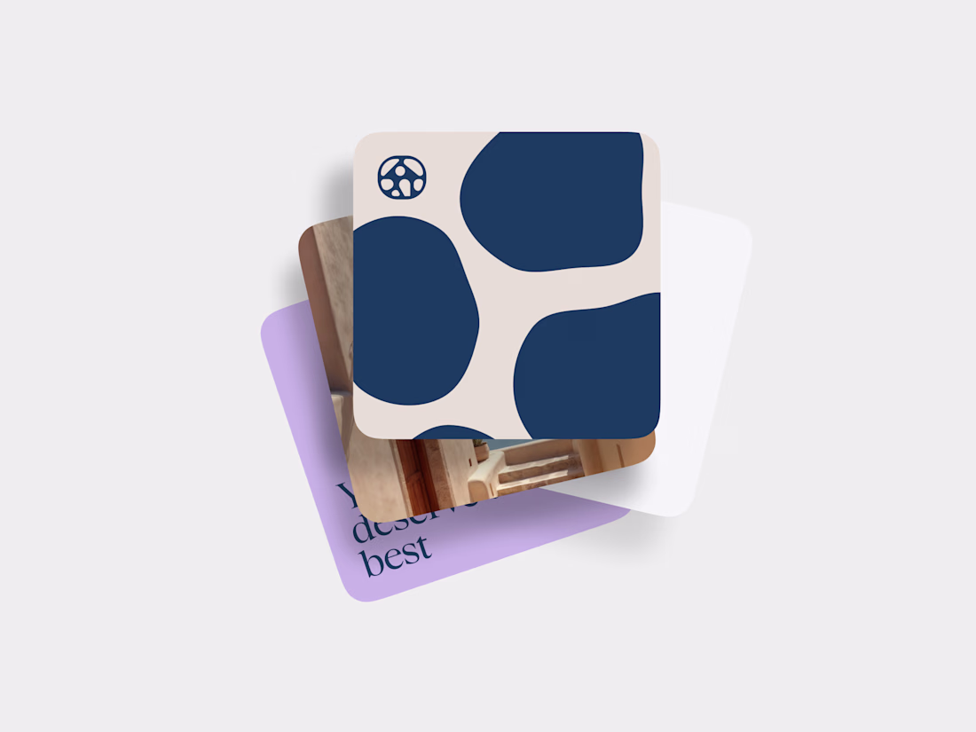
Some recent branding work for yet another real estate startup.
We’re currently building multiple projects at the intersection of real estate, branding and AI. Strategy, identity, platform development and AI integration all under one roof.
Still a lot in motion, but excited to share more soon.
🧠 🔥 🚀 If you’re building in real estate, hospitality or luxury and need a world-class partner for branding, product design, development or AI, feel free to reach out. Always open to connecting with ambitious founders and teams.
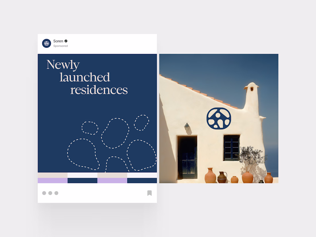
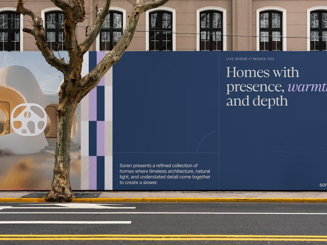
Wow, this is absolutely lovely. Really reminds me of Greece and the vibe and the scenery, and the way the walls and the textures kind of resemble the logo mark that you have.
In 2024, we built a version of Eviation that once felt right.
But somewhere along the way, we outgrew it.
Two years on, this identity is shaped by everything we’ve learned,
every doubt we faced,
every decision to evolve instead of settle.
And now, we’re ready to share it with you — with more clarity, more intention, more honesty.
Eviation, realigned.
𝙄𝙛 𝙮𝙤𝙪’𝙧𝙚 𝙚𝙫𝙤𝙡𝙫𝙞𝙣𝙜 𝙩𝙤𝙤, 𝙩𝙝𝙞𝙨 𝙤𝙣𝙚’𝙨 𝙛𝙤𝙧 𝙮𝙤𝙪.
#Rebranding #LogoDesigning #BrandingAgency #SocialMediaMarketing
Nice work
Trending
Claude
Claude has entered the design space. How are you using Claude Design?
Contra University
Learn from expert creatives how to earn more using next-gen AI tools.
creativeaiflow
Creative AI workflows are evolving. What tools do you use, and what are their strengths and weaknesses?
portfolioreview
The best portfolios tell a story, not just show a grid. Share yours for feedback.
freelancerlife
Freelancer life is wins, pivots, and everything in between. What’s yours right now?