The network for creativity
Join 1.25M professional creatives like you
Connect with clients, get discovered, and run your business 100% commission-free
Creatives on Contra have earned over $150M and we are just getting started
Back to feedPost

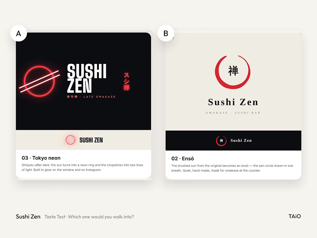
Same red sun, two very different restaurants. Which one would you walk into?
For the Sushi Zen rebrand, a twelve-seat omakase counter, I explored four ways to refresh a red-sun logo I first drew in 2018. Here are two of them:
A: Tokyo neon. The sun becomes a glowing ring, built for a young late-night crowd.
B: Ensō. A brushed circle, calm and temple-quiet.
Vote, and tell me why in the comments. I'll share which direction made it into the final brand, and the reasoning behind it, on Sunday.

The network for creativity
Join 1.25M professional creatives like you
Connect with clients, get discovered, and run your business 100% commission-free
Creatives on Contra have earned over $150M and we are just getting started



Related posts

Brand work for HauntChain
I'm loving building this brand and the results so far
A deFi platform with some gamification


That's cute ❤️

A website hero and motion identity concept for Cycle.
The experience takes the viewer through seven historical eras in one continuous forward journey, while the logo, camera path and core composition remain consistent.
The concept explores how a static identity can become a living digital experience through motion, environment and interaction.
Workflow included Spline, Claude via MCP, Midjourney and SeaDance.
Available for brand identity, motion and digital design projects.


I fall in love, It is like Encarta, but 1000% better