The network for creativity
Join 1.25M professional creatives like you
Connect with clients, get discovered, and run your business 100% commission-free
Creatives on Contra have earned over $150M and we are just getting started
Back to feedPost

I need your opinions guys
I’ve been exploring two versions of this skincare landing page and I’d really love your thoughts.
They’re quite similar, but the layout and spacing create a slightly different feel in each.
A) More open layout
B) More compact layout
Which one are you going with?


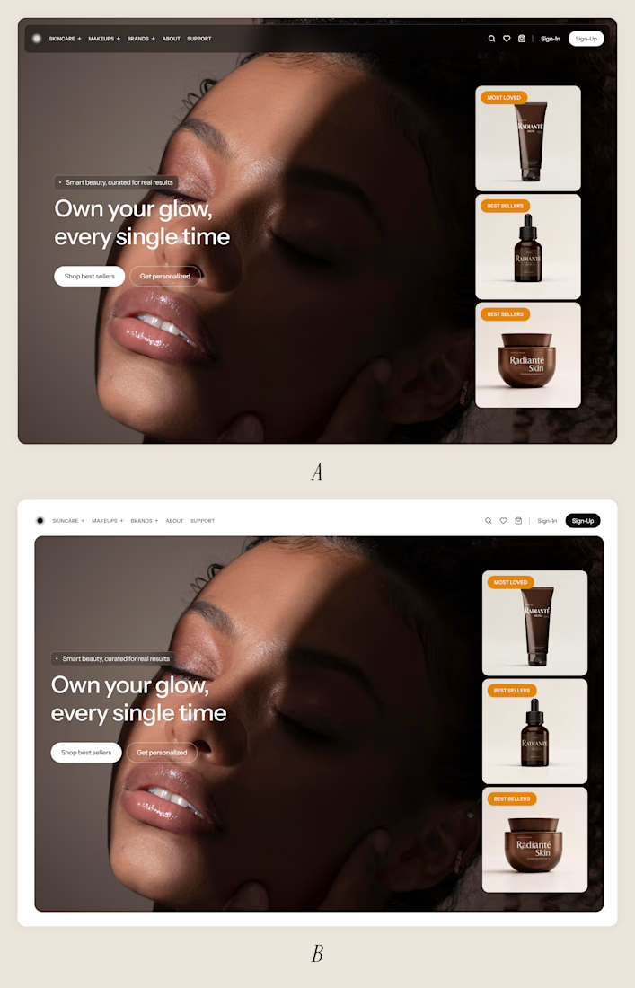

super clean work


I'll go with "A" More Better - clear visual
The network for creativity
Join 1.25M professional creatives like you
Connect with clients, get discovered, and run your business 100% commission-free
Creatives on Contra have earned over $150M and we are just getting started
Related posts


We want to hire a web designer to work in long term. Here's a project to start with. Come say hi. 👇👇👇
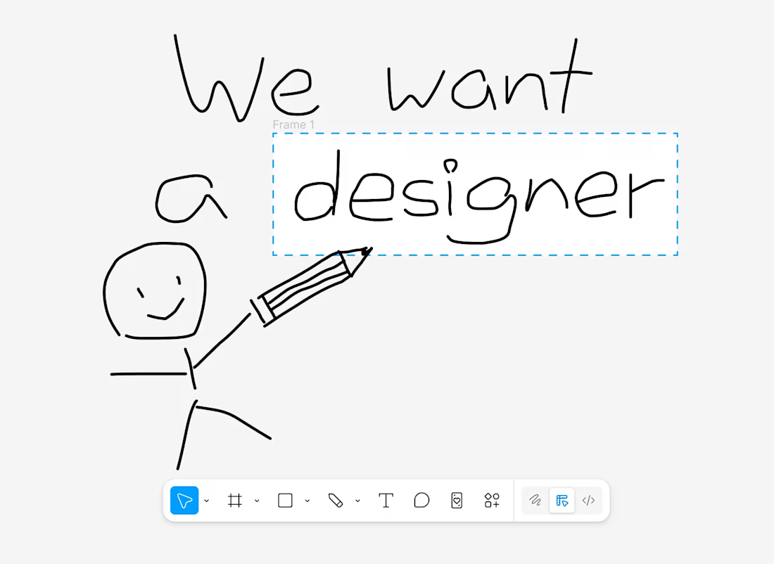
this project

Testing two versions of the same product page.
Curious to know which one would you buy from?
4 voted
57%
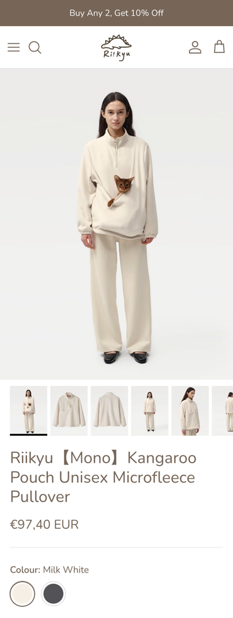
3 voted
43%
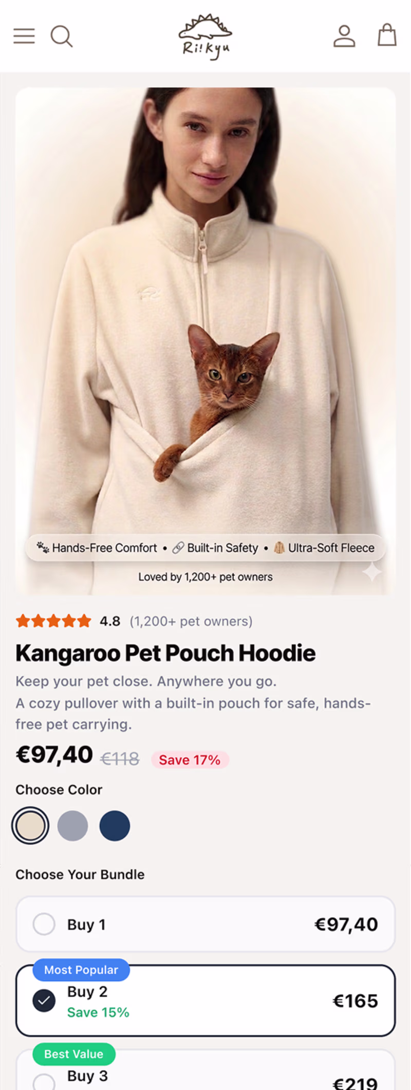
7 votes
Closed

The default page looks more Premium, the New Redesign feels like Alibaba , Is that what you where going for?

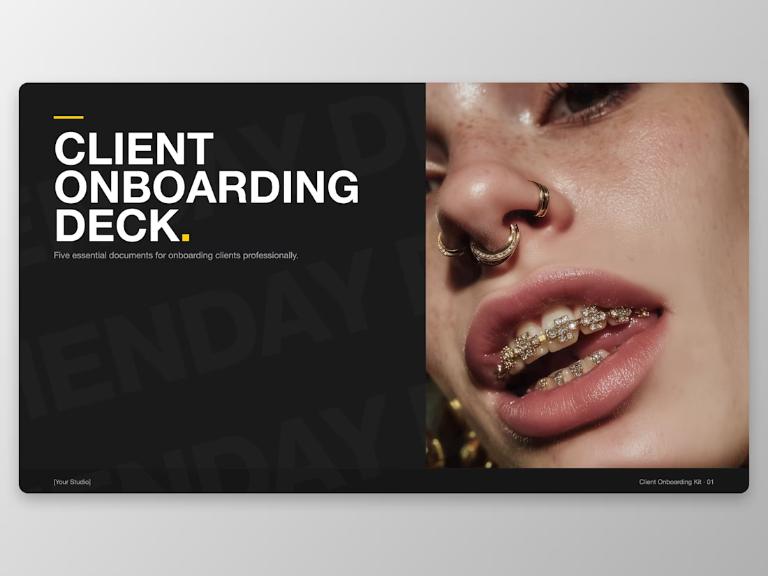
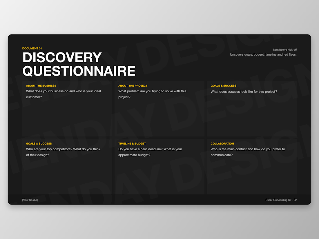
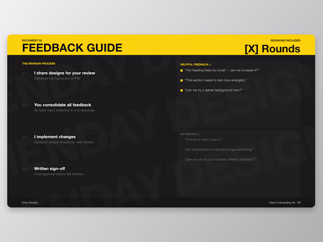
Just dropped my first digital product. 🖤
The Client Onboarding Kit — everything a freelance designer needs to onboard clients like a pro.
6 documents. Fully editable Figma file. Bold dark-theme design that impresses clients before the work begins.
grab it here 👇
Contra Product Listing

Really clear structure and layout like it


Trending


FLORA
Reusable workflows are replacing one-off prompts in creative AI. Share what you're building in FLORA.

Contra University
Learn from expert creatives how to earn more using next-gen AI tools.
portfolioreview
The best portfolios tell a story, not just show a grid. Share yours for feedback.
freelancerlife
Freelancer life is wins, pivots, and everything in between. What’s yours right now?
aivideo
AI video tools are moving at warp speed. Which ones are you experimenting with?