The network for creativity
Join 1.25M professional creatives like you
Connect with clients, get discovered, and run your business 100% commission-free
Creatives on Contra have earned over $150M and we are just getting started
Back to feedPost
Hi there. I'm new here! I still don't get this but I'll keep going


Thanks Madi!
The network for creativity
Join 1.25M professional creatives like you
Connect with clients, get discovered, and run your business 100% commission-free
Creatives on Contra have earned over $150M and we are just getting started






Related posts

What a motivation for newbies like me.

Just hit my first $10,000 on Contra 🥳🎉
I joined Contra a while ago without really knowing what to expect, and it’s been really nice to see it gradually become a place where I’ve met great clients and worked on projects I genuinely love.
Here’s to the next one 🥂

JUST MESSIN AROUND!

The wet-street reflections and that cold blue grade do all the heavy lifting here. It feels straight out of a film still. Was this generated from a prompt, or did you direct the look in post?

Can’t get enough of this visual direction for POISE.
Definitely a favorite so far 🤍
Meet POISE — where strength meets softness.
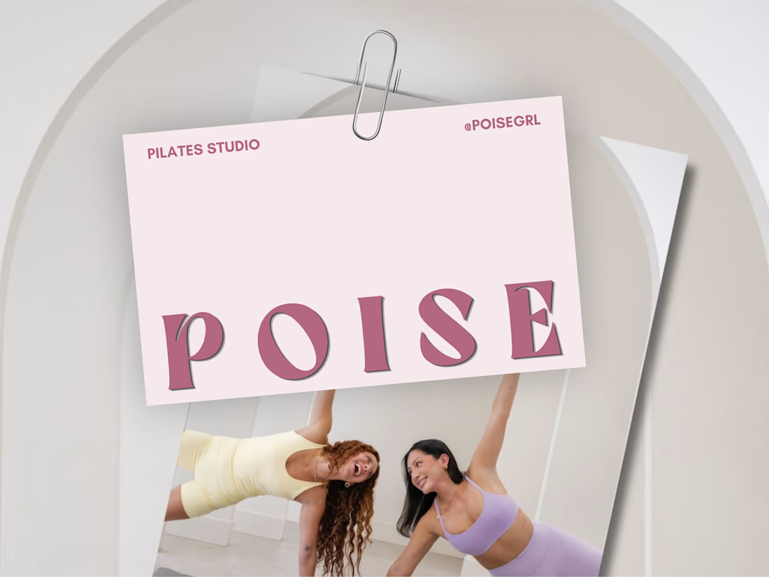
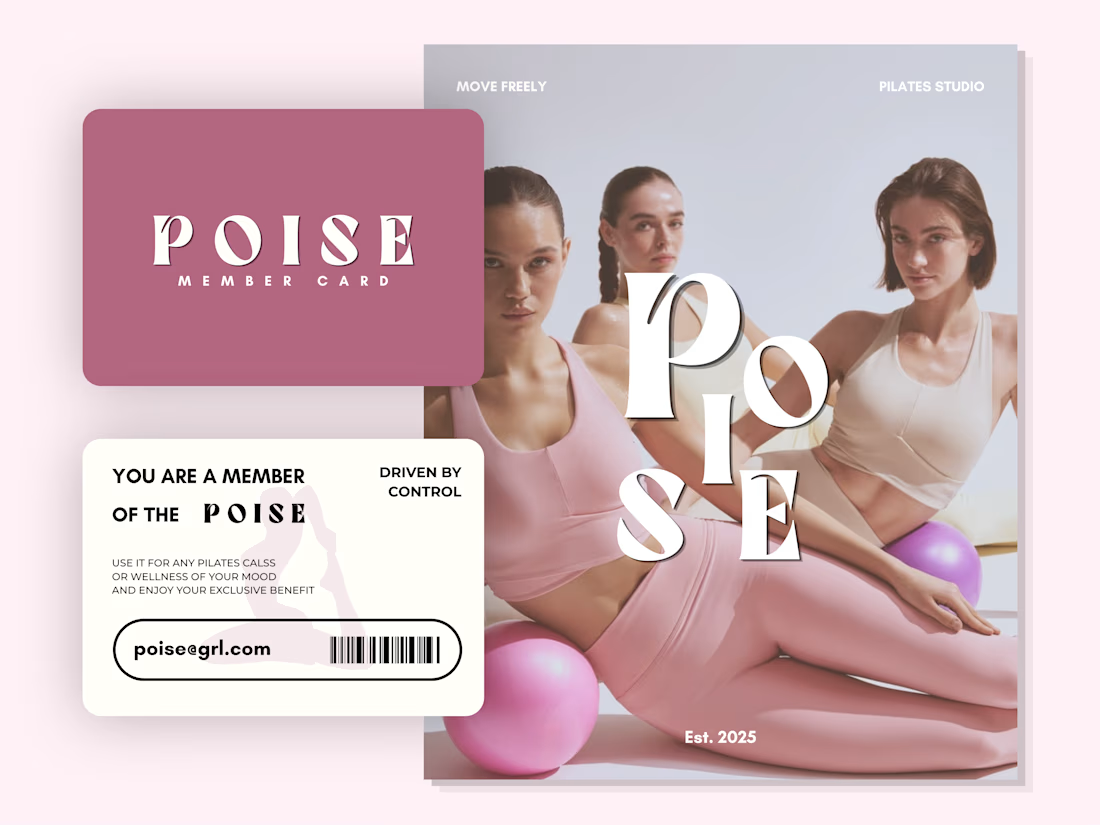
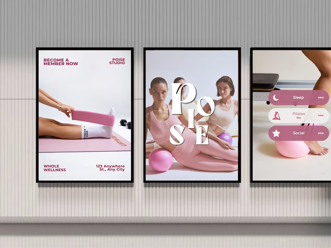
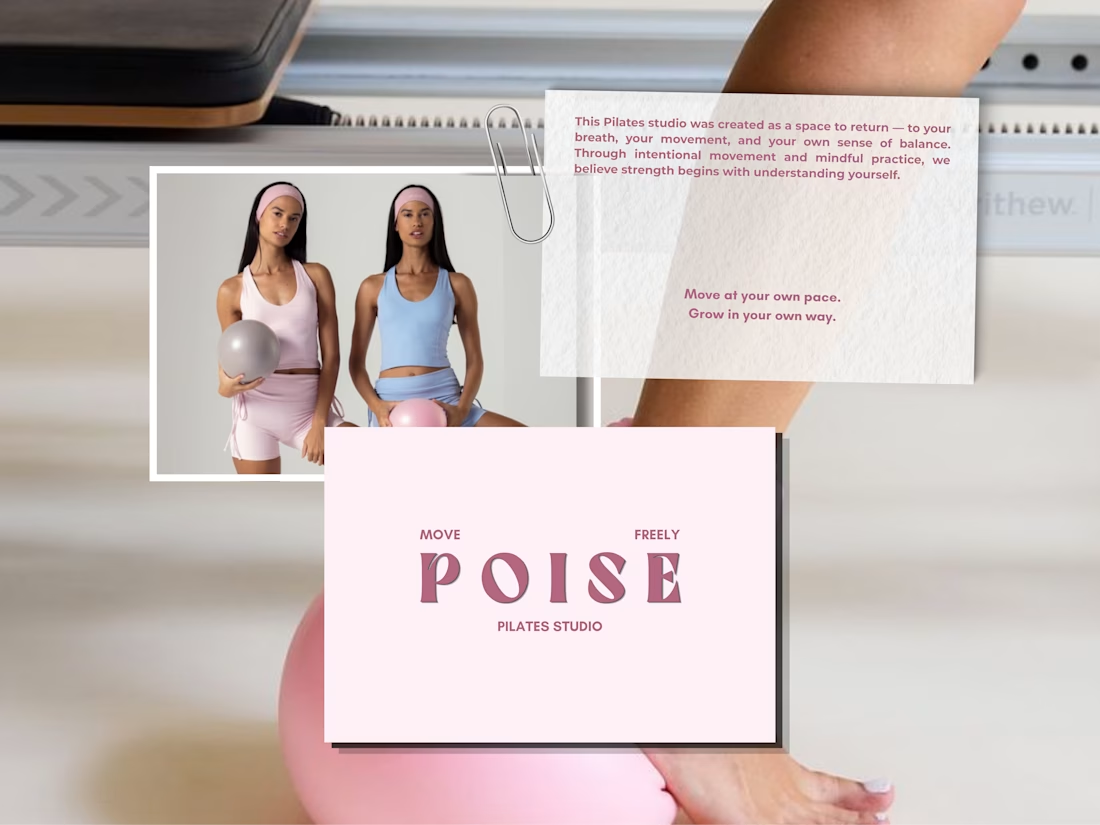
The way the soft blush pink sits against those confident serif letterforms really sells the whole idea. Strength meets softness is not just a tagline here, you can feel it in every tile. The membership card mockup is my favorite detail. Did you build the system around the typography first, or did the color palette lead?