The network for creativity
Join 1.25M professional creatives like you
Connect with clients, get discovered, and run your business 100% commission-free
Creatives on Contra have earned over $150M and we are just getting started
Back to feedPost
The Wychford Club is a private country club identity built around heritage, sport, wellness, dining and a strong sense of belonging. The visual direction combines a timeless club emblem, refined typography and candid lifestyle imagery to create a brand that feels established, understated and genuinely lived-in.
#LuxuryBranding #CountryClub #VisualIdentity
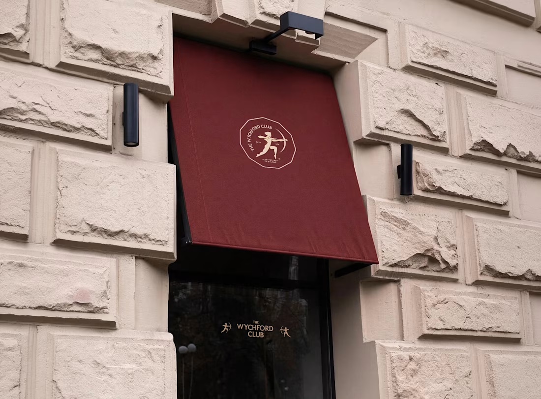
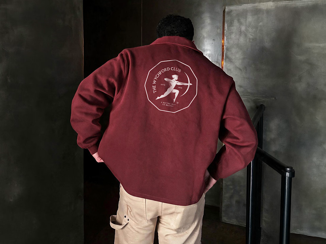
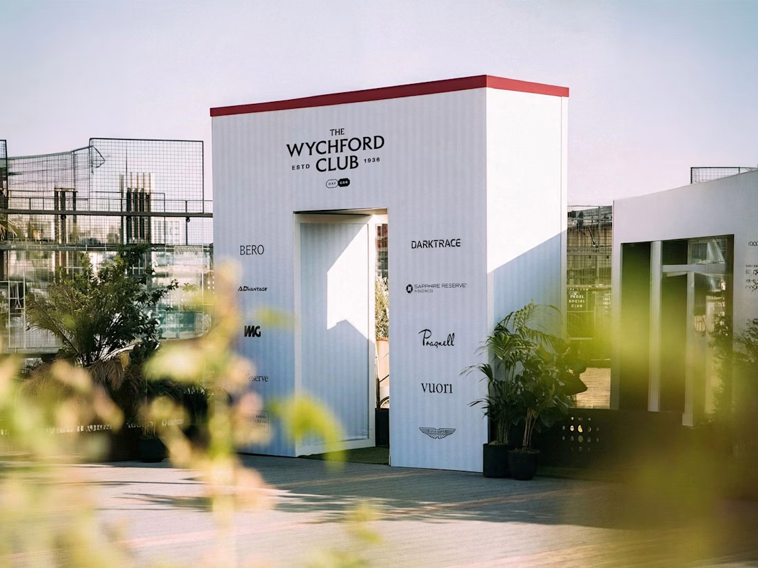

Heritage marks are hard because "established" has to read as inherited rather than drawn last month, and the candid photography seems to be doing most of that work here. Did the emblem come first, or did you lock the imagery direction before designing it?

That’s a good point. The emblem came first, but I already had a clear sense of the world the brand needed to live in. I wanted the mark to feel established without making it overly decorative or artificially vintage. The candid photography then became an important part of giving...
The network for creativity
Join 1.25M professional creatives like you
Connect with clients, get discovered, and run your business 100% commission-free
Creatives on Contra have earned over $150M and we are just getting started





Related posts

Solene: skincare e commerce website, built in Framer
Skincare shopping should feel as good as the routine itself. For Solene, I designed and built a full online store with a soft, warm identity: a bold maroon and pink palette, big expressive type and real-skin photography.
What's inside:
A hero that sets the brand tone straight away
A Bestsellers section for quick browsing
Category pages for Cleanse, Hydrate and Protect
A shop page with price slider, filters, sorting and hover image previews
An Our Story page with brand values
A clean, confident footer
Need a website for your beauty or lifestyle brand? Let's talk.


The hover image previews on the shop page caught my eye - they let shoppers sense texture instantly without an extra click.

Very well looking composition, good sinergy

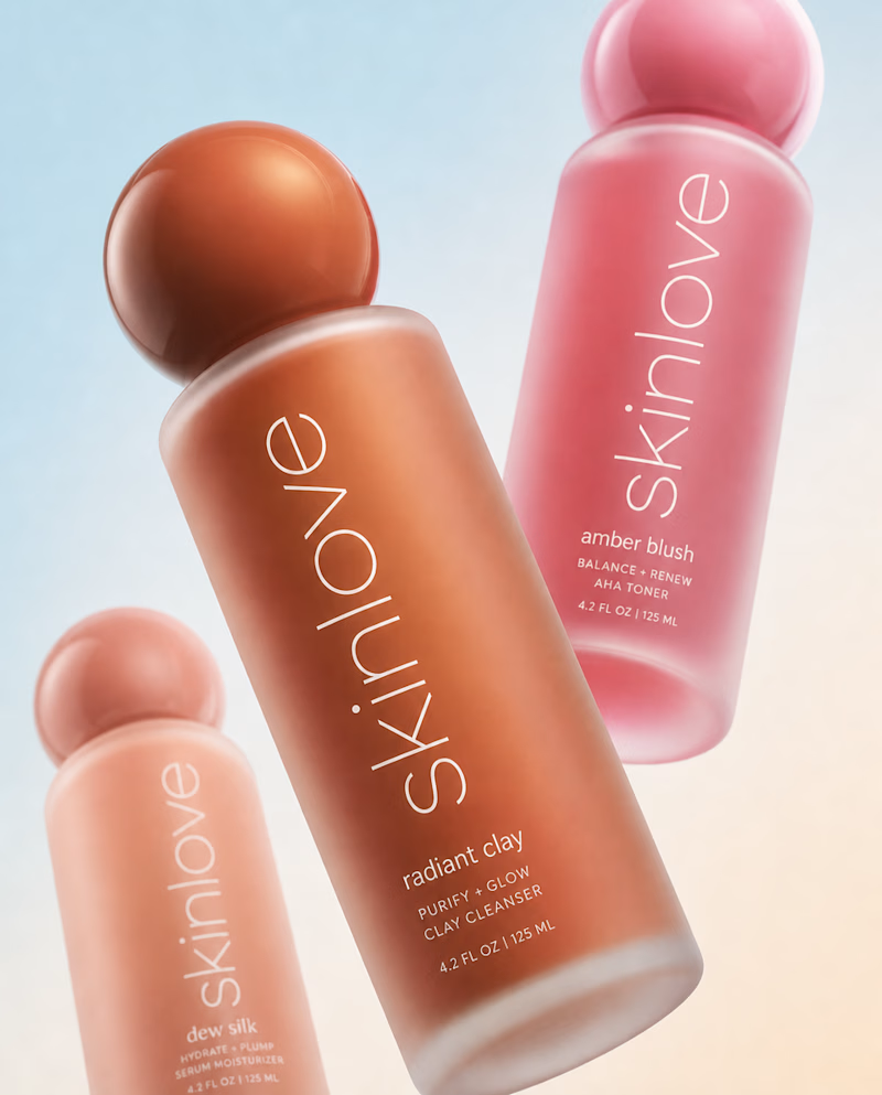
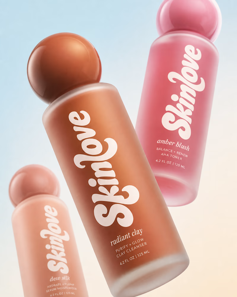
Safe or bold, which one actually makes you stop scrolling? 🤔
Sans: the serif, tight tracking, one accent color playbook every skincare brand is running right now.
Bold: the same idea, redesigned with attitude. 💅
25 voted
32%
53 voted
68%
78 votes
Closed

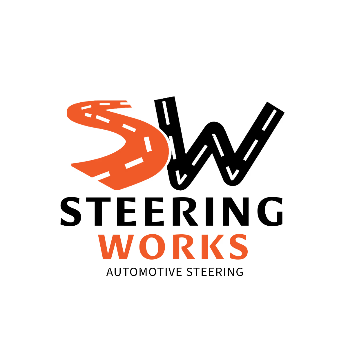
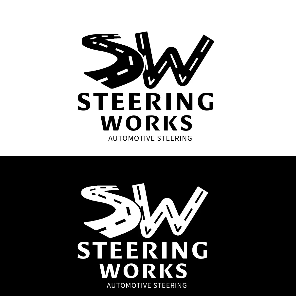
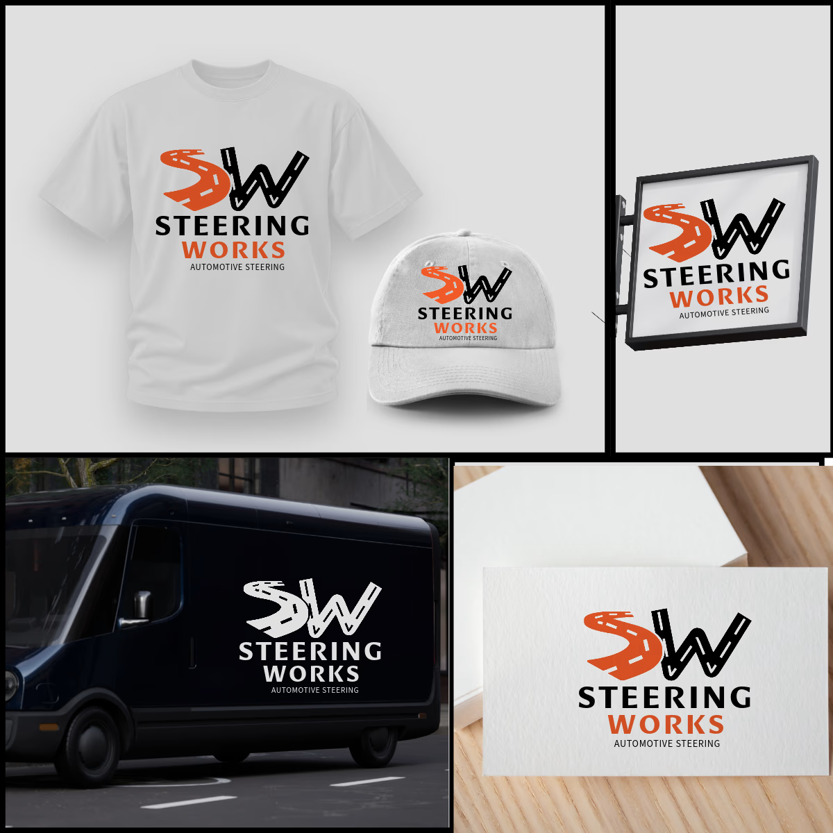
SW logo where S and W are winding roads, inspired by windy road sign idea. The orange S adds energy, black W adds strength. As shown, the design is highly adaptable and works perfectly on t-shirts, caps, van graphics, shop signage, and business cards in both color and single-color white. Strong, memorable, and built for automotive enthusiasts.



That's very attractive great job bro 🎉🎉🔥🔥