The network for creativity
Join 1.25M professional creatives like you
Connect with clients, get discovered, and run your business 100% commission-free
Creatives on Contra have earned over $150M and we are just getting started
Back to feedPost


Nice!

Fire!

The motion treatment gives the dashboard a much stronger sense of product polish—the restrained dark UI lets the status colors carry the hierarchy. I especially like how the animated metrics make the system feel alive without turning the data into decoration.

Dark dashboards live or die on how the accent colors read against all that black, and this one's readable at a glance. Was Claude doing the layout logic here, or mostly helping you iterate the visuals once Figma had the structure down?


the green dashboard cards look so good in motion
The network for creativity
Join 1.25M professional creatives like you
Connect with clients, get discovered, and run your business 100% commission-free
Creatives on Contra have earned over $150M and we are just getting started





Related posts


One of our favorite & most challenging parts of product video is figuring out how much someone actually needs to see to understand the product
That’s where motion and pacing do a lot of the work: guiding your attention and giving each step enough room to make sense.
Here’s our latest video for evolv, made by the VAAS team.

The glow on the Vee button draws the eye before the UI even appears. Nice pacing for a 1 minute product video.

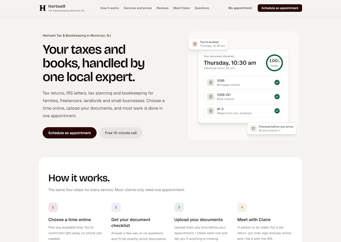
I spent the last few days on the @Lovable challenge, and I picked a business I think about every tax season: the one-person tax office.
Mine is called Hartwell Tax & Bookkeeping, in Montclair, NJ. Claire Hartwell runs it alone. No front desk, no assistant, and two crazy rushes a year. Her real problem isn't the taxes. It's everything around them: phone tag just to set a time, clients who show up without half their documents, and no-shows that leave an hour she never gets back.
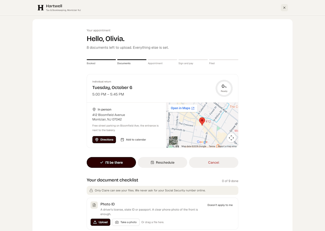
So I built her a system where a client can go from "can I book with you?" to "you're booked" in about two minutes, at 10 p.m., without calling anyone. They see real open times, pick in person or video, and answer a few quick questions that tell them exactly what to bring.
After that, Claire doesn't chase anyone. The confirmation, calendar invite and video link go out on their own. So do the reminders about missing documents, the offer to move to a later time if someone isn't ready, the message to the waitlist when a slot opens, and the nudge when someone starts booking and doesn't finish. She opens one screen in the morning and only sees what actually needs her.
You can also try it yourself. Test with your own email and the real emails will land in your inbox: https://hartwell-tax-bookkeeping.lovable.app
To see owner's side visit here.
There's a built-in demo mode that fills her week with sample clients in every stage, and a phone preview that shows every email exactly as the client gets it.
Built entirely in Lovable. #lovablechallenge


Amazing!!!