The network for creativity
Join 1.25M professional creatives like you
Connect with clients, get discovered, and run your business 100% commission-free
Creatives on Contra have earned over $150M and we are just getting started
Back to feedPost

Motion Graphic 1: “The Apple Brand Playbook”
Title: Brand Strategy Explainer: Kinetic Typography Motion Graphic
Short description (for project cards):
A 64-second kinetic typography video that breaks down the brand strategy behind Apple and turns it into six lessons for a new brand.
Full description:
I designed and animated this explainer to show how complex brand strategy can become clear, watchable content. The video has two parts. The first covers six strategies behind Apple’s brand: simplicity, emotion over specs, ecosystem, design, premium positioning and controlled storytelling. The second turns the same ideas into six practical moves for a startup.
What I handled:
Script structure and message hierarchy, from long strategy ideas down to short, memorable lines
Typography system built on one typeface family with strong weight contrast
Motion design: staggered word reveals, eased movement, smooth scene transitions and an on-screen progress bar
Color system with one accent color per message, on a clean dark background
Specs: 1920×1080, 30 fps, MP4 (H.264), about 64 seconds, no audio
Best for: brand agencies, startup pitch decks, LinkedIn and YouTube educational content, course intros, social media explainers

The network for creativity
Join 1.25M professional creatives like you
Connect with clients, get discovered, and run your business 100% commission-free
Creatives on Contra have earned over $150M and we are just getting started











Related posts


Three weeks into building the Pasted website, after the design was approved, an 11-page document arrived with a whole new vision.
It was beautiful work, and it described a different project at the agreed price.
I asked them to decide: keep the approved scope, or pause and price the new idea separately. On day six, they chose the original. We shipped two weeks later.
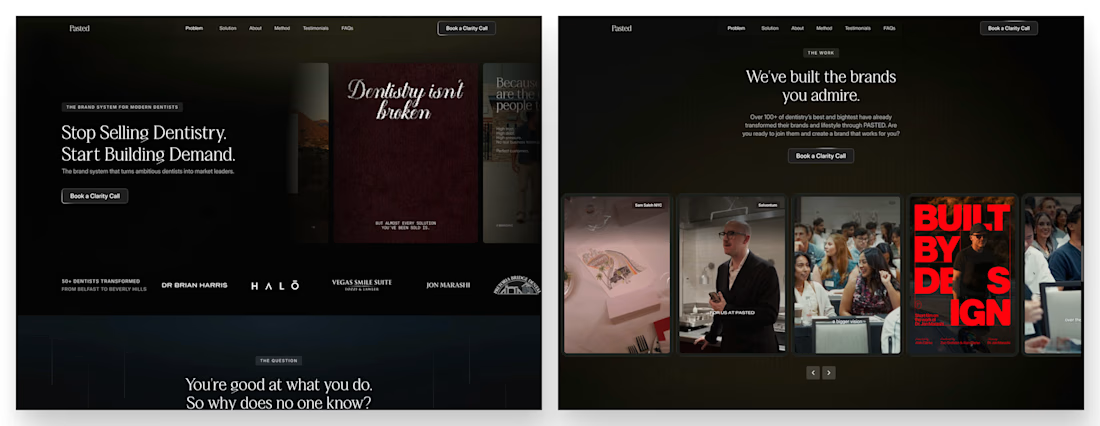

Offering to price the new vision as its own phase also lets the client see what the idea costs without it feeling like a no. Was a change-order process already written into your contract, or did you build that path on the spot?


Mastering Claude + Figma MCP has been a process, but it’s already made iterating on brand assets significantly faster

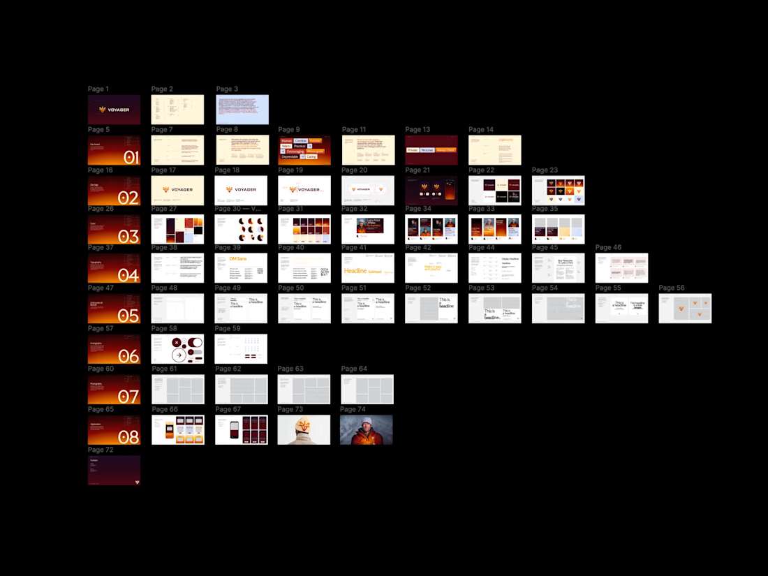

Same here, once it clicks the iteration speed is wild. Would be cool to see how you set up your workflow.

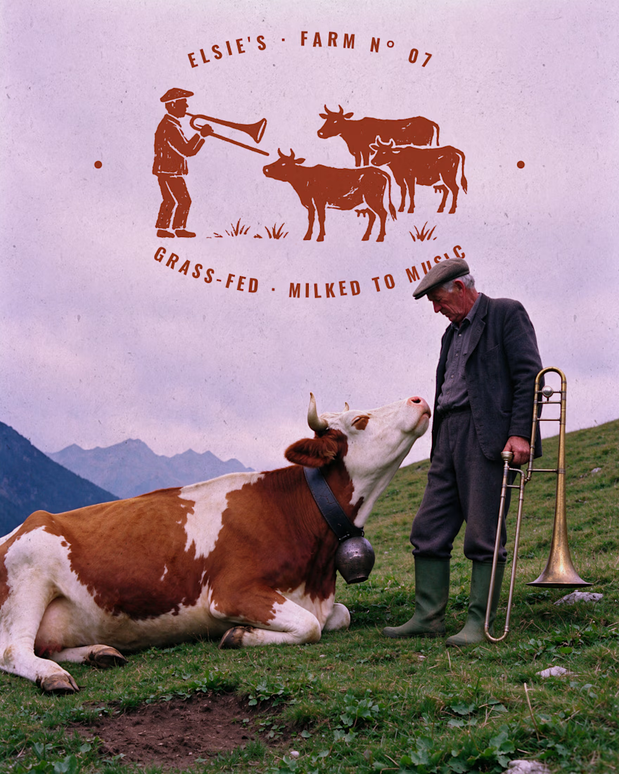
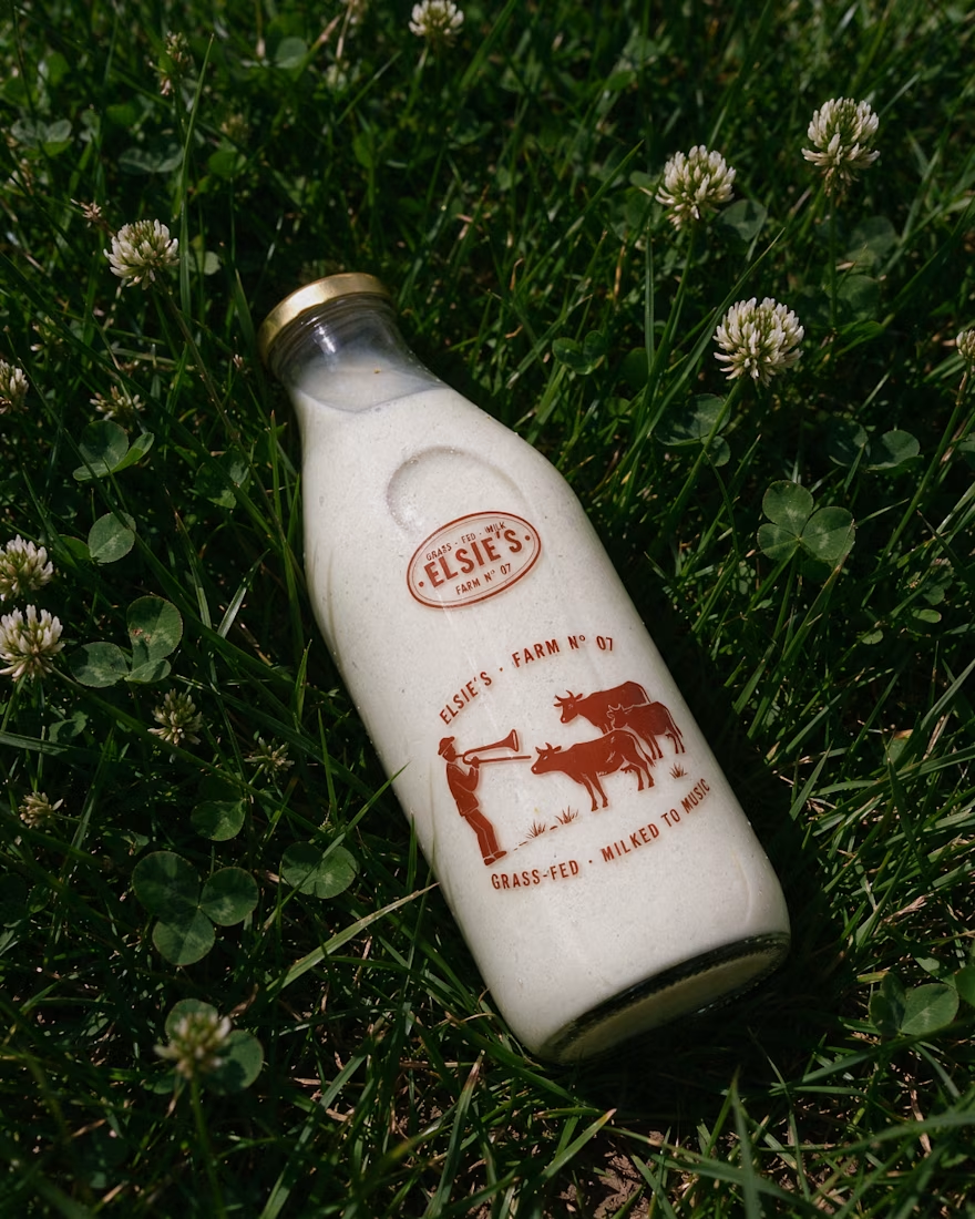
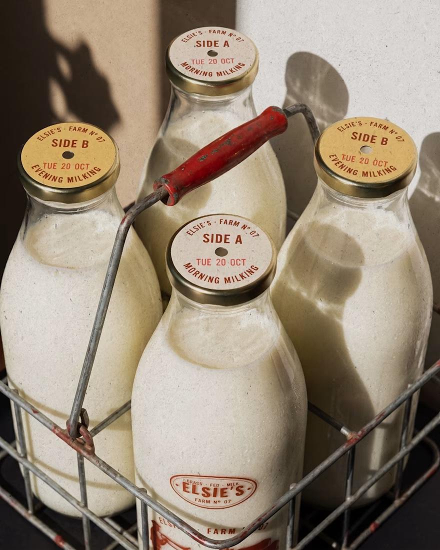
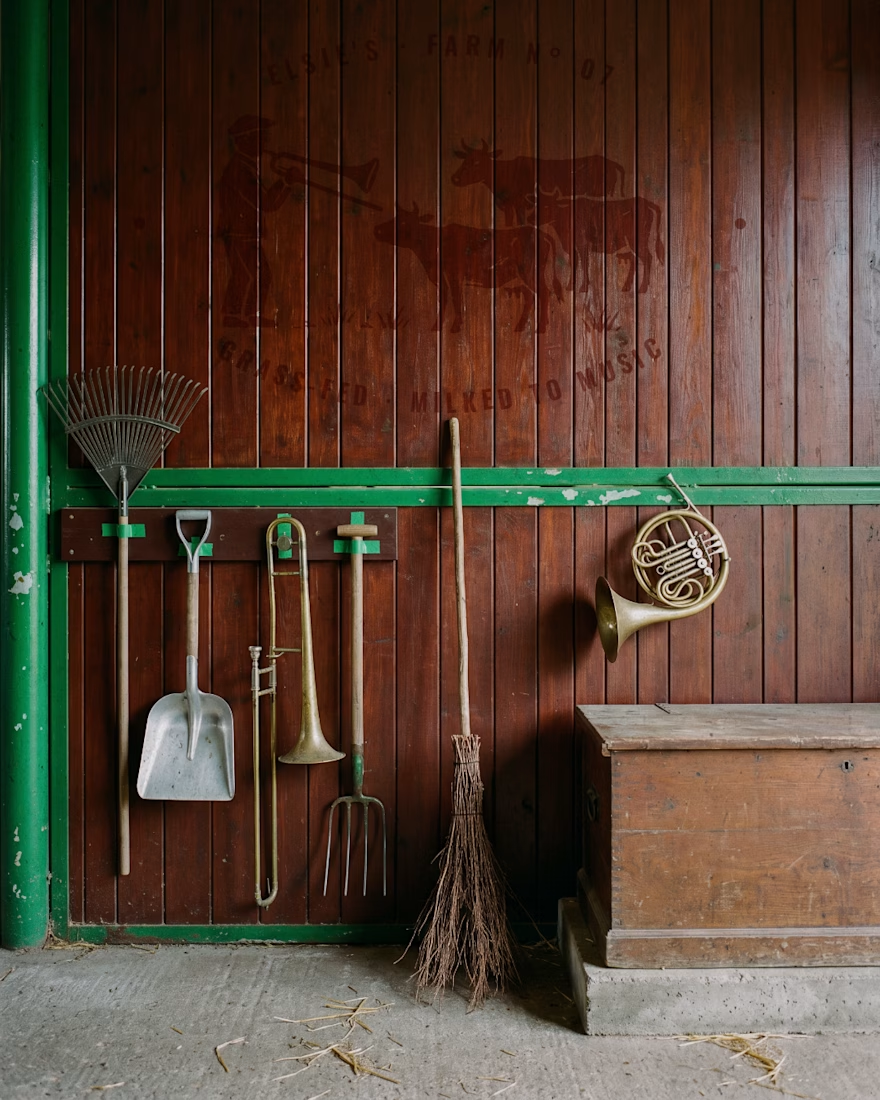
Elsie's: brand identity and packaging for the @designerbriefs weekly challenge (Brief 183). An organic milk brand from very happy cows who love fresh grass and good music.
The logo comes from the brass name plates farmers fixed to their milk cans, with every letter struck by hand. Then came a stamp-style illustration of a farmer playing to his herd, and a returnable glass bottle printed in barn red. All the imagery was made with my Augmented Art Direction process: AI as the tool, art direction and Photoshop retouching to finish every image by hand.
What song would you play to Elsie's cows? 🎺🐄




great work andreu