The network for creativity
Join 1.25M professional creatives like you
Connect with clients, get discovered, and run your business 100% commission-free
Creatives on Contra have earned over $150M and we are just getting started
Back to feedPost
Sayless | Smart Home & AI Website Design 💻
These are the three pillars I got to work with on the Sayless project, and honestly, it's one of my favorite intersections in design right now.
Designing for the smart home and automation space is a unique challenge. You're translating invisible technology into something people can feel, understand, and trust. The product is complex. The communication has to be simple.
For Sayless, I led the project from research to launch, competitor analysis, user flow mapping, wireframes, and final design. The goal was clear: a website that doesn't just look good, but actually works as a business tool.
This is the kind of project that reminds me why I love what I do. 🖤
#SmartHome #WebDesign #AIAutomation #UXDesign #BusinessAutomation #ProductDesign


This is exceptional work! You’ve perfectly balanced complex, invisible tech with a minimal, high-end visual aesthetic. It looks polished, professional, and completely seamless! 🔥🙌


Thank you for your warm words 😍 😊

Kateryna, its awesome!!! 🔥 Always in love with your designs 😍 😍 😍
Thank you so much 😍 😍

Love this. The hardest part is rarely the interface itself — it's making complex technology feel understandable and trustworthy to real people.
Thank you sooo much 😍

Great work, Kateryna🔥
Thank you))


Kateryna, we're absolutely in love with your work! 🔥 🚀
So smooth and polished, pleasant to the eye
Thank you so much, that's very kind of you! 😍

So perfect! 😻 🐐🔖
Thank youuu😍


Such an amazing result, love how it turned out! 🔥
Thank you so much 😍

Awesome! 🤩

This is an amazing concept.
As someone into Automation and lover of home design processes....love itttt


Nice work!👍

u got my goat, nice work

Translating 'invisible tech' into something human and trustworthy is such a tough challenge, but you absolutely nailed it! 🏡 Loving the clean vibes on this!
The network for creativity
Join 1.25M professional creatives like you
Connect with clients, get discovered, and run your business 100% commission-free
Creatives on Contra have earned over $150M and we are just getting started



Related posts

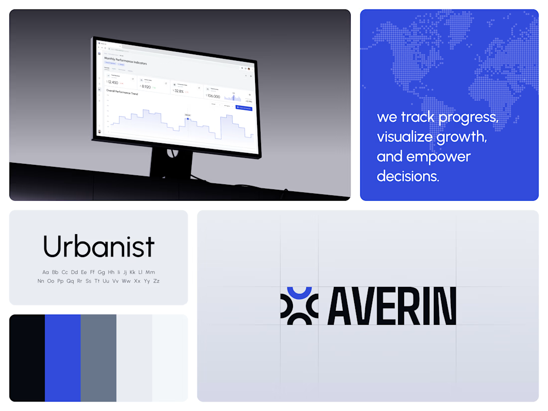
AI Analytics Dashboard
One blue runs from the logo to the chart line.
Revenue, active users, conversion rate and income sit in a row of cards above the trend chart. The cards answer where the numbers stand. The stepped line answers how they got there, holding each period's value until the next, with a tooltip on a dashed guide line for the exact figure.
The identity pairs a four-arc mark with a condensed wordmark, drawn to the same top and bottom lines on the construction grid. The top arc's blue comes back in the slogan tile, the chart line and the main button, so the brand and the product share one accent.
Designed by the Hue & Machine team.
#DashboardDesign #DataVisualization #SaaS #Analytics #AI #WebApp #BrandIdentity #UIDesign #ProductDesign #FigmaDesign



Really liked how these designs turned out!
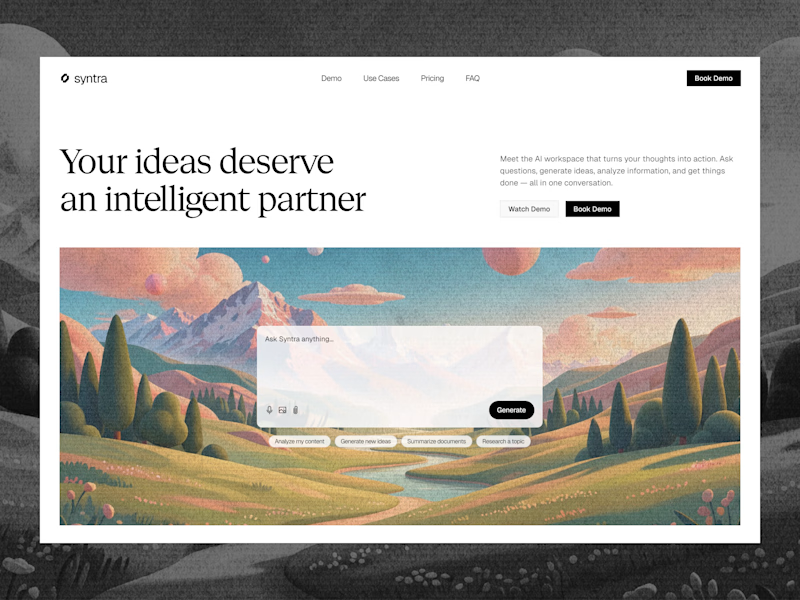
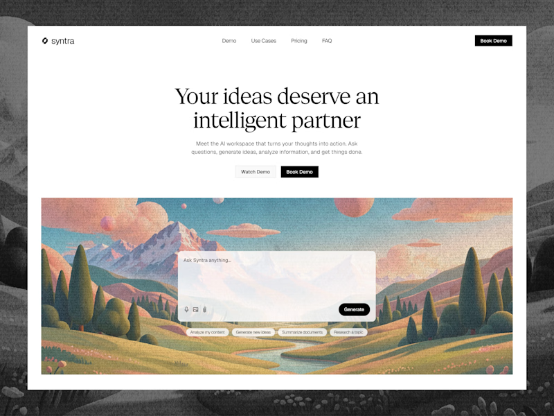
Explored a concept for AI SaaS product, focusing on a clean interface and a simple, intuitive chat experience.
Tried two different layout variation for the hero section.
Which would you like?
13 voted
57%
10 voted
43%
23 votes
Closed

Really clean concept! 👏
I like the second layout more — the headline "Your ideas deserve an intelligent partner" + the chat preview below makes the AI feel real and easy to use immediately. The first one is also clean, but this one sells the product faster.
I also design SaaS...


Still looking for a web designer so help us out by applying 😅


