The network for creativity
Join 1.25M professional creatives like you
Connect with clients, get discovered, and run your business 100% commission-free
Creatives on Contra have earned over $150M and we are just getting started
Back to feedPost

Canned Tuna Packaging Design | Modern Food Branding & Label
Modern canned tuna packaging with bold typography, minimalist graphics and a shelf-ready label system created for a contemporary seafood brand.
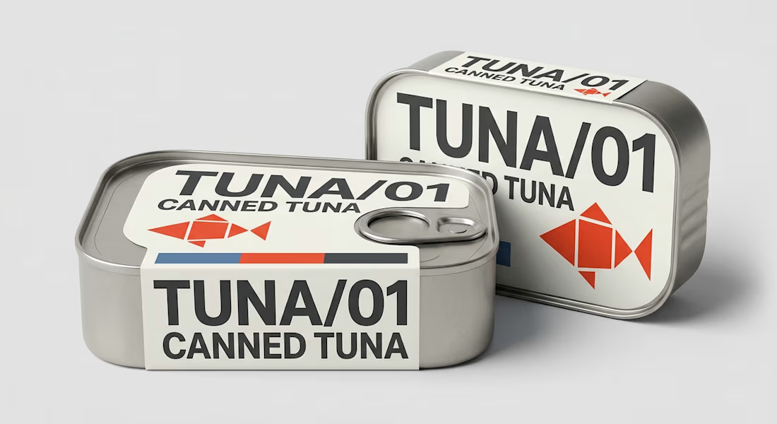
TUNA/01 is a contemporary canned tuna packaging design created around one clear objective: make a simple everyday food product instantly recognizable on a crowded retail shelf. Instead of following traditional seafood packaging filled with realistic fish imagery, ocean graphics and decorative elements, this concept uses bold typography, geometric forms and a highly controlled visual system to create a distinctive modern identity.
The packaging is built around a compact rectangular metal can with an easy-open pull-tab lid. A clean cream label system contrasts against the exposed brushed metal, giving the product an industrial yet refined appearance. The oversized TUNA/01 typography becomes the main branding element, allowing the package to remain recognizable even when viewed quickly or from a distance.
A geometric red fish symbol provides an immediate connection to the seafood category without competing with the typography. Restrained red and blue accents add visual energy while keeping the overall food packaging design simple, contemporary and commercially believable.
One of the key considerations behind this project was creating a flexible canned food branding system that could work across both the front-facing label and top panel of the container. This gives the product visibility whether cans are displayed upright, stacked or arranged horizontally on supermarket shelves.
The concept demonstrates how strategic packaging design and brand identity can transform a familiar commodity into a more recognizable retail product. Rather than relying on excessive graphics, every element has a specific function: the typography establishes hierarchy, the fish symbol communicates the product category, the color system improves recognition, and the exposed metal reinforces the canned-food format.
This project showcases my capabilities in canned food packaging, tuna packaging design, seafood packaging, food label design, FMCG packaging and retail packaging design. Particular attention was given to label proportions, information hierarchy, typography, container structure and realistic presentation so the final concept feels appropriate for real commercial production rather than simply a decorative mockup.
The TUNA/01 identity could also be expanded into a complete canned seafood range, with variations for tuna in olive oil, tuna in spring water, salmon, sardines, mackerel and other preserved foods while maintaining the same recognizable brand architecture.
For food brands and FMCG businesses, I can develop complete packaging solutions including food packaging design, product label design, canned food labels, packaging artwork, brand identity, print-ready files, dielines and realistic 3D packaging mockups.
The final result is a bold, minimalist canned tuna package designed to achieve strong shelf recognition while remaining practical, scalable and commercially relevant.TUNA/01 is a contemporary canned tuna packaging design created around one clear objective: make a simple everyday food product instantly recognizable on a crowded retail shelf. Instead of following traditional seafood packaging filled with realistic fish imagery, ocean graphics and decorative elements, this concept uses bold typography, geometric forms and a highly controlled visual system to create a distinctive modern identity.
The packaging is built around a compact rectangular metal can with an easy-open pull-tab lid. A clean cream label system contrasts against the exposed brushed metal, giving the product an industrial yet refined appearance. The oversized TUNA/01 typography becomes the main branding element, allowing the package to remain recognizable even when viewed quickly or from a distance.
A geometric red fish symbol provides an immediate connection to the seafood category without competing with the typography. Restrained red and blue accents add visual energy while keeping the overall food packaging design simple, contemporary and commercially believable.
One of the key considerations behind this project was creating a flexible canned food branding system that could work across both the front-facing label and top panel of the container. This gives the product visibility whether cans are displayed upright, stacked or arranged horizontally on supermarket shelves.
The concept demonstrates how strategic packaging design and brand identity can transform a familiar commodity into a more recognizable retail product. Rather than relying on excessive graphics, every element has a specific function: the typography establishes hierarchy, the fish symbol communicates the product category, the color system improves recognition, and the exposed metal reinforces the canned-food format.
This project showcases my capabilities in canned food packaging, tuna packaging design, seafood packaging, food label design, FMCG packaging and retail packaging design. Particular attention was given to label proportions, information hierarchy, typography, container structure and realistic presentation so the final concept feels appropriate for real commercial production rather than simply a decorative mockup.
The TUNA/01 identity could also be expanded into a complete canned seafood range, with variations for tuna in olive oil, tuna in spring water, salmon, sardines, mackerel and other preserved foods while maintaining the same recognizable brand architecture.
For food brands and FMCG businesses, I can develop complete packaging solutions including food packaging design, product label design, canned food labels, packaging artwork, brand identity, print-ready files, dielines and realistic 3D packaging mockups.
The final result is a bold, minimalist canned tuna package designed to achieve strong shelf recognition while remaining practical, scalable and commercially relevant.


The network for creativity
Join 1.25M professional creatives like you
Connect with clients, get discovered, and run your business 100% commission-free
Creatives on Contra have earned over $150M and we are just getting started











Related posts

15 seconds of smooth UI, editorial layouts, and micro-interactions.
Kept the micro-interactions snappy, typography expressive, and transitions buttery smooth.
Rate this UI animation from 1 to 10 in the comments, or tell me what you’d improve! 😉


Solid 10/10 bro! 🔥 Micro-interactions are super snappy and transitions are buttery smooth indeed. Editorial layout game is strong. Keep it up!


😍

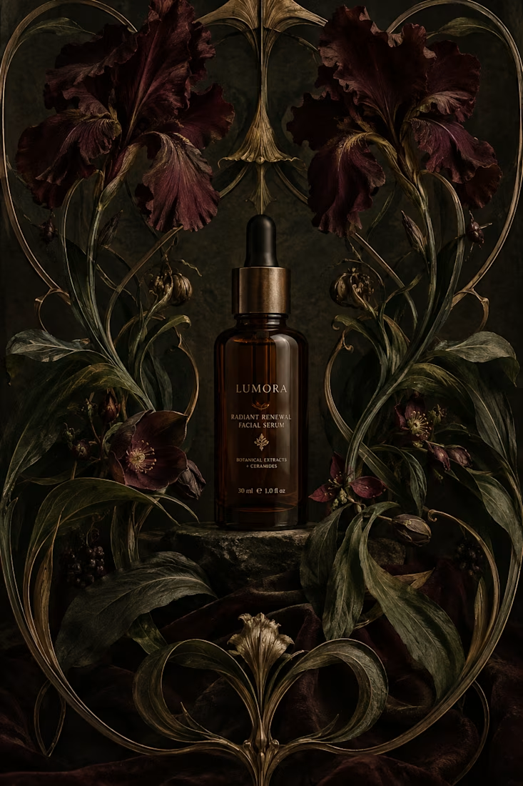
What would happen if a modern skincare product had to communicate without the visual language we associate with beauty today?
Instead, I went back to Art Nouveau, where typography, illustration, architecture, and ornament were treated as one visual system.
The subject actually...



thanks for sharing!

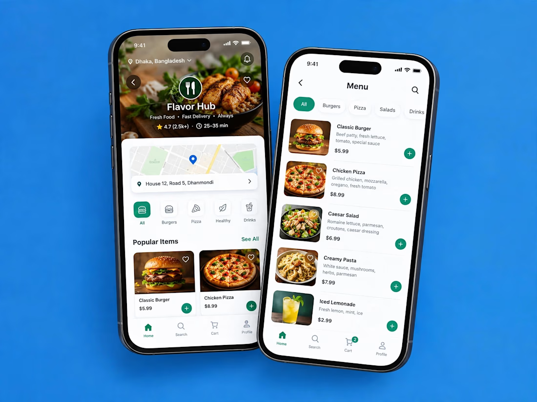
A clean and modern food delivery app concept designed with a focus on simple navigation, clear layouts, and a smooth user experience.
Designed in Figma.

Love how clean and intuitive this feels, the navigation looks super smooth and the layout is really well balanced