The network for creativity
Join 1.25M professional creatives like you
Connect with clients, get discovered, and run your business 100% commission-free
Creatives on Contra have earned over $150M and we are just getting started
Back to feedPost
Make Your Choice is a speculative running/fitness ad created between two friends who love being creative and trying new things. I was behind the camera and edit and my friend @ponomaribo was the main man! Bo came to me with some ideas to try and shoot this and another sports ad type video following some of our previous collaborations and of course I immediately jumped to the opportunity.
For this I used my trusty Fujifilm X-H2S with the main lens being the XF16-55mm f2.8 and the XF56mm f1.2 for the last shot. I tend to always use Dehancer for my base color grade and film emulation, with my grade and balancing on top. Utilising lots of the new magic masks in DaVinci Resolve. I’ll share some of my Dehancer choices in the future blog post.


aw thank you Ciro! I had a lot of fun with and I feel the words have strong meaning for me.
The network for creativity
Join 1.25M professional creatives like you
Connect with clients, get discovered, and run your business 100% commission-free
Creatives on Contra have earned over $150M and we are just getting started







Related posts

for my "3rd" submission i wanted to explore more with the 4-Stepped bar effect with @Invideo , so i made this nice edits
i had different clips i compiled in a compilation video, then placed the effect on the clips to make this edit.
how i did it? (check the comment section below, for my workflow)
Vicky, my Agent Two AI built the bar effect, then i told Vicky to place the bar effect on the first 2 seconds of every incoming clips
i prompted Vicky to build the bars in a rectangular-horizontal box,. with rounded corners.
i also told Vicky to add the SFX Sound you hear as the Bars lands/reveals, and i loved how that sounds lands alongside the bar effect.
❤️my first Contra submission - https://on.contra.com/zkgcpj
❤️my second Contra submission - https://on.contra.com/RdBPjt
N/B: Agent Two, created everything about this video,.. the only thing i did was upload the clips, trim each clips, and added the background song
👉my workflow is in the comment section, check it out to know how i made this edit

here's my workflow of how i made the above video edit in Invideo Editor

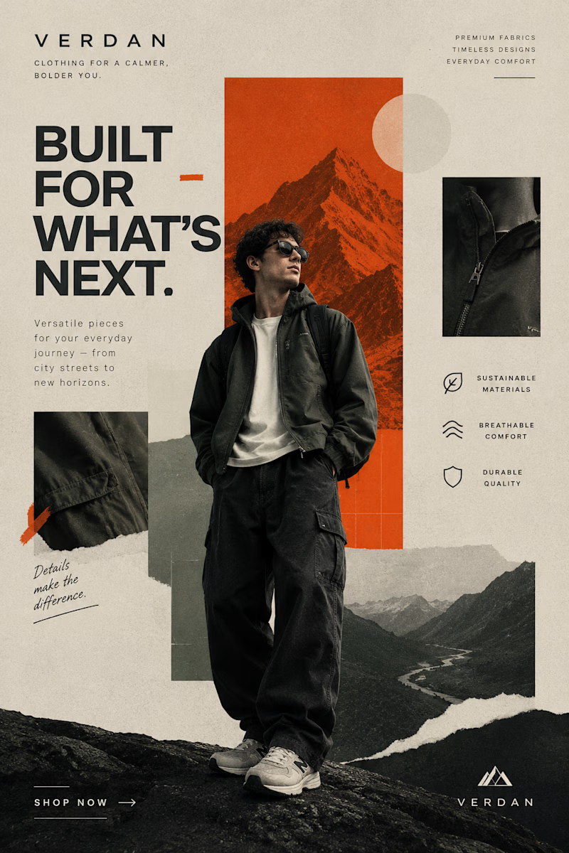
Two Brands. Two Completely Different Creative Directions. 🎨
A brand’s visual identity can change everything about how its products are perceived.
✨ Option A: Cinematic Minimalism — elegant, refined, and luxurious.
🔥 Option B: Modern Editorial Collage — bold, expressive, and adventurous.
Both styles tell a different story, but which one captures your attention?
Vote A or B in the poll and tell me what makes your choice stand out!
Need eye-catching advertisement designs for your brand, product, or social media campaign? I create custom ad creatives tailored to your brand’s identity, audience, and goals.
Have a project in mind? Explore my services on Contra and let's bring your ideas to life.
1 voted
14%

6 voted
86%
7 votes
Closed

Modern Collage is tough 💪🏽

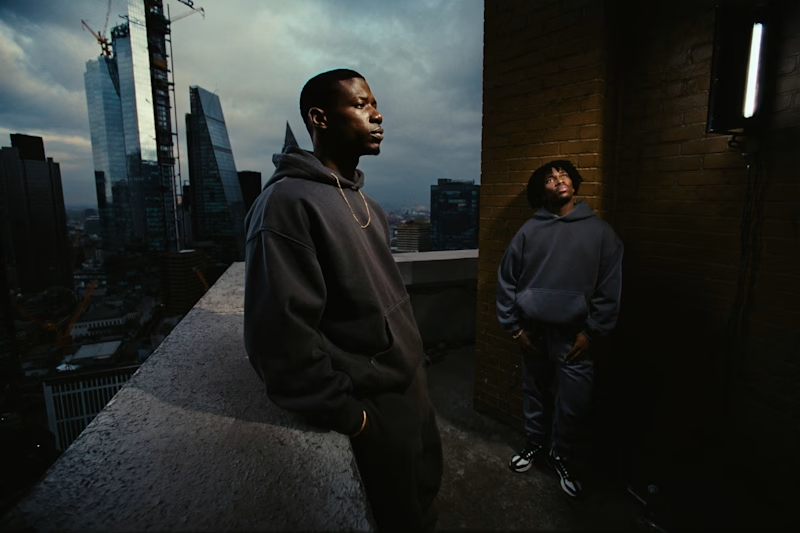
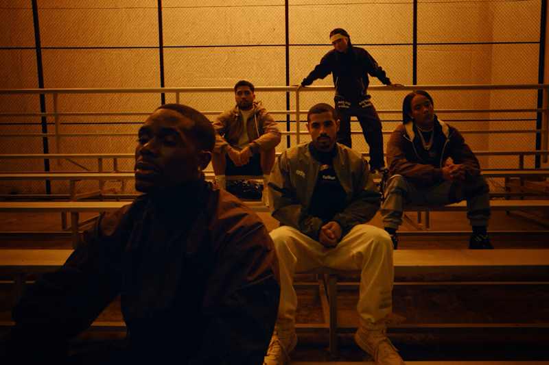

Rooftop Blues is more attractive it hits 🎉😎