The network for creativity
Join 1.25M professional creatives like you
Connect with clients, get discovered, and run your business 100% commission-free
Creatives on Contra have earned over $150M and we are just getting started
Back to feedPost

Another one in the books with Da Sh, and the kind words mean a lot.
RECOMMENDED
“I love working with him. He is fast, communicates well, kind, and really good at his job. Looking forward to working with him some more.”

Da Sh
The network for creativity
Join 1.25M professional creatives like you
Connect with clients, get discovered, and run your business 100% commission-free
Creatives on Contra have earned over $150M and we are just getting started



Related posts

A little attitude, a little chaos, and a whole lot of DANDY.
Created this editorial carousel series for DANDY, blending bold, unconventional typography with cinematic food and cocktail photography. The idea was to make every frame feel like a statement rather than just another menu showcase.
Played around with oversized type, experimental layouts, dramatic lighting, playful copy, and striking compositions, giving each dish and drink its own personality while keeping the entire series visually connected.
Less like a regular food campaign. More like DANDY being DANDY.


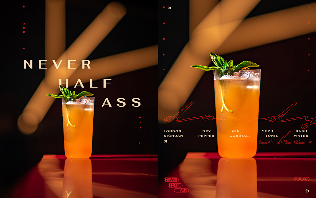
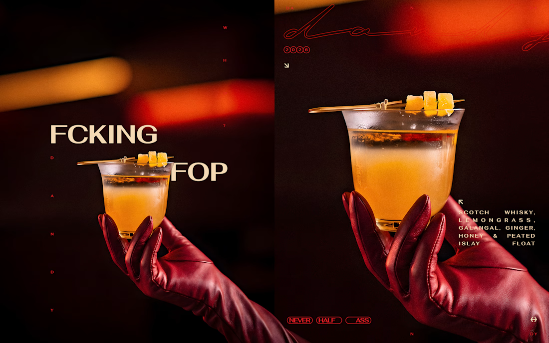
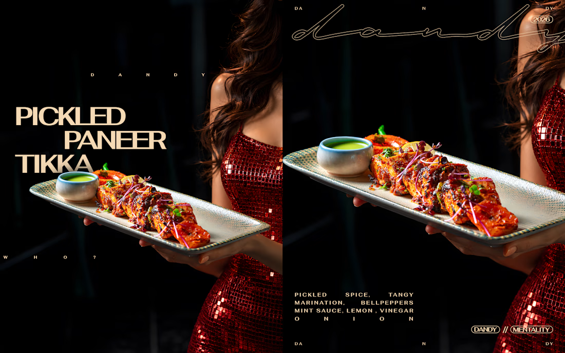
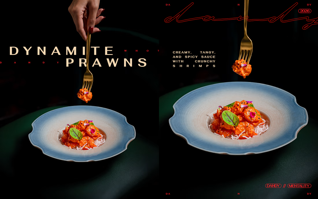

Cropping the type tight against the glossy photography gives each frame its own tension. Did you set the type first and crop the photos to it, or fit the type to each image afterwards?

This is a big milestone. Congratulations🎉


Thoughtful concept and excellent execution.

🌸When Lord Rama returned to Ayodhya after 14 years of exile and his victory over Ravana, thousands of diyas lit up to welcome him home.
🌟Lord Rama won over darkness. Let human imagination shine brighter than algorithms.
May your year be full of bright frames and beautiful moments. Happy Diwali to this wonderful Contra community. 🪔🙏
