The network for creativity
Join 1.25M professional creatives like you
Connect with clients, get discovered, and run your business 100% commission-free
Creatives on Contra have earned over $150M and we are just getting started
Back to feedPost

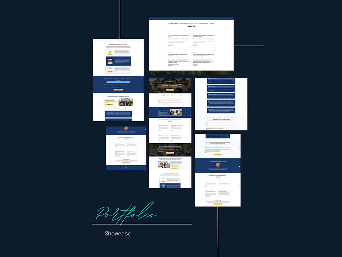
Designed and built a full sales funnel page for a home services subscription business targeting homeowners tired of chasing multiple contractors for repairs and maintenance.
The page was structured around a core pain point — what I framed as the "Vendor Vortex" — and positioned the client's one-call system as the obvious solution.
What went into it:
Trust-heavy design using a clean blue and gold palette suited to the home services industry
Problem-framing section to identify the homeowner's frustration with managing multiple vendors
Social proof section with real homeowner testimonials placed early to build credibility fast
Three-tier subscription pricing layout ($99 / $199 / $299) with a clear "most popular" option to guide decisions
Feature breakdown of exactly what subscribers get — reducing doubt before purchase
Scarcity element: limited monthly service spots to create urgency
100% money-back guarantee section to eliminate risk
Strong CTAs throughout pushing toward a single conversion action
Built on Systeme.io with full mobile optimization
The objective was to turn skeptical homeowners into paying subscribers through a clear, trust-first structure that handled every objection before the pricing section.


The network for creativity
Join 1.25M professional creatives like you
Connect with clients, get discovered, and run your business 100% commission-free
Creatives on Contra have earned over $150M and we are just getting started





Related posts

I’ve always liked products that solve a very specific problem instead of trying to do everything.
So for the Lovable Challenge, I picked a simple question that event-tent rental businesses hear all the time:
“Can I book a tent for my wedding?”
The problem is… a tent can’t really be booked until you know if the whole event will work.
How many guests?
How much usable space?
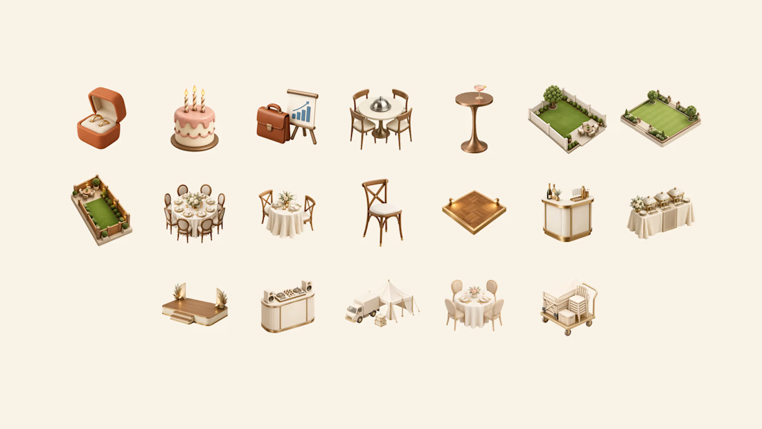
Tables? Dance floor? Bar? Stage?
Will the layout actually fit?
Can the crew set it up and pick it up on time?
Usually, the owner has to figure all of that out manually through messages, calls and calendar checking.
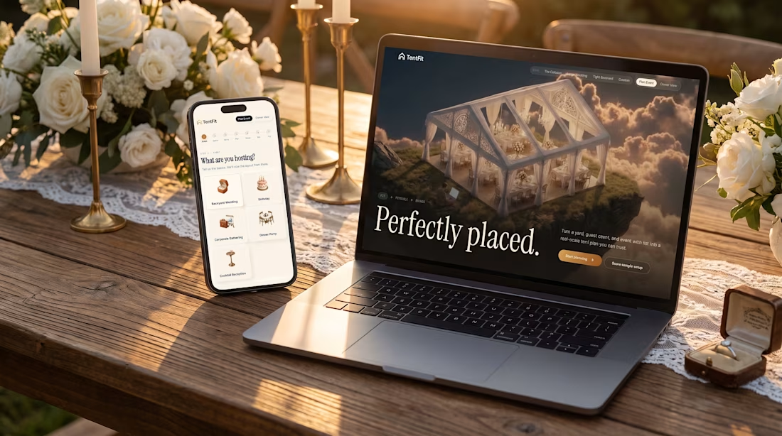
So I built TentFit — a spatial booking experience for event tent rentals.
The customer starts by planning the event, then maps out the space and everything they want inside it. TentFit checks the layout and highlights conflicts.
And instead of just saying “doesn’t fit,” it helps solve the problem:
Switch the tent. Move the layout. Remove an element.
Once everything works, TentFit checks the logistics and turns the final setup into a booking.
The goal was simple:
Make the customer’s decision easier, and make the owner’s job easier.
The flow is basically:
FIT → FEASIBLE → BOOKED
I had a lot of fun building the spatial planning part of this one.
X/Twitter post: https://x.com/brjanov/status/2105630218492731501?s=20
Built with @Lovable
#LovableChallenge #ProductDesign #UXDesign #NoCode #SaaS #WebDesign



Nice stuff!



Love to see the case study.


Well done !