The network for creativity
Join 1.25M professional creatives like you
Connect with clients, get discovered, and run your business 100% commission-free
Creatives on Contra have earned over $150M and we are just getting started
Back to feedPost

SaaS landing pages are deceptively hard to get right. Everyone's seen a hundred of them, so the bar for "clean and polished" is invisible until you miss it.
That was the real challenge behind NexaFlow — a SaaS website I built solo across the full MERN stack, aiming for something that felt production-ready rather than "portfolio project."
The scope covered a landing page, auth flow, and about/contact pages — nothing exotic on paper. The work was in the details: component architecture that stays clean as it grows, animations that feel intentional rather than decorative, and a layout that holds up equally well on desktop, tablet, and mobile without separate hacks for each.
Framer Motion handled the animation layer, but the harder problem was performance — making sure smooth motion didn't come at the cost of load speed. SEO structure got the same attention; a SaaS site that isn't discoverable isn't really finished.
What I took away from this one wasn't a new tool or framework — it was a sharper sense of where "good enough" actually sits for production-style work, versus where I used to stop too early.
Code's public if anyone wants to dig into the architecture decisions directly.
What's a UI pattern you thought was simple until you actually tried building it responsively?
Project :
Live demo: https://nexa-flow-fawn.vercel.app
The network for creativity
Join 1.25M professional creatives like you
Connect with clients, get discovered, and run your business 100% commission-free
Creatives on Contra have earned over $150M and we are just getting started





Related posts


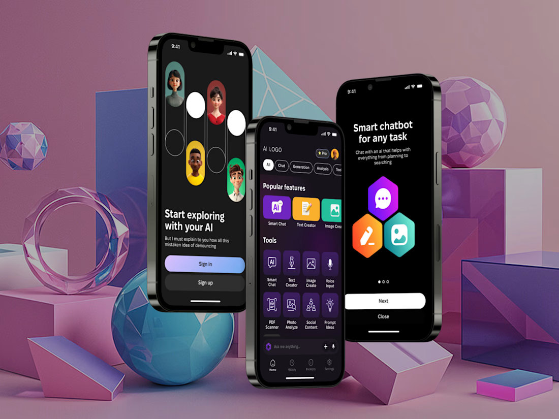
I've built a new mobile AI assistant that brings chat, text and image generation, voice input and document analysis into one app.
It have Smart Chat, Text Creator, Image Create, Voice Input, plus PDF Scanner, Photo Analyze, Social Content and Prompt Ideas, filtered by category.
Almost everything AI can do, just in one place.


Such an amazing tool! Keep going!


Dan Holdsworth and Luke Allen ship brands as a code ready repo.
The handoff includes global CSS, a clip JSON file, an agent file, and a human-readable README. Clients drag and drop it into their codebase and the brand is operable from day one.
They started doing this because clients kept improvising after handoff. A PDF gets opened once and forgotten. A repo stays in the codebase as a source of truth.
The thinking matters. The handoff is the start of the brand's life in production. If the system breaks the first time someone extends it, the design work didn't finish.
They also talked about taking only two projects at a time, catching a logo that sat too close to a Pinterest reference and redoing it the same day, and the difference between cheap and affordable when you raise prices.
Full episode: https://www.youtube.com/watch?v=Gl0Q2Xjw1Ao

AI is an analytical tool it doesn't have tast or creative intelligence or emotional intelligence it will never be better than humans in that because it has no emotions or creativity

Visit the live app here: https://paws-and-puddle-pro.lovable.app/
Meet Sam. He runs a highly requested mobile pet grooming van in Denver, but standard booking calendars are quietly killing his margins. Because generic apps let customers pick any time slot they want, Sam spends two to three hours a day zig-zagging across the city in traffic, burning fuel and losing out on actual appointments just to accommodate a messy schedule.
To fix this, I built Paws & Puddle, a web app that solves his geographic routing nightmare before a booking ever hits the calendar. Instead of a basic form, I engineered a zero-click geo-gate. It automatically fetches a user's zip code via location services and dynamically filters the calendar to only show availability for the specific days Sam’s van is already assigned to their neighborhood.
Because forced logins instantly kill conversion rates, I designed a completely frictionless guest checkout. But to ensure long-term retention, the Thank You page features a "Guest-to-Auth" funnel that seamlessly converts their inputted data into an account post-booking, simply by asking the user to "set a password to track your van's ETA."
Backed by a full operator console where Sam can manage custom service zones, assign route days, and trigger automated status emails, this build proves that premium, minimalist design and aggressive problem-solving belong in the exact same app.
Check out the demo video below to see the end-to-end flow in action! @Lovable #lovablechallenge


Very nice visual design. I love the dog drawings 😍