The network for creativity
Join 1.25M professional creatives like you
Connect with clients, get discovered, and run your business 100% commission-free
Creatives on Contra have earned over $150M and we are just getting started
Back to feedPost

I explored ColorThief today, a JavaScript library that extracts a dominant color and a palette from an image. One useful application is a music player whose background picks up colors from the album artwork.
In v3, palette extraction uses OKLCH by default, grouping colors by their perceived similarity. It also provides swatches such as Vibrant and Muted, plus contrast ratios against black and white.
I’d use those colors for backgrounds and decorative accents while keeping error, status and primary action colors consistent. After adjusting a background’s lightness or saturation, contrast needs checking again.
For a catalog with fixed product images, I’d save the palette during image processing rather than extract it every time someone opens a card. The goal is to let the interface adapt to its content while keeping its hierarchy and readability predictable.

The network for creativity
Join 1.25M professional creatives like you
Connect with clients, get discovered, and run your business 100% commission-free
Creatives on Contra have earned over $150M and we are just getting started



Related posts

12 React Form Mistakes That Frustrate Users 😤
Your React form looks perfect... until someone actually tries to use it!
Can't type? Data disappears? Submit button does nothing?
Here are 12 common React form mistakes every developer should avoid:
1️⃣ Starting inputs with undefined instead of ''.
2️⃣ Clearing all form data after a validation error.
3️⃣ Forgetting e.preventDefault().
4️⃣ Showing validation errors while users are still typing.
5️⃣ Not showing a loading state after clicking Submit.
6️⃣ Using array indexes as keys in dynamic fields.
7️⃣ Forgetting to connect labels with htmlFor and id.
8️⃣ Putting all form state into one big object.
9️⃣ Showing every error at the top instead of next to its field.
🔟 Forgetting onChange on controlled inputs.
1️⃣1️⃣ Using setValue() instead of reset() to set initial form values.
1️⃣2️⃣ Never testing forms with a keyboard.
Remember: A good form doesn't just work when users do everything right. It should also handle mistakes gracefully.
👉 Read the full article with examples and fixes:
https://blog.webdevlab.org/react-form-mistakes-frustrate-users
💬 Which of these React form mistakes have you made before?
#ReactJS #ReactDevelopment #JavaScript #FrontendDevelopment #WebDevelopment #ReactHookForm

Once you know what to avoid, part of the way is clearer.

Personal Trainer Website – Helping Fitness Businesses Grow Online
The Problem
Relying only on social media makes it difficult for personal trainers to present their services professionally, build trust with potential clients, and manage enquiries or session bookings easily.
Potential clients may struggle to find service details, understand available training options, or know how to get started.
The Solution
I built a professional website that gives personal trainers a dedicated online presence where potential clients can:
Explore training services and programmes.
Learn about the trainer and their approach to fitness.
View testimonials and build confidence.
Find clear calls to action to enquire or book training sessions.
Access important business information in one place.
Why It Matters
A website gives a fitness business more control over its online presence. It makes information easier to access, creates a professional first impression, and gives potential clients a clear path from discovering the business to making an enquiry.
The goal is simple: help personal trainers attract potential clients, build trust, and turn more visitors into enquiries.


Nice focus on booking.

A product page should make the next decision clear: which colour, which size, and what happens next.
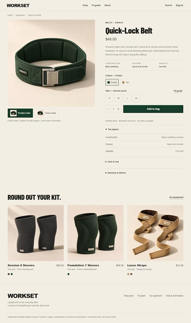
For WORKSET, my self-initiated Shopify fitness concept, I kept those decisions together:
Product details, colour and size sit beside the main image.
The closer view uses the selected colour’s own photo.
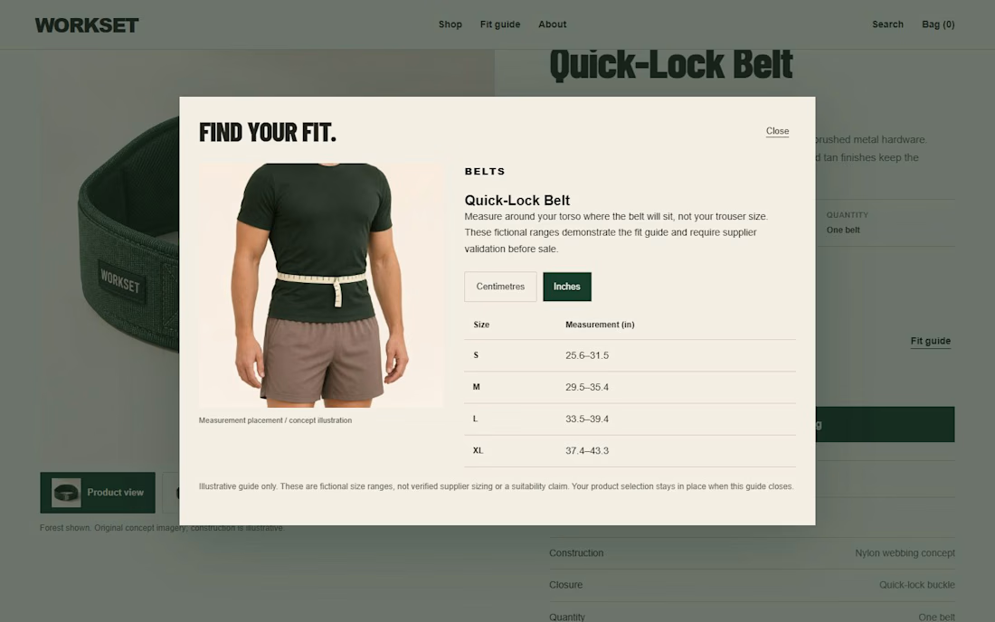
Fitting guidance opens beside the selection, with cm/inch switching and a return to the same choice.
The forest-green palette and warm neutrals give the store its character. The layout gives shoppers a clear path through the product.
This is a working portfolio concept with illustrative products and original AI-assisted imagery, not a client sales result.
Have one Shopify page that needs a clearer layout or stronger product presentation? My Focused Shopify Page Improvement is $750 for one agreed template, up to five standard sections. Send your store URL and the problem you want to solve; I’ll confirm fit before any commitment. Custom interactive features are scoped separately.


Very nice