The network for creativity
Join 1.25M professional creatives like you
Connect with clients, get discovered, and run your business 100% commission-free
Creatives on Contra have earned over $150M and we are just getting started
Back to feedPost

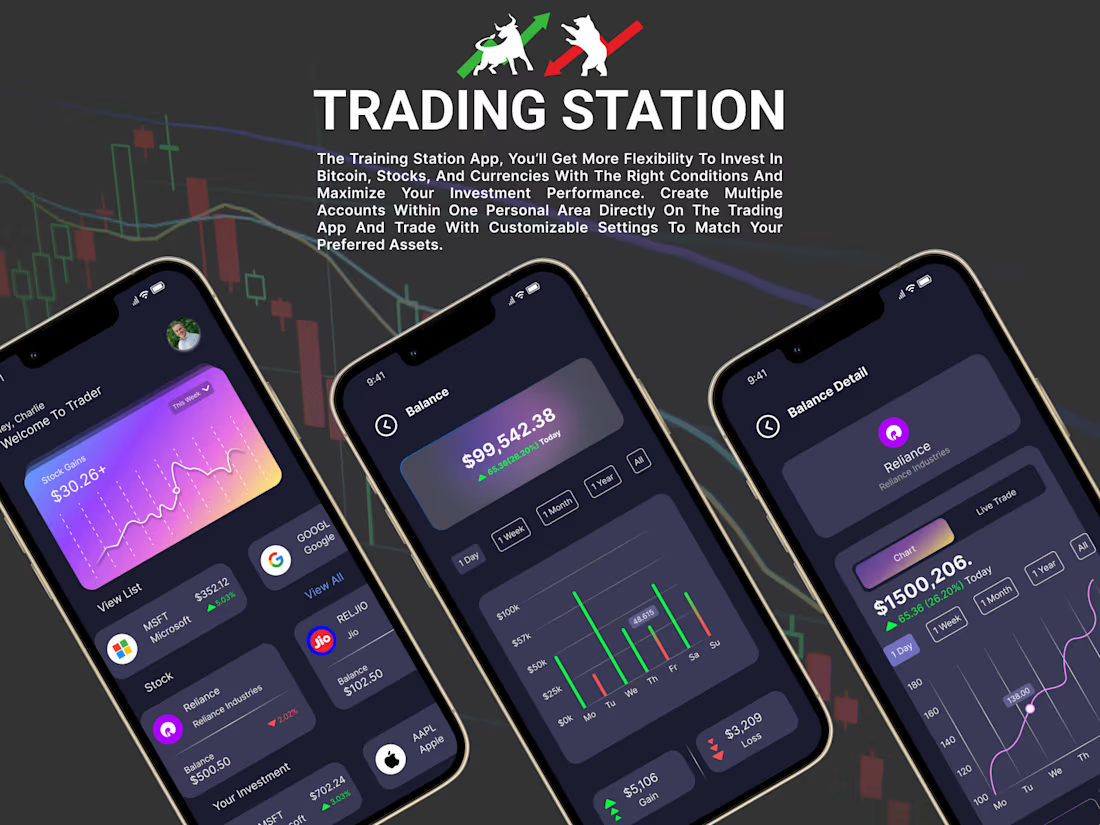
📈 Trading Station — Crypto & Stock Trading App UI/UX Design
Smarter insights. Better control. A seamless trading experience.
Introducing Trading Station, a modern trading app concept designed to make managing investments across multiple financial markets more intuitive and accessible.
The app brings Bitcoin, stocks, and currencies together in one platform, allowing users to monitor balances, explore market performance, and track their investments with ease.
Key Features:
• Multi-asset investment management
• Real-time balance and portfolio overview
• Stock and cryptocurrency tracking
• Interactive charts and performance analytics
• Detailed asset and balance insights
• Customizable trading preferences
Design Approach:
I focused on creating a premium dark-themed interface with vibrant gradients, clean data visualization, intuitive navigation, and a clear visual hierarchy to make complex financial information easier to understand.
The goal was to combine a modern visual identity with a smooth and user-friendly fintech experience.
Have an idea for a fintech product or trading platform? Let's connect and bring it to life!
The network for creativity
Join 1.25M professional creatives like you
Connect with clients, get discovered, and run your business 100% commission-free
Creatives on Contra have earned over $150M and we are just getting started





Related posts

New case: TokenHub 🏙️ → 🪙
I designed and built the website and the investor platform for TokenHub, a Brazilian real estate tokenization fintech. The goal: make investing in property feel as clear as using an app, without hiding the risks.
• A website that explains tokenization without jargon: Three.js hero, a returns simulator and the journey in four steps
• An investor area with overview, project pages, a wallet where each balance can be hidden on its own, an OTC desk with time-limited quotes, marketplace and statement
• Returns labelled as hypotheses, risk never shown by colour alone, every screen reviewed from 375 to 1440 px

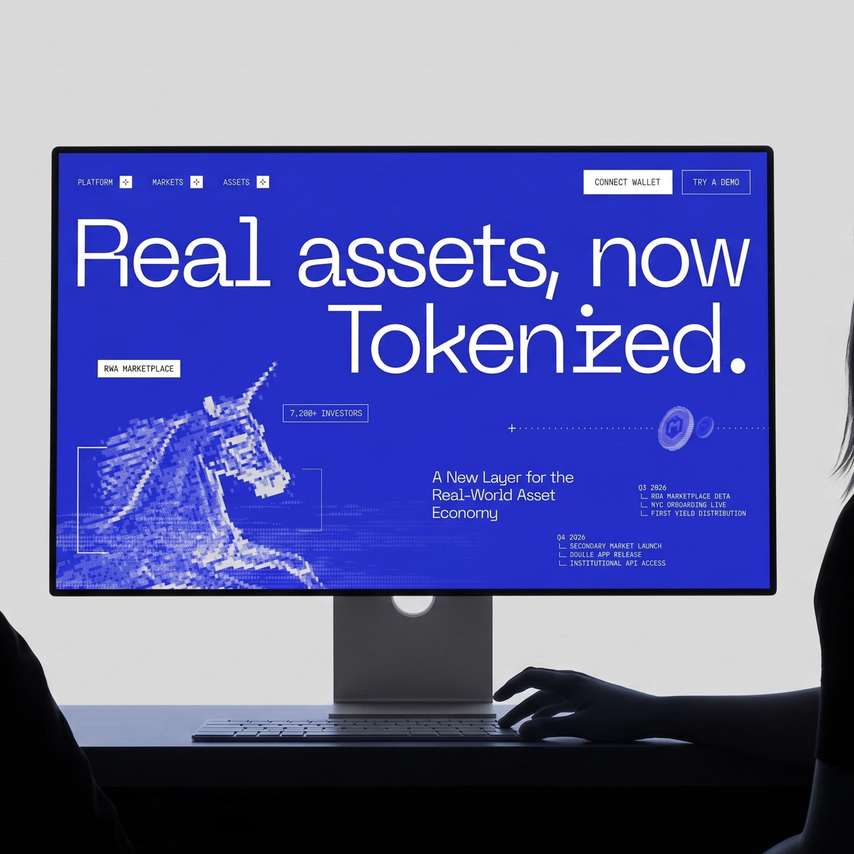
Making real-world assets accessible on-chain. NOISED brings DeFi, fintech, and traditional finance together in one bold marketplace.
Want to create something like this?
Let's Talk!


A compelling vision can get investors interested.
But at some point, the conversation turns to numbers.
And I think a well-designed investor presentation needs to be prepared for both.
That's the balance I aim for in every investor presentation I design. CapitalFlow, a fintech startup focused on making business funding more accessible across borders, was no exception.
Different investors may approach the same opportunity with different priorities.
Some might initially focus on the bigger picture.
What problem is the company solving?
Why does the solution matter?
What makes the opportunity worth pursuing?
Others may go straight to the financials.
How large is the realistic market opportunity?
What assumptions support the revenue projections?
How does the business plan to generate returns?
And what exactly will the investment be used for?
And often, the same investor will move between both perspectives.
This creates an interesting challenge for presentation design.
Because there's a significant difference between making a number prominent and making it meaningful.
A billion-dollar market estimate might capture attention. But without understanding how much of that market the business can realistically address, the figure provides limited insight.
A revenue projection might look impressive. But it needs to be clearly distinguished from existing performance and supported by understandable assumptions.
And a funding request becomes more informative when investors can see how the proposed allocation connects to the company's priorities.
These distinctions influence design decisions.
What information deserves the strongest visual emphasis?
What context needs to remain visible for a figure to be interpreted correctly?
When does a comparison communicate more effectively than a large headline?
And when does simplifying a slide actually remove information the audience needs to evaluate the business?
For CapitalFlow, I worked with the startup's existing brand identity, translating its visual language into a presentation system that could support both the broader narrative and the financial detail.
But maintaining a consistent visual identity didn't mean every slide needed the same treatment.
Some sections needed space for a key idea to stand out.
Others required a more structured approach, allowing financial information to be compared, understood, and connected to the broader business narrative.
And I think that's an important part of designing investor presentations.
The goal isn't to make every number look impressive or every slide equally dramatic.
It's to understand what each piece of information needs to communicate and design around that purpose.
Because an investor pitch deck shouldn't simply make a business opportunity look convincing.
It should make that opportunity clear enough to evaluate.

