The network for creativity
Join 1.25M professional creatives like you
Connect with clients, get discovered, and run your business 100% commission-free
Creatives on Contra have earned over $150M and we are just getting started
Back to feedPost


I designed this website for Palmo, a cold-pressed coconut water brand. The goal was to make a simple drink feel fresh, natural and premium, and to tell the product story through motion instead of long blocks of text.
Hero. The page opens with oversized condensed type in deep husk brown, "PARADISE IN EVERY SIP.", beside a photorealistic 3D coconut. A soft butter-yellow palm illustration sits in the corner. A small hand-drawn arrow points to two quick benefits, "Rich in electrolytes" and "No added sugar," and a short brand line sits on the right with a hand-circled "Discover Flavors" link. The header stays minimal: a palm logo, a basket icon and a pill-shaped "MENU" button that opens a full-screen brown menu with large stacked links and a palm silhouette.
The scroll story. I made the main section one continuous scroll-driven sequence, so it plays like a short film:
The crack: the coconut rotates as "THE REAL SOURCE OF EVERY SIP." splits apart around it, then cracks open to show the water inside.
The facts: round badges float in one by one: 500mg potassium, 0g sugar, 45 kcal and 100% natural hydration.
The transformation: the shell closes, and a progress label tracks the journey from "Whole coconut" to "Canned."
The reveal: the coconut becomes a Palmo can, "KEEP SIPPING.." scrolls past, and the page drops into a scalloped brown section.
Visual language. The palette comes straight from the product: creamy coconut white, rich husk brown and a sunny butter yellow. I paired a tall condensed display typeface with a handwritten accent font for small details like labels and buttons, which keeps the brand bold but friendly. Wavy, scalloped edges between sections look like the rim of a cracked shell and tie the whole page together.
Shopping. In "EXPLORE ALL FLAVOURS," each flavour sits on its own card: Natural Pure, Golden Pineapple and Ruby Watermelon. Hovering a card flips its background to that flavour's colour and shows the can in 3D. A plus button opens pack-size options, so visitors can add to the basket without leaving the page.
Trust and close:
"YOU DESERVE THE BEST FOR YOUR HEALTH." pairs a short mission line with a scattered stack of holiday-style photos.
"SIPPERS SAY !" is a review slider of short quote cards.
"THE BOX OF HEALTH" is a flavour carousel where the background changes colour with each can.
The footer turns into a mini game: visitors swipe to slice falling coconuts above a giant PALMO wordmark, which gives the brand a playful, memorable goodbye.


The network for creativity
Join 1.25M professional creatives like you
Connect with clients, get discovered, and run your business 100% commission-free
Creatives on Contra have earned over $150M and we are just getting started





Related posts

SERVE — Tennis Courtwear Landing Page 🎾
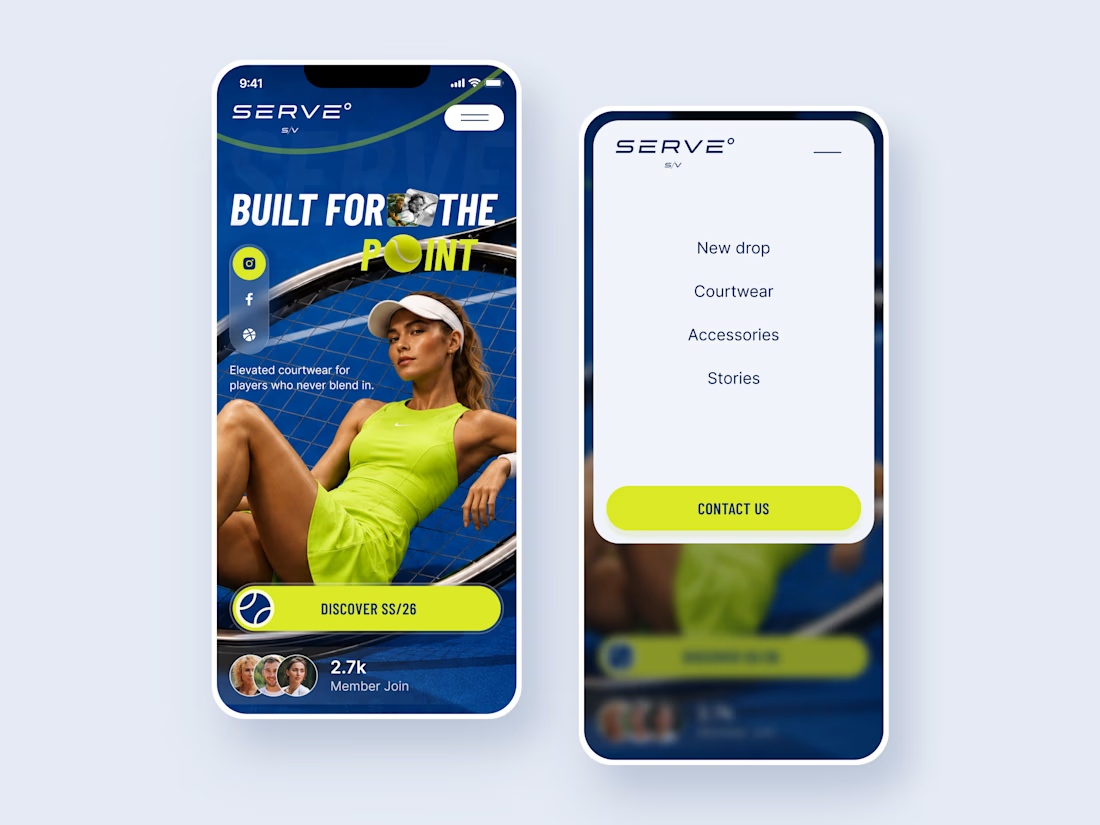
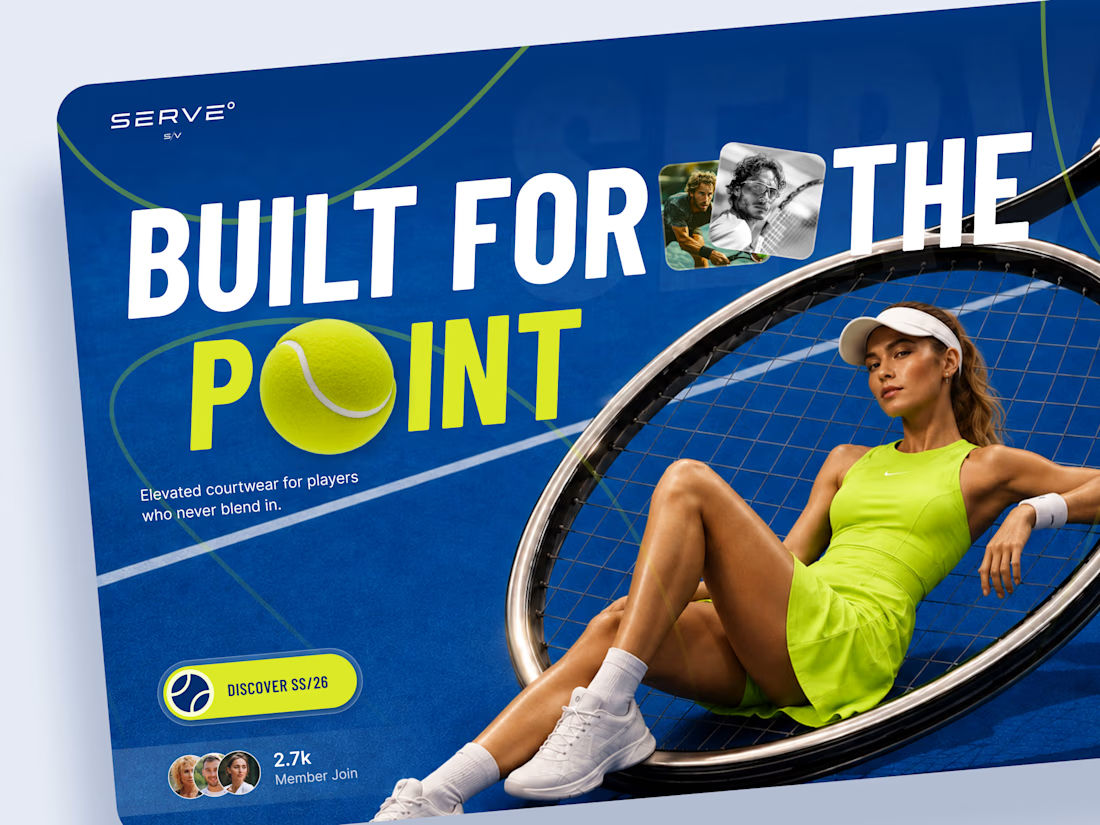
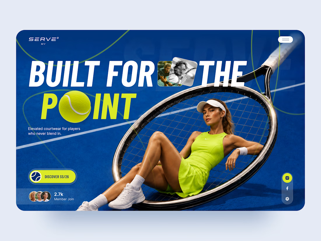
SERVE is a bold landing page concept for a contemporary tennis and courtwear brand built around performance, style, and attitude.
The goal was to move away from the traditional clean, minimal sportswear aesthetic and create something with more energy and personality. Deep court blue, electric tennis yellow, oversized typography, and layered photography give the experience a strong editorial feel.
Special attention was given to:
• a hero composition built around the tennis racket and athlete
• oversized typography that feels energetic and campaign-driven
• electric yellow accents inspired by the tennis ball 🎾
• layered photography and graphic elements that create depth
• a strong CTA for the SS/26 collection
• social and community elements that make the brand feel active
• a simplified mobile composition that keeps the same visual impact
• a clean mobile menu that contrasts with the expressive hero
The result is a high-energy digital experience that blends sports performance with fashion-forward art direction.
Looking to create a bold website for your sports, fashion, or lifestyle brand? Let’s build something people remember ⚡




Continuing my series of short motion videos for a crypto project.
Which coin looks better? (Rendered on a transparent background, by the way.)
If your product needs something similar, feel free to reach out :)
67 voted
74%
24 voted
26%
91 votes
Closed

B took the lead for me

Bleu Cleaning Local Business Website Project done
A clean, trust-focused website design for a home and office cleaning service, made to help visitors find a cleaner and book in less than a minute.
The Problem was
Most cleaning websites lose customers before they book. Visitors don't trust strangers in their space, prices are hidden, and booking takes too many steps.
Solution I deliver
I designed Bleu's Website around one goal: get visitors to book faster.
Instant booking: A postcode search and Book Online button in the hero start the booking straight away.
Trust from the first scroll: A "40,000+ properties" statistic, a project gallery, and client testimonials prove reliability.
No pricing surprises: Every service shows a clear price, with "no hidden fees" stated upfront.
Doubts answered: Eco-friendly products, a satisfaction guarantee, easy rescheduling, and an FAQ remove the last reasons to hesitate.


This is lovely and beautiful 😍