The network for creativity
Join 1.25M professional creatives like you
Connect with clients, get discovered, and run your business 100% commission-free
Creatives on Contra have earned over $150M and we are just getting started
Back to feedPost

My personal portfolio website is live.
And before I share the link — I want to share the story behind it.
I got into UX/UI design in 2020. Zero experience. No connections. Just a laptop, free YouTube tutorials, and a lot of uncertainty about whether this was the right path.
The first year was just learning — courses, practice, failing fast. Then I joined Zainklab agency. That was my first real taste of what it meant to work with clients, handle feedback, and deliver under pressure.
After about a year, I went freelance.
Fiverr and Dribbble turned out to be more than platforms — they became my portfolio, my client pipeline, and my proof of work. Today, 4 years later:
→ 150+ projects completed
→ 6+ years of experience
→ 10+ diverse industries
→ Clients across 4 continents
→ Video testimonials from founders, PMs and CEOs
This website is the honest version of that journey.
Not a highlight reel. The real story — the learning, the grind, the work.
I design interfaces that work for real people — not just look good in Figma. I care about accessibility, systems that scale, and solutions that actually solve problems.
If you're a founder, startup or agency looking for a designer who brings both craft and strategic thinking — I'd love to hear about what you're building.
📩 abustudio52@gmail.com
🔗 Portfolio link in comments
#UIDesign #UXDesign #FreelanceDesigner #PortfolioLaunch #PersonalBranding #ProductDesign #DesignCommunity #FreelanceLife #SaaSDesign #BuildingInPublic


The network for creativity
Join 1.25M professional creatives like you
Connect with clients, get discovered, and run your business 100% commission-free
Creatives on Contra have earned over $150M and we are just getting started



Related posts


Here’s a little piece from my current project. As I watch the Swiss design concept become a part of my creative DNA, I find myself constantly gravitating towards this direction in web design.
What’s really interesting is that Volume 3 studio and I are experimenting here, mixing things that seem completely unmixable at first glance.
Since Volume 3 is a CGI and VFX studio, it was crucial to incorporate a 3D dimension into their brand communication. On top of that, a Terminal UI is exactly what keeps that technical vibe going.
So, the final mix is International (Swiss) style, a Terminal UI, and a 3D feel brought to life by neumorphism. Crazy, right???
It looks simple and clean, but behind the scenes, there’s a massive amount of work on the details. We focused on all those little things that push the UX/UI into the premium segment — the things you don't necessarily see right away, but you definitely feel when you're on the page.
The work is still ongoing, so I can't dive into reflecting on the whole process just yet, but I'm gonna keep revealing small parts here.


Swiss grids on the web never get old when they're this clean. What are you and Volume 3 mixing it with?

Headquaters landing page web design 3D animation website icons


that metallic material is fire

Card Banking Web Design Exploration
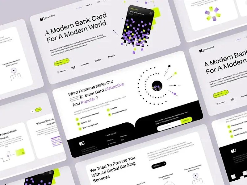
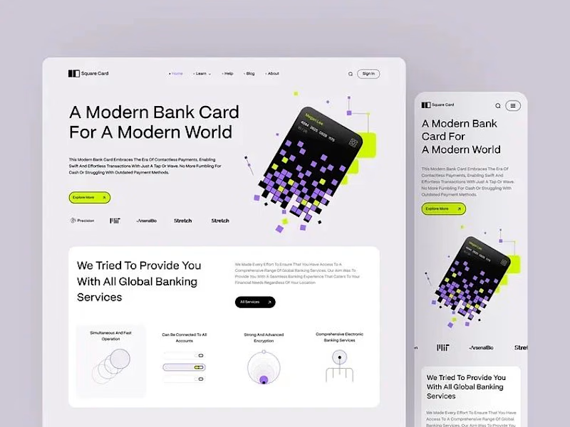
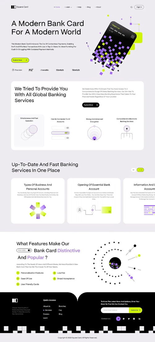
“A modern bank card for the modern world.” That line set the tone, and the layout follows it.
The hero is one pixelated card, built from small squares in lilac, lime and black. It breaks apart into the page, and the product still reads first.
The headline runs large across the left in clean type, so big the message lands before anything else. The card keeps its playful shape, and the words still lead.
Thin line icons and numbered points split the features into small, clear blocks. The busy information gets a strict structure to lean on.
A single lime button sits under the headline and marks where to go next.
Designed by Pixel & Form.
#WebDesign #BankingDesign #FintechDesign #UIDesign #LandingPage #ProductDesign #ResponsiveDesign #CardDesign #Typography #FigmaDesign


Nice work!