The network for creativity
Join 1.25M professional creatives like you
Connect with clients, get discovered, and run your business 100% commission-free
Creatives on Contra have earned over $150M and we are just getting started
Back to feedPost

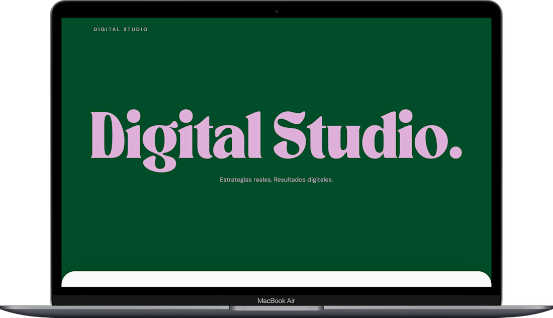
DigitalStudio is a modern portfolio website created for a marketing agency to showcase its services, brand identity, and previous work in a clear and visually engaging way.
The objective of this project was to build a strong online presence that communicates professionalism, creativity, and trust while helping the agency attract new clients.
What I focused on:
Clean and modern user interface
Strong visual hierarchy and branding
Clear presentation of services and value proposition
Portfolio sections to highlight previous work or case studies
Responsive design for all screen sizes
Conversion-focused layout with contact and call-to-action sections
This project reflects the type of websites I build for creative agencies, studios, and service-based businesses that need a professional digital presence to convert visitors into leads.

The network for creativity
Join 1.25M professional creatives like you
Connect with clients, get discovered, and run your business 100% commission-free
Creatives on Contra have earned over $150M and we are just getting started





Related posts

Just shipped the BALEEN site — a marine salvage brand's home isn't a brochure, it's a registry.
A draggable archive of hyperrealistic specimen stamps as the hero. A live ledger of recovered objects. A vessel section with working depth and call sign.
Every object catalogued, never sold as treasure. 🐋⚓️

100% brochure, from layout, typography, sections, color palete and the description 100% AI generated. I use AI as well, but it seems like you did not put any human output anywhere.

Creating immersive digital experiences with smooth website animations ✨
Designed & developed by Usman DevHub Tech & Creative Studio.
We create premium websites with modern UI, interactive animations, and unique visual experiences that help brands stand out. 🚀
Want a website like this for your brand?
DM us and let's discuss your project.
#WebDesign #WebDevelopment #WebsiteAnimation #UIDesign #CreativeStudio #DigitalAgency #UsmanDevHub


Light or refined - which E-Bike product breakdown section design would you choose?
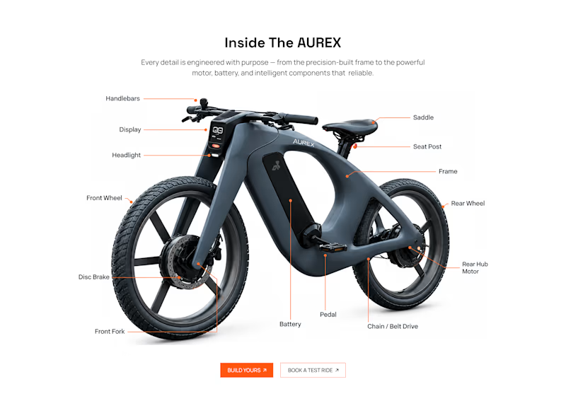
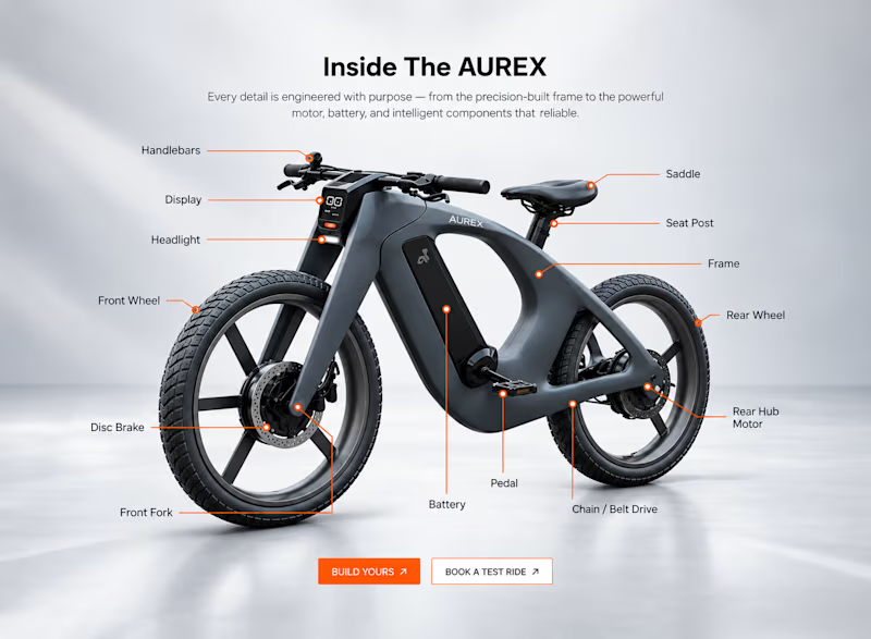
Two concepts for the same AUREX e-bike. Same product, same components, two different presentation styles:
A - Soft Studio: subtle gray depth, larger product focus, and a more premium visual feel.
B - Clean Minimal: bright white background, tighter spacing, and a more technical editorial layout.
Which direction feels stronger for a premium e-bike brand and why?


5 voted
31%
11 voted
69%
16 votes
Closed

A feels more premium to me. The soft gray depth and bigger product focus make the bike feel like something special. B is great for specs, but A sells the feeling