The network for creativity
Join 1.25M professional creatives like you
Connect with clients, get discovered, and run your business 100% commission-free
Creatives on Contra have earned over $150M and we are just getting started
Back to feedPost

A SaaS video for Contra, built with AI.
I wanted to explore how far the new Claude Motion Design tool could push a product-focused concept while keeping the visual language clean, modern, and aligned with Contra's identity.
From concept to motion, using AI as part of the creative workflow rather than just a generation tool.
#Contra #MotionDesign #AI #AIVideo #SaaS #CreativeDirection #ArtDirection #ProductDesign

The network for creativity
Join 1.25M professional creatives like you
Connect with clients, get discovered, and run your business 100% commission-free
Creatives on Contra have earned over $150M and we are just getting started




Related posts


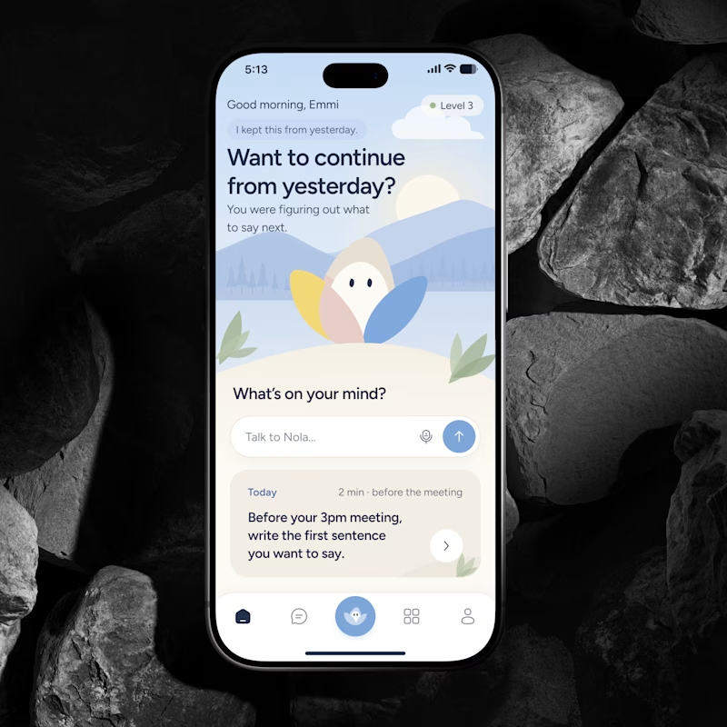
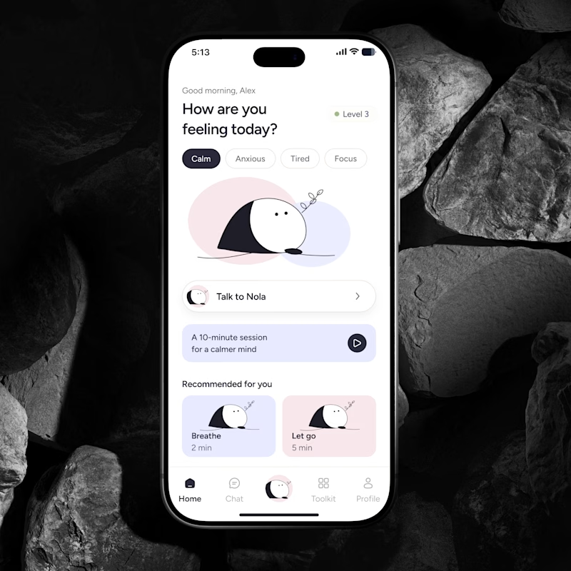
🔥 If you were building an AI Wellness Companion today, would you design a feature or a brand people could actually form a relationship with?
I explored two directions for the same product.
🅰️ Emotional Companion
Built around context, continuity and the feeling that it remembers you.
🅱️ Character Led Companion
A recognizable character that becomes the emotional anchor of the product.
Imagine you’re the founder. Which concept and character would you bet the brand on for the next few years?
Which feels more distinctive, memorable and scalable?
👇 A or B and why?
#AI #WellnessApp #AICompanion #ProductDesign #MobileAppDesign #BrandDesign #UXDesign #HealthTech #AsolDesign

30 voted
39%
46 voted
61%
76 votes
Closed

Character definitely wins here. I think it's like verion2.0 of the emotional one.

typography animation for the word "WALK" with dynamic motion and vibrant neon gradient lighting (teal/purple). Subtle motion blur emphasizes the speed of the letter reveal.


A product can be powerful and still be difficult to understand.
For this concept, the product had a lot going on.
My job was to simplify it without making the product feel simple.
I focused on:
→ finding the core value
→ removing unnecessary information
→ creating a clear visual story
→ using motion to make the product instantly understandable
Here are 4 frames from the concept.
I make product, launch and feature videos for SaaS and AI companies — turning complex products into simple, exciting stories.


Really inspiring work! 🌈